?????
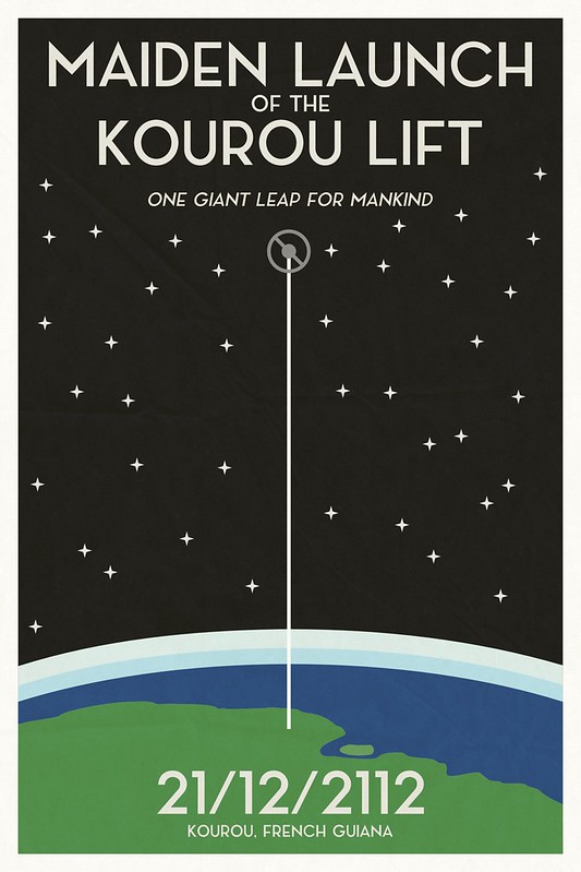
First design assignment! I’m starting out with this assignment where I’m supposed to make a poster for an upcoming event. I decided that I’d instead make a poster for an event in the history of one of my conworlds. My girlfriend and I are working on a sci-fi world together. In this world, NASA, ESA, and AEB work together in the early 22nd century to construct the world’s first space elevator outside of Kourou, French Guiana (the location of ESA’s main space center nowadays). Anyways, here’s what I got:
The maiden launch was a pretty big event, with lots of people visiting Kourou to watch the first climber take off. Note that the date on the poster is in date/month/year format, which is officially adopted by most countries, including the US, by the end of the 21st century. To make this, I just used Inkscape (as always)! The font I used was this cool free font called Noir, which I thought fit really well with that kind of minimalist yet also kind of vintage aesthetic.
I’m really happy with how it turned out! I wanted it to look kind of like the vintage space posters that NASA released pretty recently, and I think it ended up somewhat similar to a few of them. I made sure that the perspective for the poster is right; the space elevator there is actually going up out of French Guiana. So yeah, I really liked how this turned out! I think I might make some more space posters at some point.


Add a comment