After responding to the article about Show Your Work around a month ago, I now have to respond to chapters 2 and 3 of the actual book. I think I’ll talk a bit about each chapter separately, then discuss my thoughts about the book itself.
2) Think process, not product
As I mentioned in the previous post about this book, this chapter mainly talks about sharing the creative process, instead of just sharing the art itself. Artists on the internet definitely seem to be taking advantage of the ability to share their process. I see tons of art livestreams, patreons for comics, art blogs, etc. I definitely agree that sharing your process is a new and important part of creating art in the digital era.
3) Share something small every day
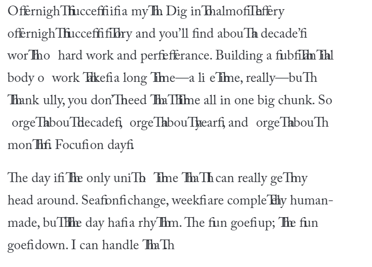
While reading this chapter, I think something went wrong, because:

The first part of this chapter tied in with chapter 2: it talked about sharing little bits of your process daily. I liked the flow/stock stuff towards the end of the chapter. I didn’t know there was a name for that. I still disagree with the “you might have to miss an hour of sleep”. Make time without losing sleep!! Everyone needs sleep.
Design Stuff
I feel like I can’t judge the design of this book properly. Because it was online, the stuff that would be on two pages side-by-side in a real book ended up being misaligned. I felt like I had to ignore the pages with content besides text in order to not ruin the flow of the text. I do like the use of colour in the non-text pages, namely the inversion to white text on a black background. It helps in not obstructing the flow of the text as much, as it sets it apart from the black-text-on-white-background pages.
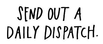
I also like the use of typography with things like this:

It really sets it apart from the page as a whole. It reminds me of how newspapers often put important quotes in big text set apart from the article as a whole. The proportion between the big text like that and the remainder of the text on the page is interesting, as the short snippets like the one above feel as important as the entire body of text. The big text is a short important tip, while the text elaborates on it and is more specific. It’s neat.
The book definitely had some interesting design choices, though to be entirely honest, I feel like I already knew most of what it was trying to tell me. The most important parts were outlined in the article from a month ago, after all.


Add a comment