I tried my hand at making a logo for my group’s radio show: History 2.0. As the show is about how history would be different if people during different historical events were given access to the internet, I decided to try to make a logo that combined the old and new. I ended up making this:

It’s made up of an old-timey globe like this:

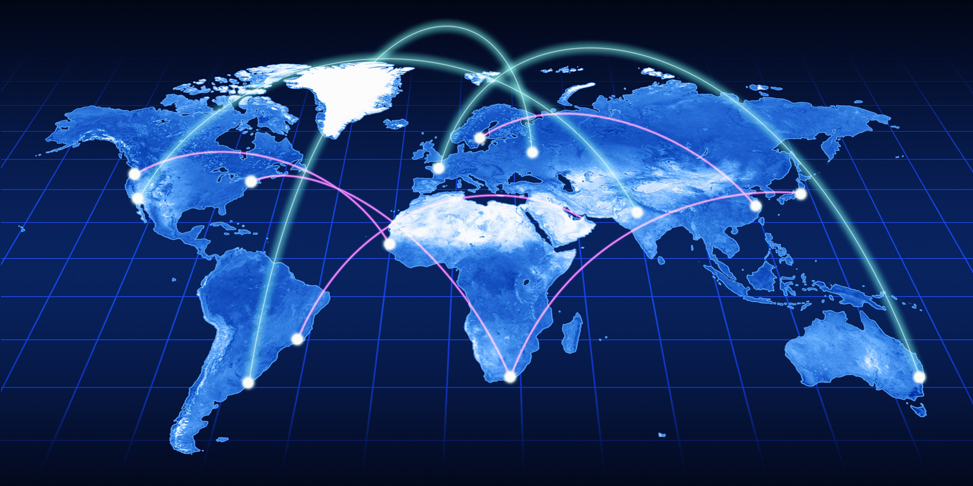
together with a map of internet connections like this:

I also tried to use a font for “History” that looked pretty dated, while the font for “2.0” is more modern and technological. I might do some retouching, since the internet connections look a little off for some reason, but I’m overall pretty happy with how it looks. Now I’ll just have to run it by my group members to see what they think!


Add a comment