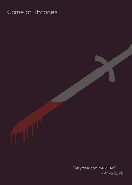
For this week’s assignments, I am focusing on design.
For my birthday on February 23rd, I received both seasons of Game of Thrones on Blue-ray/DVD. I can’t stop watching it. So my mind has been on Game of Thrones all week.
The moment I saw this assignment to make a minimalist movie/tv show poster I knew I had to do Game of Thrones.
I started by writing down a bunch of ideas for the poster. How can I represent an entire series with one symbol?
I thought about a crown or the throne of swords–but how overdone is that?
So I went with something that is poignant and representative.
If you haven’t seen the series, you may not get the reference, but it’s a pivotal moment in the series.
Resources
The colors!
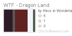
I wanted soft colors that weren’t too bright. So, I went to a palette site called Colour Lovers. Naturally, I searched, “Game of Thrones.” On the first page was this masterpiece:
I knew I wanted something with grey for the sword, but also red for the blood. How perfect is this?!
Sword Clipart
Blood Drip Brushes for Photoshop
I found my blood drip brushes on Deviant Art. You can see and download them here.
The Font
Some final thoughts
I would write a tutorial for this if I didn’t have to switch between Photoshop and Corel PaintShop Pro to complete it. Photoshop, I learned, does not like to replace black and white colors. So while I needed to use Photoshop for just about everything else, I had to turn to PaintShop to use color replacer.
I absolutely loved making this poster, and I wish I could make a ton more for this class (if I had the time, I would do it for fun!).


Add a comment