During this week we had to go around and take pictures of elements of design. Here’s what I got.
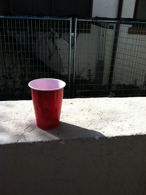
This was my example for color. There are many colors in the photo, but the red of the cup instantly draws attention to itself.
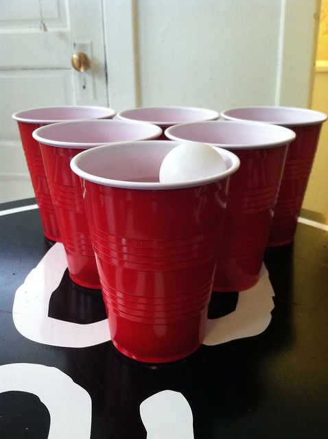
I took this picture the morning after a party. I thought it exemplified rhythm and balance very well. The eye follows along the paths of the cups and is clearly repeated a couple times and it’s very balanced, going along with each cup and lining up well.
This is a good example for minimalism and symbols. Mac has become a household thing and everyone knows what it is now. Therefore, it is clearly a symbol. It’s also very minimalistic because it is just a cutout of an apple with only one color.
This is a good one for proportion but its also kind of bad because the plants in between the porches become distorted and it’s hard to tell where they’re from.
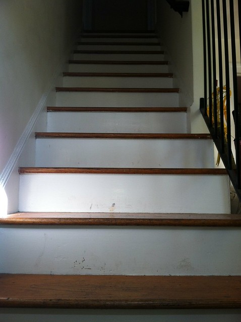
This wasn;t taken for this assignment, but it shows off many of the elements very well. Proportion is shown off in the depth, there’s a rhythm with each step, It’s very balanced, the steps dominate the picture because there’s nothing else in the picture, and there’s a clear unity with each step being part of the bigger stairs.


Add a comment