Since we are learning all about design this week, we had to go on a design safari. We had to look for many different forms of design around us. Here’s what I found:
Color
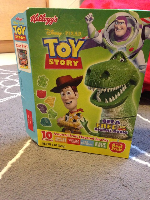
Color is really important for evoking different emotions. Some colors can make you more excited and some colors can make you feel more at ease. It is incredibly important to be conscious of you color choices so that you can get across the point that you had hoped to.
My box of Toy Story fruit snacks showing the use of a lot of color.
Typography
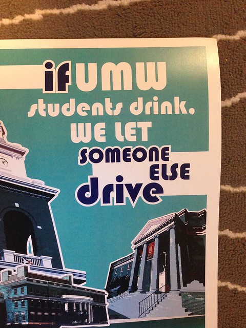
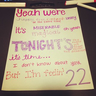
typography is something that I find incredible cool and interesting Typography is the way that words are are sized, arranged, and designed to give them meaning without pictures being involved. I loved making my own type of typography when paper and makers too!
A UMW sign showing off typography
My homemade typography
Metaphors/Symbols
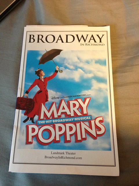
Metaphors and symbols can be super helpful because they allow you to use a single object to represent something. This is a great advertising technique because you are able to get your point across in short and simple way by using one symbol to show what you are advertising.
The Mary Poppins booklet showing symbolism by having just a picture of Mary Poppins to represent the play.
Minimalism & Use of Space
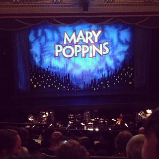
Sometimes less is more. Keeping things simple often makes it easier for people to understand. Keeping the main point uncluttered and easy to follow can make people more inclined to take the time to figure out what you are trying to tell them.
The backdrop for Mary Poppins showing minamilism by only having the title and a small design
Form/Function/Message
Some objects just simply tell you what they are without any words at all. You can see something and just know what it means with out words having to be shared at all. Good examples of this are street signs. While some have words on them, like a stop sign, you would be able to know what they meant with out the words even being there.
A trophy showing success without words being attached
Balance
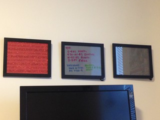
Balance involves the things like symmetry and asymmetry. It is important for this idea that things seems to be in an equilibrium with one another. This is helpful because it is often seen as being pleasing to the eye and something that people enjoy looking at.
Frames showing balance by all being the same size and being hung in a straight line
Rhythm
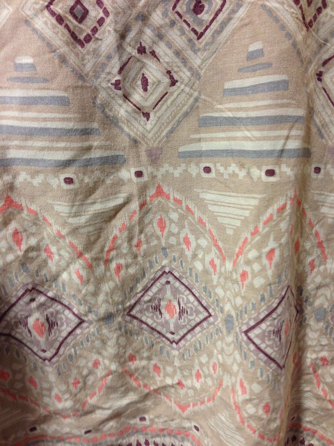
Rhythm includes things like patterns and repetition. This pattern and repetition is quite appealing to the eye and something that we are naturally drawn to. This rhythm is quite popular and can be seen just about anywhere you look.
My shirt showing rhythm by having a repeating pattern on it.
Proportion
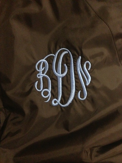
Proportion can be shown by having the same or similar objects represented in different sizes. Sometimes proportion can be used to add depth to a picture and some times it can be used to highlight what is the important part of what you are looking at.
My monogram showing proportion by having my last initial the largest and my first and middle the same.
Dominance
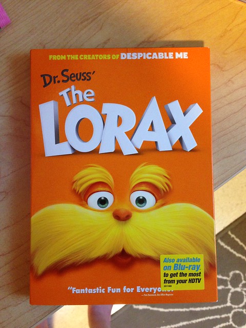
When something is dominating it is taking over the picture of object. It is showing you what is important by making is larger than everything else so that your eyes naturally are drawn to that item.
- The Lorax DVD showing dominance by having the words the biggest part of the cover to draw your eyes in
Unity
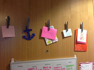
Unity is when things are so similar to each other or so connected to each other that they appear to be one. They can eve have more value together than they once had as separate items.
Clothespins showing unity by all being the same in size and color (aka glitter)



Add a comment