I decided to take some photos at my parents’ house since I was going to be there this weekend. In the 20 minutes of this photoblitz, I managed to take only a few pictures, but they came out pretty well. Let’s begin.
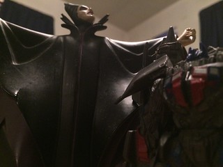
The image above shows two things that definitely do not belong together. As you can, it is Maleficent and Michael Bay’s version of Optimus Prime. There wasn’t anything else in my room that didn’t fit together like these two. One is a heroic leader and the other is the essence of evil. The angle for this image is a bit strange, but I think it is a perfect way to fit both characters in the image. Maleficent standing above all. Will Optimus be able to stop her reign of terror? Another reason I used this angle is because the Maleficent figure is kind of big and clunky compared to the Optimus who is just a keychain accessory.
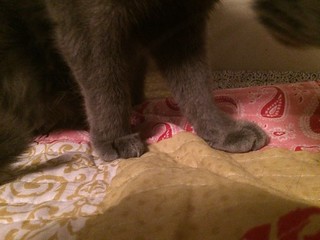
As you can see, I took a photo of my cat’s paws for my next image. It was a bit difficult to do since she kept trying to play with the camera, but I did manage.
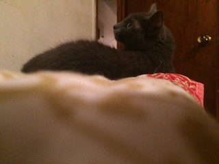
I did take another when she was laying down. This photo would be considered a strange angle. I could’ve have taken the picture from above or even from her front, but this angle makes it seem like I am sneaking up on her or just spying on her in general. It seems like she noticed as well.
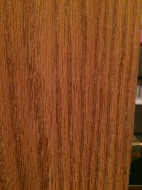
The final image is the pattern of the wood on a stand in my room. If you look closely, the lines seem like they are going to converge at the bottom of the image. I decided to go with the image mainly because the design of the wood looked simple and you can see the design better because of the light color compare to the other wooden objects in my room.
Overall, the strange angle and two things that don’t belong together worked the best for me. You can even make stories out of those images and I feel better when I can position objects or get the right angle to create said story unlike the image of my cat’s paw or the image of the wooden stand.
Looking through the other photoblitz images, I really enjoyed Kelsey’s images of the flowers below. They appear to go on forever and the angle that she took this image really brings out all of the different colors of the countless amount of petals.
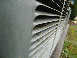
It looks like Rachel created a never ending photo of converging lines at a rather interesting angle. I love how she managed to combine three of the possible requirements for the assignment. The angle especially makes this photo very different. She could have taken this photo at another angle, but it would’ve lost it’s charm.
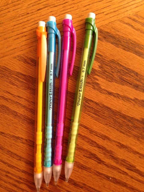
Adam’s image below really brings out the neon like colors of these pencils. Laying them on the darker wood with ta light source helps contrast the colors in the photo. That’s how the color of the pencils appear brighter than they actually are and how the eraser heads shine brightly.



Add a comment