This week we had to do a DesignBlitz. I was sick for the first half of the week and couldn’t really look around for things exhibiting good design concepts until the week was almost over. I’m visiting my dad this weekend, and have been trying to figure out some good things to photograph, when I noticed that we had four brands of soda. I looked at the packaging and realised each one used their designs to convey different things.
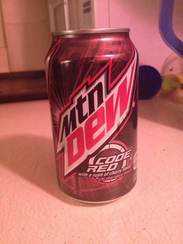
1) Unity – Mountain Dew: Code Red
First up we have my younger brother’s favourite. The design is rather hectic; there’s a lot going on in the background behind the text. The whole can is also a mix of reds, with a bit of white and black. Altogether, they make the entire can seem very high energy and intense, which is very fitting for a high-caffeine soda.
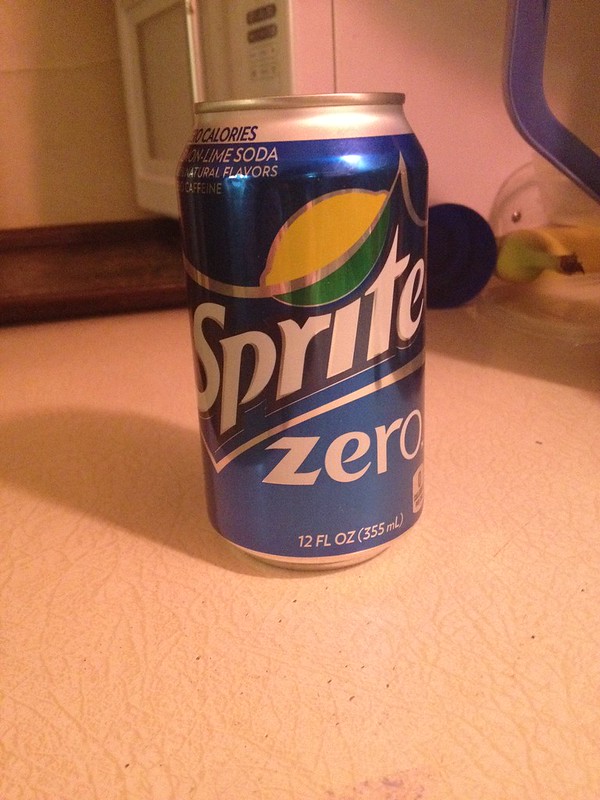
2) Typography – Sprite Zero
Now for my youngest sister’s favourite. The Coca-Cola Company (which owns Sprite) started calling many of its diet drinks “Zero” in an attempt to make them sound cooler, better, and more interesting. They also wanted to market to men who thought diet drinks were bland and feminine. Unlike the following diet drinks, which use very simple fonts for the “Diet” in the name, Sprite Zero uses a more interesting font, to try to convey that it’s better than a diet drink.
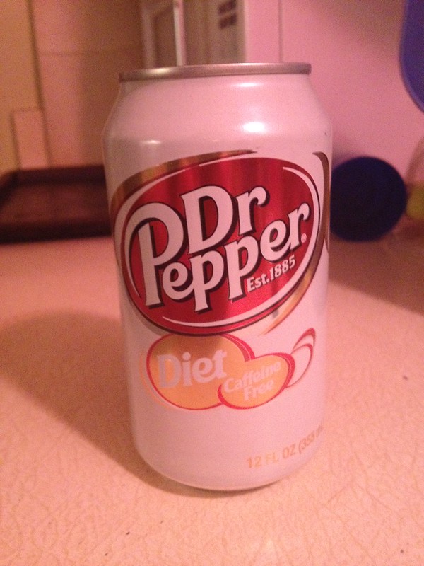
3) Colour – Diet Dr Pepper
This one’s the older of my two younger sisters’ favourite. One of the first things you might notice on this can is its rather muted use of colours. It still has the standard red of a Dr Pepper can, but only on the logo. The body of the can is now white, while the “Diet” and “Caffeine Free” areas are muted gold. The use of muted colours goes very well with the fact that this is not only a diet soda, but also a caffeine free version of a diet soda. A low-energy can for a low-energy drink.
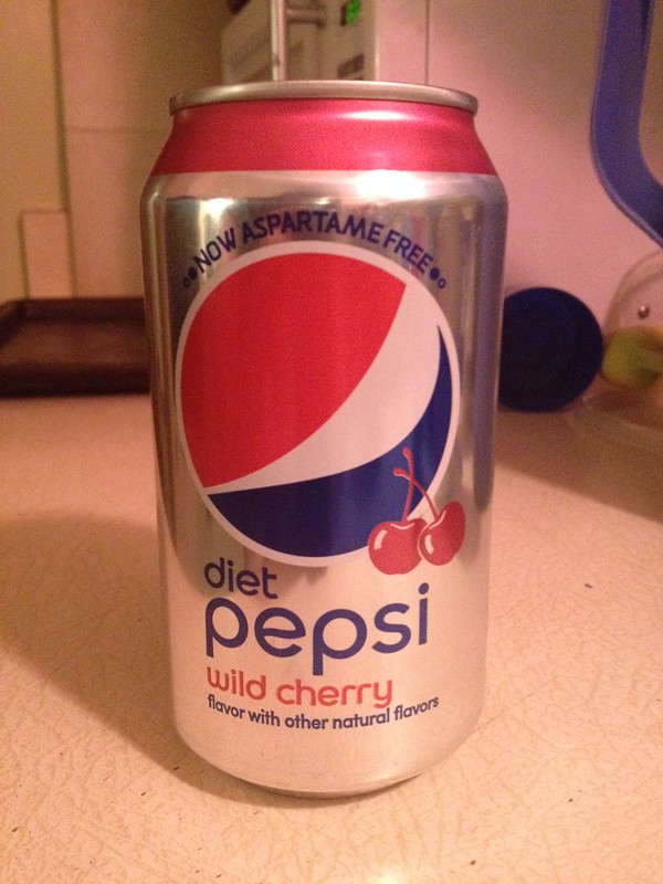
4) Minimalism – Diet Cherry Pepsi
This one’s my favourite of the bunch. Like Diet Dr Pepper, it features a light-coloured and simplistic can. This one, however, is even more minimalist. There’s the already minimalist Pepsi logo, “diet pepsi” in a simple font below it, “wild cherry” in the same simple font below that, etc. It’s all very basic, without any crazy designs or fonts. The least minimalist part of it is the two cherries below the Pepsi logo. This makes sense, since Pepsi is a cola-flavoured soda (the most basic soda flavour, and thus the most minimalist design), while the addition of cherry makes it a little less basic (with the less-basic cherries added to the simplistic can).
I really did not expect to be analysing the designs of different cans of soda, but this is DS106. You never know what’s going to happen.


Add a comment