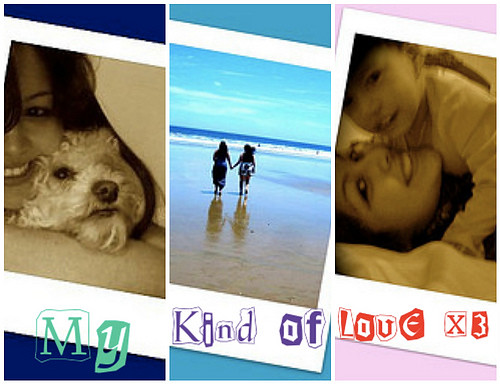
With first impressions being critical I see a very family oriented person. An early twenties female with a love for animals and family. A three tone background shows old fashioned polaroids set on soft colors. Images are most likely not actual polaroids but set in a frame from a generated computer image. I think this itself needs a couple tweeks. It would have looked nicer if it had the effect of the poloriods lying on top of each other almost like a scattered look, as though shuffling through memories. The font expressing the words “My Kind of Love” offer a warm and open expression. The font you chose is nice because it adds that scarpbook effect but the breaking in the words makes the picture look choppy and ameture, and you can see the uneven shift from each different background. The three colors offer a good tone but dont necessarily match the background colors, also an ameture effect. Finally, the images are cropped and crunched in the polaroid frames. They have limited views because of the crop editing, not a great look. Each photos have a sepia edit to them except for the center beach photo this is generally a very basic editing skill but gives good value to the piece. Instead of sepia i would have gone with black and white, that would have brought the colors out better and matvhed more for leaving the middle picture with color.
For this assigment I really liked “My Kind of Love in 3 Forms” by Katherine<3.


Add a comment