-
-
-
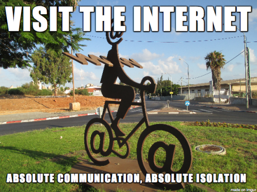
Some humans have their feet on the ground weighed down by mind…
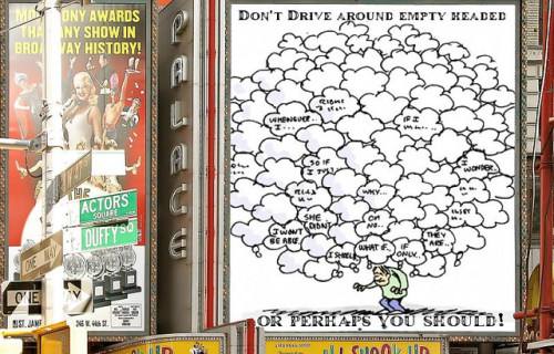
Some humans have their feet on the ground weighed down by mind chatter, no space for stars or wonder… made at Big Huge Labs.
-
-
-
A Blossoming Portrait of creative prowess…
Source available on Flickr Made with: Stereogranimator -
Letting Go
So we came to the end of our radio show The DS106 Good Spell in 106 Bullets. We did it in 107... -
Ahmad talks about random acts of kindness
The image of this 12 year old child holding on to his friends as he goes to school, will haunt me... -
So, my love for making photos look old goes back to…
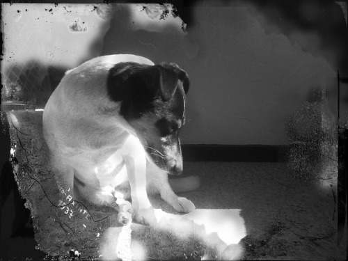
Made by hand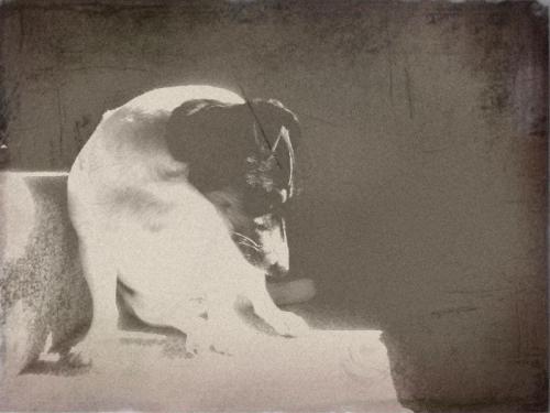
made by generatorSo, my love for making photos look old goes back to @bionicteaching and a long time. This photo of @gifadog was the first one I ever made. I used a blog post written by Tom and fell in love with the idea as well as learning a lot about how to Photoshop.
So the top photo (labelled ‘made by hand’) is the one I made. You can find it on Flickr and also read the comment there. It took a long time to make. It takes me less time now but it is still in the region of hours to get ‘just so’. I also feel a sense of ownership for each blemish I add and that makes me love the ‘old’ photo I end up with.
Today’s Daily create asks us to use a generator for the same purpose. I was not going to do it, as I am a bit of a snob when it comes to apps and generators…but this is the Daily Create, we must obey!
The bottom photo (labelled ‘made by generator’) is my submission for today’s daily create. Clearly much easier, upload a photo and download the ‘old’ photo. Emotional attachment to output? None.
Which do you prefer and why?
-
Yet another Daily Create…actually this one was not for…
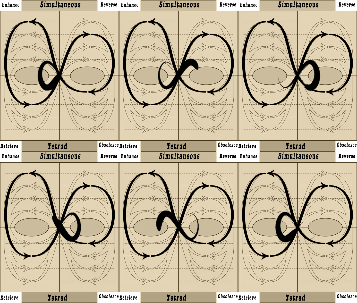
Yet another Daily Create…actually this one was not for DS106 but as it has taken me days and days to pull together, I thought that I could offer the .PSD file for #artdropday. So far, no takers. I guess it is a bit boring to count as art! It was made for a blog post elsewhere on the subject of our relationship to social media. You can find funnier gifs at @gifadog ‘s Tumblr, I guess.
-
For todays DS106 Daily Create click-bait!
For todays DS106 Daily Create click-bait! -
It all started with a Tweet. Viv said ‘Spike will start miaowing…
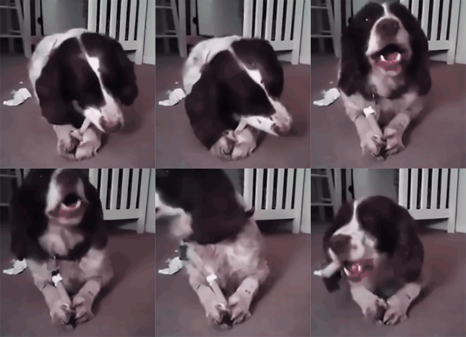
It all started with a Tweet.
Viv said ‘Spike will start miaowing next’ to illustrate the idea we were in a parallel world where the impossible was now possible. I said I would make it digitally true as soon as I got a Spike Gif.
I knew I had John Johnston’s plug in installed in my sandbox domain. I knew Viv had made some Vines of Spike eating a bone.
How hard could it be? The rest of the post outlines the process; not because it is elegant but because sometimes you go around the houses to do something and it takes you right back to doing it the hard way!
I got an email that gifs.com now allows you to do frame by frame editing and tweening with their editor. I have tried their editor before but the result is not the quality I have come to expect from my gifs. Still, I thought I would give it a go because it said it take a Vine Video and turns it into a downloadable gif. Easy.
I thought I would add a dancing sticker as above with the new features download it and boom upload my my sandbox domain add cat sound and done.
It kind of worked. The new features are….shall we say glitchy? I started 1 day ago and could not get the gif with the frame by frame editing to save ( yes, I have written to them to let them know). In the end I thought, how about just the gif from the Vine movie and then I can add the sound without the sticker. Yes, that worked. Download gif.
Forgive me, but who on earth finds joy in watching a 250x250 shaky gif? With a logo that takes up some of what little space is there, it was a waste of time for me. I would no post **that** even on my sandbox domain.
So, I went to my usual workflow with the crappy gif. I cut the logo out as I really did not think they deserved it. Photoshop aligned the frame, I selected 20 frames out of the 48 frames in the original, I cropped, I changed the resolution and the image size, I dithered on 128 colours using the soon to de dead ‘save for web’ in Photoshop. Bingo. I had a decent gif. I am still not happy with it as the edges are too close to Spike and…but it was good enough for the wee gif(t) I wanted to make for Viv and David.
How hard could it then be to find a cat making the right noises? Harder than you think. If it is not the right sound at the right pace it does not synch well with the movement. I tried 3 different cat sounds from Freesound.org. Of course, the one that worked was a .wav not an MP3 so pop into Audacity and export as MP3.
Once I had the image and sound right, it was a breeze to use John’s plug in and publish a post with Spike miaowing! Head over to my sandbox to see the first dog miaowing ever!
The moral of the story: Don’t try to shortcut art, it will not be rushed.
Useful websites
John’s plug in for Wordpress rocks!
Freesoung.org great for finding strange sounds.
Gifs.com (they may get the new features working and it is great that you can just add ‘gif’ to a YT URL and it takes you straight to their editor to make the gif. I have never been able to use output as quality is not good enough for me)
I also wanted to try gifgrabber and I thought I had it on the Apple store to install as I had used it before. No. It turns out it is now giphy capture (they must have bought it) and let us say that the reviews did not inspire me to download. It does not allow you to grab high def quality gifs as the previous app did. I did get miffed by the fact that Giphy decided to alter my potential old version download to the new ’version’ which is really not a new version at all, but a new app. Bad Giphy.
I usually grab with Screenflow but it is not free and I think it is only Mac. It is awesome as you can edit, add captions, it have actions that means you can do typography; you can scale and crop….I don’t even know half of all it can do.
-
The garden of death Hugo Simberg (1896) Just playing with old…
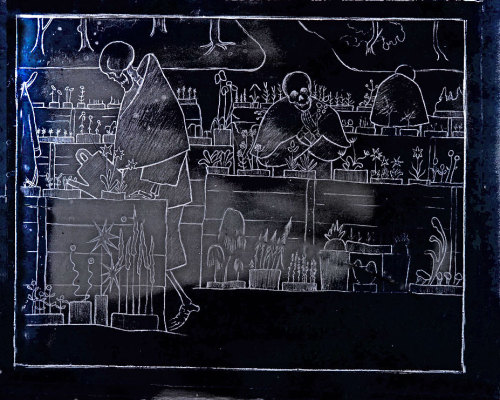
With negative adjustment in Photoshop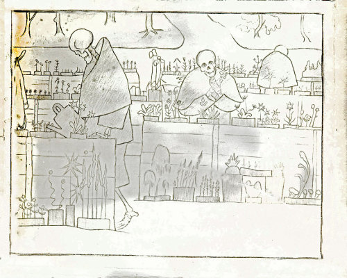
Cleaned up version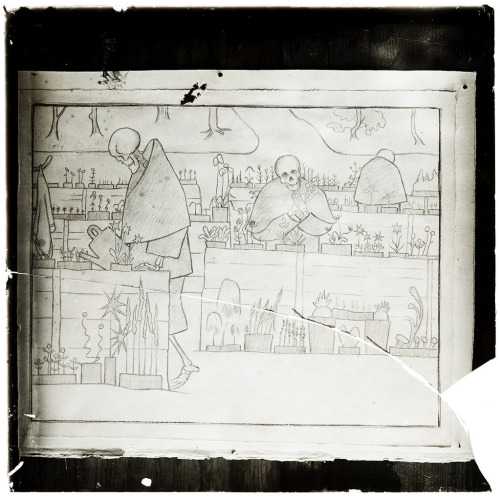
Original from websiteThe garden of death Hugo Simberg (1896)
Just playing with old images today. I loved this one and tried to ‘see it better’. Death is gardening, I love that. Thanks @jimgroom for pointing me to the post.
-
The new daily create site is making me lazy. It is so easy to…

The new daily create site is making me lazy. It is so easy to just post on Twitter and forget to write posts narrating process and reflecting on learning. I keep telling myself it is ephemera and it does not matter, picking up on Michael Branson Smith’s distinction between ephemeral art and more long term projects.
All this is true. What is also true is that each little creation teaches me something and helps me keep up to date with what the web offers to help us make digital art.
The rest of this post is my attempt to put this right in terms of a few dailies Creates I made the last few weeks. I want to explore the tools I used and write some reflections on what I have learnt.
A while back we made a logo with a logo generator. My immediate reaction to it was negative. I often find that with prompts that send me in directions I would not choose to go! What is the point of just using a programmer’s knowledge of design in order to create an output that I have nothing to do with? Where is the creativity in that? I have learnt to ignore the critic when it comes to this type of thing. So I started to play with Emblematic.
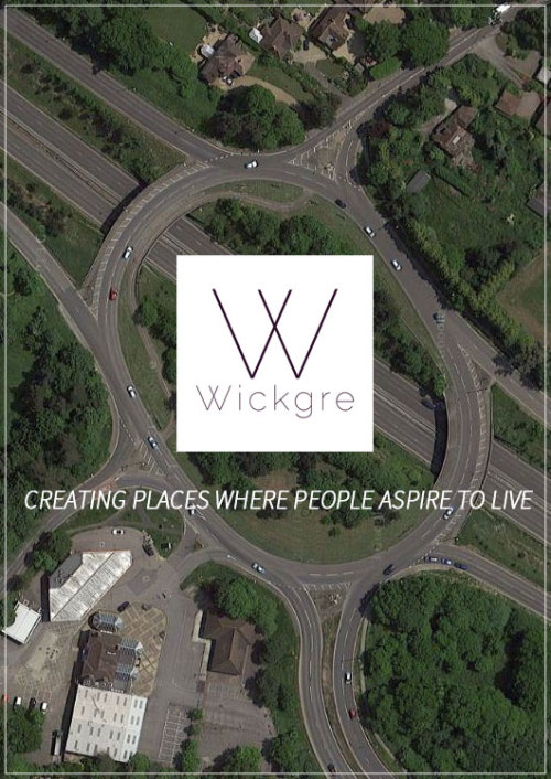
My immediate reaction was: meh. But here is the kicker; as I played I saw that it was possible to adapt parameters in the designs I liked. Some of these parameters were not familiar to me and changing them taught me new elements of design. In making a choice about what I like, I am choosing what I like for a purpose. This taught me something about aesthetics for fulfilling a brief. It is not the same to design a logo for this blog and for, say, a fake hipster new ‘hood as in my ‘WickGre’ logo above. Again, quoting Michael and @ryanseslow: In making a choice about ‘like’ I am learning something about art even if I am not creating it myself; I am learning about refining my taste for a purpose. A design skill.
I first used Emblematic to make the new logo for this blog. When it came to creating acronames I remembered that tool and decided to use it. The brief: a hipster fake name for an area in my locality. I do not want to put too much location information online, because I am paranoid. So, I chose a local area that has gone through huge development recently but is not too close to me. The development has been controversial. I remembered the idea of Honest Slogans (another daily create from a long time ago, I think). What would it be like if my fake name for the new development had an honest slogan?
So I looked for an image that would be an accurate reflection of what people are buying when they buy houses there. The place basically overlooks a huge roundabout with a huge superstore. I have nothing against this, but it does feel rather dishonest when commercials advertise the new homes as ‘luxury countryside living’. It is dangerous to cross the roads to get out of the development and I fail to see how living by a roundabout (large road intersection, for those not in the UK) can be said to be ‘countryside’. So, I made my poster for WickGre - creating places where people aspire to live, with a background of the large roundabout that defines it. It really is not that different from “DoWiSeTrePla” - Downwind of the Sewage Treatment Plant mentioned on the podcast that explores ‘the SoHo effect’. Perhaps I should have called it: CleViBiRo - Clear View of Big Roundabout.
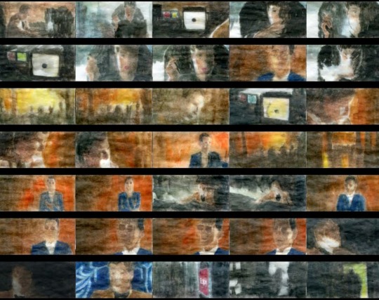
On other news, we had a another create that made us use a nifty tool that allows us to print out video. Again, I could not see the point initially. I knew that @johnjohnston had made these storyboards many times and his were awesome. What was the point of something that gave you no control? You just gave it a URL and then it gave you a series of frames on a pdf. Meh. But, not meh! Read on.
John’s scrolls are wonderful but beyond those of us who do not command the Command line on a Mac. This tool made this accessible to the rest of us, but I genuinely did not see this when I first tried the tool. So I made a comic.
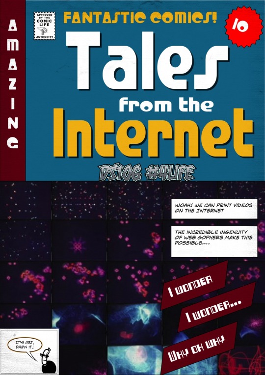
I could see how awesome the programming was, I could not see practical applications. I chose to do my background with and abstract video. I got a beautiful wallpaper, and assumed that this would be the only use. Then others started to use it. I realised how wrong I was. Jim Groom explored the potential use for scene analysis and understanding of a film. Doh! Of course, I never thought of that. I left a comment to that effect. He further suggested in his response,
Yeah, John Johnston has been doing amazing experiments along these lines for a few years now, we need to make some of that available. I like the idea of a daily tool..
Yes! Imagine watching a film and being able to create a storyboard of different scenes to analyse later not being dependent on You Tube. I started to learn how this could be useful practically as well as aesthetically.
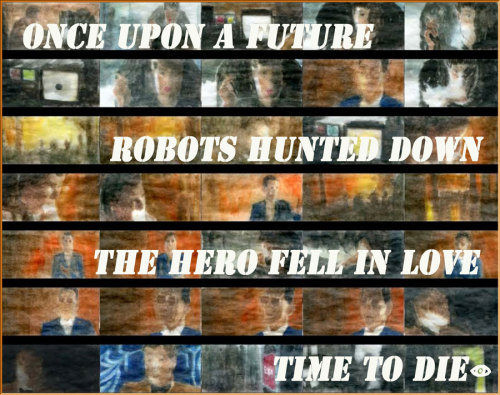
We then had a daily create that asked us to give clues for people to guess a movie. I immediately thought about the print a video tool. Get a scene and use as background to give clues on top of that background. The film was easy to guess, but I thought the poster looked lovely with the watercolour version of Blade Runner as background.
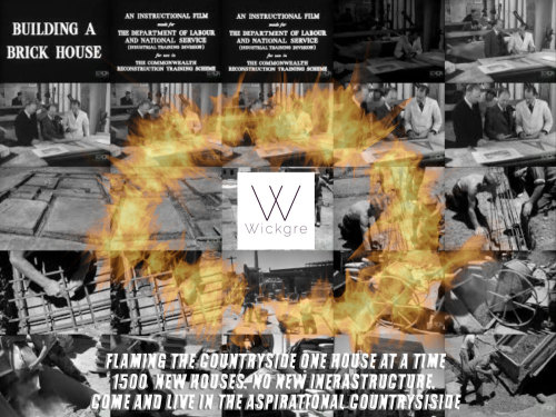
And we are up to yesterday’s daily create. A 3 word map story. For this to work with the image of a map, I had to post location information. How to do it without that? I searched for my 3 words for the same location of my previous honest poster: Bricks, Flames and Active. This made me laugh. I immediately thought of the slogan: Actively flaming the countryside one brick at a time. I did a little bit of research. Turns out that 1500 houses have been built, without any changes to the local infrastructure. Who knows what the people buying the houses will have to go through as the houses sell - no more school places, no more parking, no more access roads…
I decided to do a protest poster. I wanted to do flames around the logo. I have tried and failed to learn how to do this in Photoshop before; mainly because I did not get the how to select a path before rendering the flames. I used a tutorial and managed to create what I had in mind.

I replaced the background with a wallpaper of some public domain footage of a black and white house build, using the print video tool. And Bob is your uncle.
So, yes it is true that the creations are ephemeral and are not something I will add to my best work folder. Yet, as a daily practice it cannot get much better than this: my expectations challenged so I can learn something new, finding practical uses for tools I was unfamiliar with, learning one more trick in a tool that will take many lifetimes to learn well and finding out about my local area’s development plans.
And the biggest gift? I realise that I now have a tool to select frames for gifs easily. I can print it out, take time to view as stills and select my moments when making video gifs. Anything that help us gif better is a god send, says @gifadog
Thank you, daily create.
-
Well, this was supposed to be a quick one. I wanted to gif part…
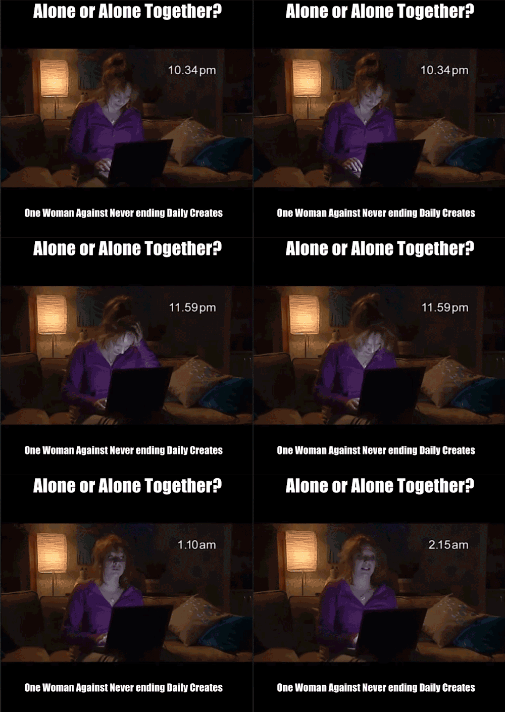
Well, this was supposed to be a quick one. I wanted to gif part of my Addicted movie trailer for today’s daily create. I decided to go with one of those easy peasy generators. This is the sucky gif it made and I could not leave it at that. I cannot leave a sucky gif out there… So, I had to go back to my own work flow: ScreenFlow, edit movie, export movie, import movie into photoshop, make the gif. The result: 27 frames, 628x590, just over 1MB and the manic timing I wanted to show how addictive DS106 can be; enacting what the gif describes by taking most of the afternoon to make something that is meant to take no more than 30 minutes! Bye for now. Heading to my DS106 anonymous meeting.
-
Okay, so this was not at all close to the prompt for yesterday’s…
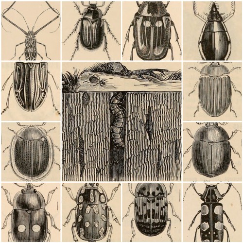
Okay, so this was not at all close to the prompt for yesterday’s daily create. But the prompt really did not speak to me and I have been doing this for long enough to determine my own creativity rules, dagnabit!
I saw this post by Open Culture that talked about the Internet Archive’s public domain photo repository, I clicked and was lost there for a while. The latest uploads were the bugs in my wee collage above. I was taken by the little creatures and thought: a collage would be awesome! But it is such a silly thing and it would take so long in Photoshop…
To my rescue: Big huge labs.
I thought it would take a while anyway to get the photo links over and organise the thing so that it looked good. It looks good, right?
Well, I did not do it. Big huge labs did. Here is the magic: it can use your Flickr Favourites to create the thing for you! So, I went to Flickr selected my favourite bugs from the Archives and went back to Big huge labs. All I had to do was say use my Favourites, give them my user name and wham! The web gophers went away and produced the collage. What is incredible to me is that the layout is just as I imagined in my head. It is likely (I have not checked) that the middle photo is the largest and hence the one chosen for the middle - but it felt like web magic to type in: I want this, and to have the very thing I imagined come back to me with no effort.
I have pro membership with Big huge labs, their tools are simple but so effective - no fancy big sell, just somebody making web magic. They rock.
-
and now following @bionicteaching teachings I made it even…
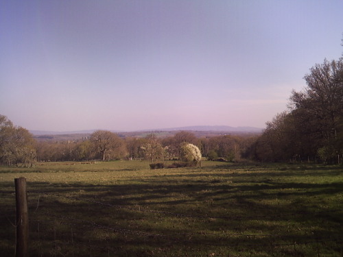
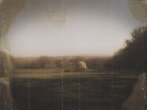
and now following @bionicteaching teachings I made it even older! Get an old photo, pick up bits and add to photo you are ageing. Mess around to blend.
-
Just playing with layers and filters in Photoshop. How to turn a…
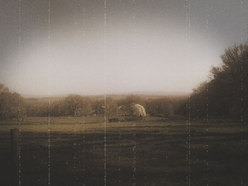

Just playing with layers and filters in Photoshop. How to turn a new photo into an old tutorial followed is here.
-
These are the last 9 days using the #gridsgestures activity to…
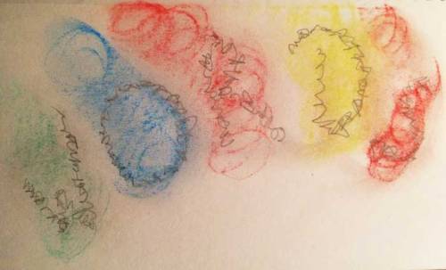
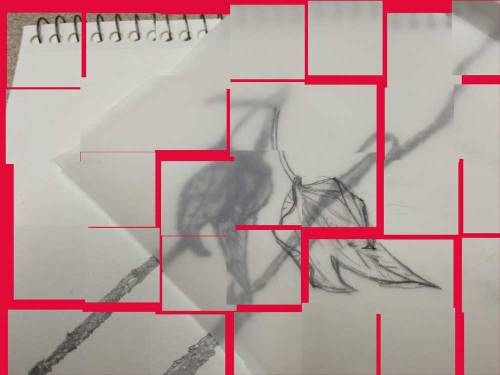
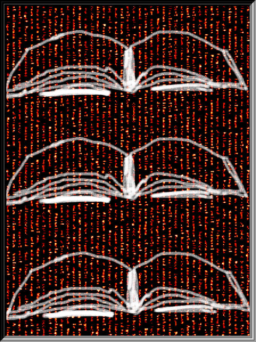
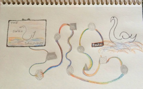
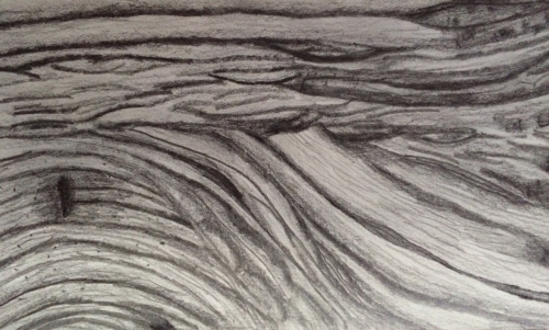
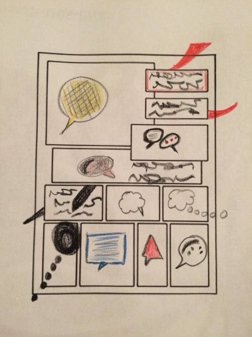
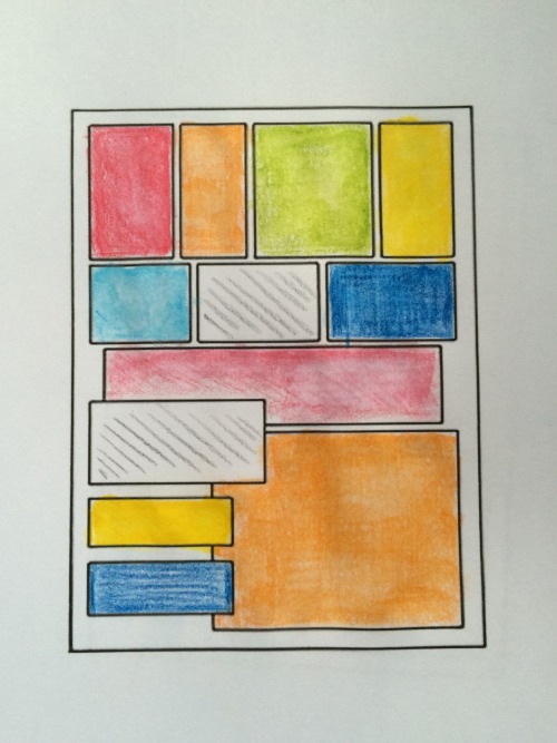
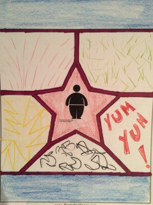
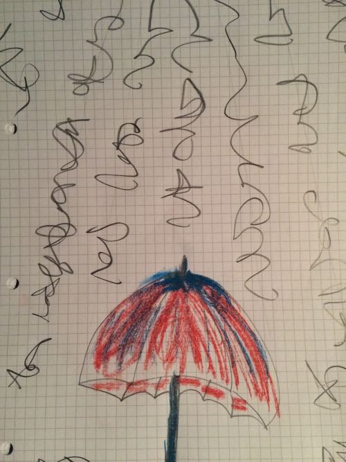
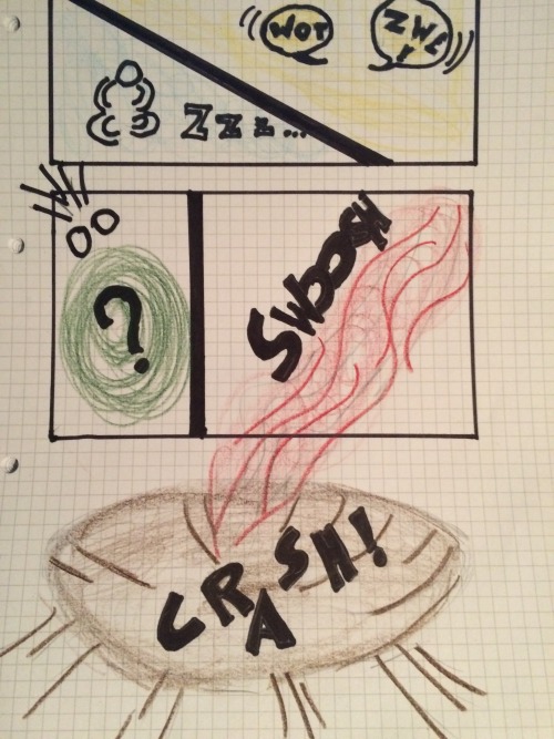
These are the last 9 days using the #gridsgestures activity to reflect on the day.
I have spoken before about how it is helping me learn about comics.
These last 9 days have done that too but I have focussed much more on the reflective quality of the activity. Making the commitment to do one daily, has me thinking about the essence of my day through the day. That is a nice thing. What is the most relevant thing that I will want to put into this abstract comic format at the end of a day? I think about the flow of my day, key things that happened and how then to describe in a page with no words, not drawings just panels and marks…yes, I cheat a little but it is nice to learn about ‘written sound’ in comic, or asemic writing to make it seem like words but not words….I have also experimented with different media this time and have gone back to pencil! I like pencil.
Thank you @nsousanis for a great learning space.
-
Why U use Tumblr?
Aaron Davis (@mrkrndvs on Twitter) is presenting somewhere on blogging platforms. He asked about... -
My grandmother’s hat
I was going to call this post ‘The improvisational And’ but I thought above was much more #DS106... -
Dear haters,I have so much more for you to be mad at, just be…
http://imgur.com/MrEfJyB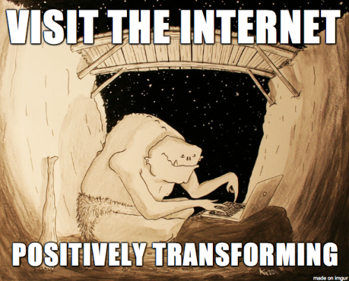
http://imgur.com/t4RyqXfDear haters,
I have so much more for you to be mad at, just be patient.
Yet another daily create, just make memes damn it!
-
This week I joined in with #gridsgestures (worth clicking on…
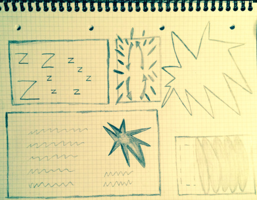
Day 1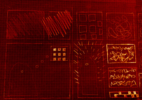
Day 2: Not as planned, never ending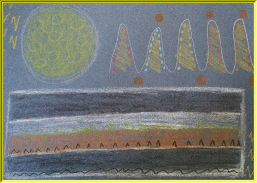
Day 3 - colour but flatlining on sofa with cold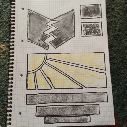
Day 4: a comic is the grid. Today no snafu :)
Day 5 Tears, snot and rain. Watery inside + out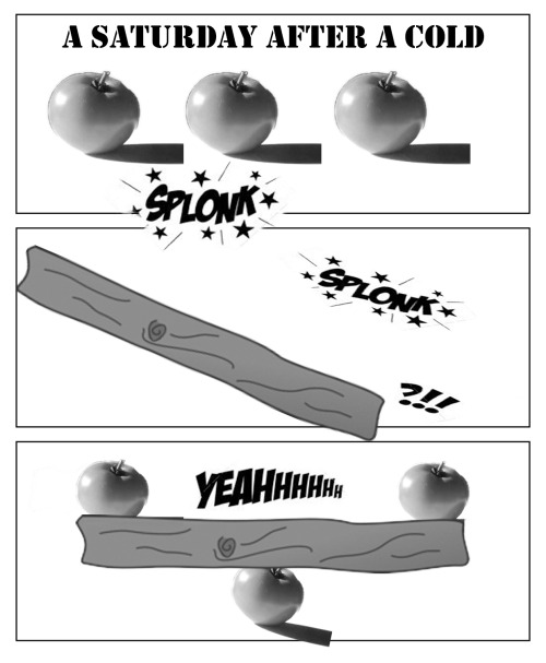
Day 6 - Working with digitalThis week I joined in with #gridsgestures (worth clicking on link to see all contributions) on Twitter. It was a comic making activity without drawing led by @Nsousanis who teaches comics as a way of thinking and uses this activity in his courses as a starting point to learn about time and space on the page.
This was timely for me as I am teaching myself to make comics following Comics: Art in relationship and Drawing Words, Writing Pictures. I have been struck by the idea the ‘time happens in the gutter’ in comics and also by the idea of challenging my imagination to ‘make the panels speak’. The task was to make a grid with marks on the paper that told of our day through the week. The photos above are my attempts, I tried different media to experiment with what might be my preference going forward.
My favourite and the one I got the best feedback was a simple pencil sketch. I think I have learnt how to start ‘to think comics’. Working with panels, text and words means great flexibility. One can let one’s mind create an idea, thumbnail this idea a few times as a kind of script, then production can be a quick sketch, digital, pastels or anything else one chooses. What is interesting to me is that the ‘work’ (for me at least) was in the thinking about the interplay of all elements in comics and how to express an idea on paper.
I think I now get abstract comics as a genre more. I also see what makes minimalist comics work. Look at the work of Shane Simmons, you do not need to learn to draw to produce them, but you do need scripting and an understanding of time in the gutter and how humans seek closure and make meaning, even out of dots! (click on his name to get more readable samples)
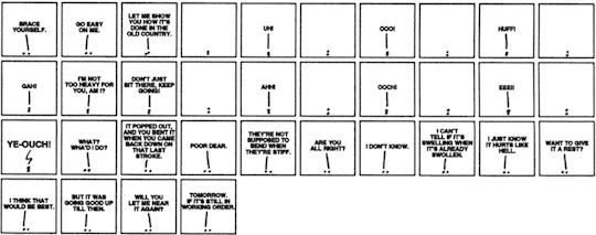
I am also starting to get the idea that what makes a comic funny is what is absent but implied as it makes the reader’s mind work to make sense. I have Matt Madden and Jessica Abel to thank for this as I practiced captioning a simple drawing that was not designed to be funny.
Also this week has shown me the importance of a title or some kind of context setting. I did this on the tweet for each day, but what was said mattered to make sense of the grid (look at the captions in each photograph and the last day has its title embedded - click on any image for gallery). Title or context is another element in relationship in a given comic. What Matt Silady suggests is the we avoid the kind of relationship between the elements where each element says the same thing. Redundancy in comics seems something less than desired. I guess it is because the reader has to do no work. It is all obvious and hence not funny. I see how some of my early digital attempts are just obvious and not funny.
This week was a great week to put together many ideas I have been learning on my courses. Thanks, Nick.
-
-
I think I got this.I think I just made a comic that demonstrates…
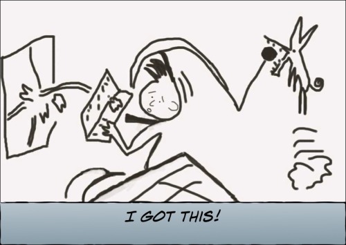
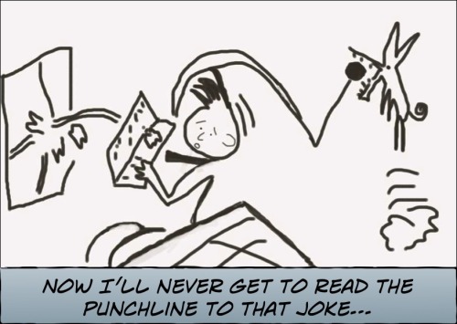
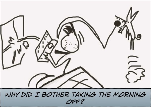
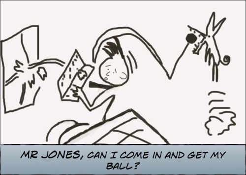
I think I got this.
I think I just made a comic that demonstrates an visual-text interdependent relationship only about 20 more to go. As I understand it, the image without the words is meh and the text without the drawing is WTF.
I am doing two courses on comics one a MOOC and the other a book. Blending it with: how the heck do I draw in Photoshop sprinkled with a face to face drawing class….and I am putting it all together in Comic Life.
-
Oh, my! This daily was just too much fun. My first Žižuku…
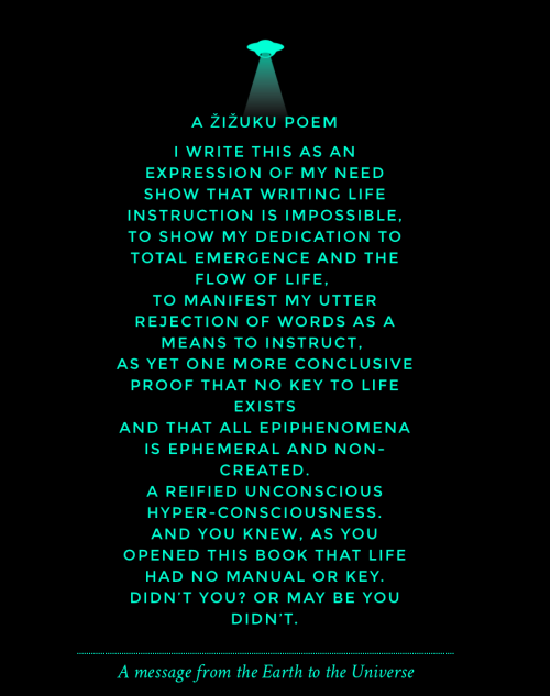
Oh, my! This daily was just too much fun.
My first Žižuku poem!
What is a Žižuku poem? You may well ask: “pick on any widely received idea and find the most clever-sounding way to invert it, so as to create a paradox, or at least the semblance of one.” The post is well worth a read though it may only amuse a few language or philosophy geeks.
Read on if you want to know how I did it.
I read the post and got hang of the rules of the game.
I took the subject of the Daily Create today and applied the rules to it using some of the content on the blog to help me get started. Then went to Notegraphy and looked for a template that was suitably tacky and ‘new agey’ - I wanted it to look as if the words actually meant something. Once I found the perfect template, Bob is your uncle!
Lastly, I just keep laughing as I read it. Humans make wonderful nonsense generators. Just give us an arbitrary rule and we are away!
-
An interesting Daily Create today.It talks about an old song…
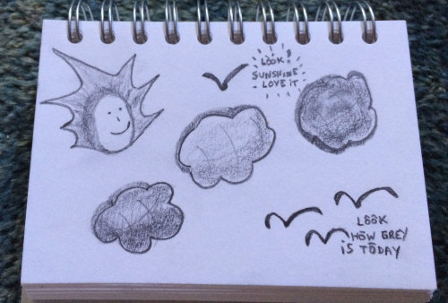
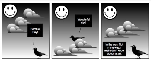
An interesting Daily Create today.
It talks about an old song that I knew as by Joni Mitchell though it turns out somebody called Judy Collins sang it first. Who knew?
As I listened to the song ( the Joni Mitchell version, of course) I doodled a cartoon in my sketchbook by hand. The simple idea being that you get to see both sides of the cloud if you change location (or attitude). Yet, if you take the point of view of the viewer you see that ‘truth’ lies in both sides rather than one or the other. Kind of like what the song is saying.
I then wanted to ‘improve’ on the idea and simple sketch. I went to Strip Generator and created a comic strip there. Same idea, still simple but tidier, more words and 3 frames. I was able to use a line from the song at the end frame which may be seen as more amusing.
Just reflecting on where the creativity lies. The idea? The execution? The quality of the output? I had great fun with my wee sketch, yet it is so basic and simple compared to the digital comic strip. All I had to do to produce it was copy image templates already available and type in some text in boxes already provided by the generator.
I really don’t know clouds at all.
-
Well, I had to Storify the wonderful Daily create for my…
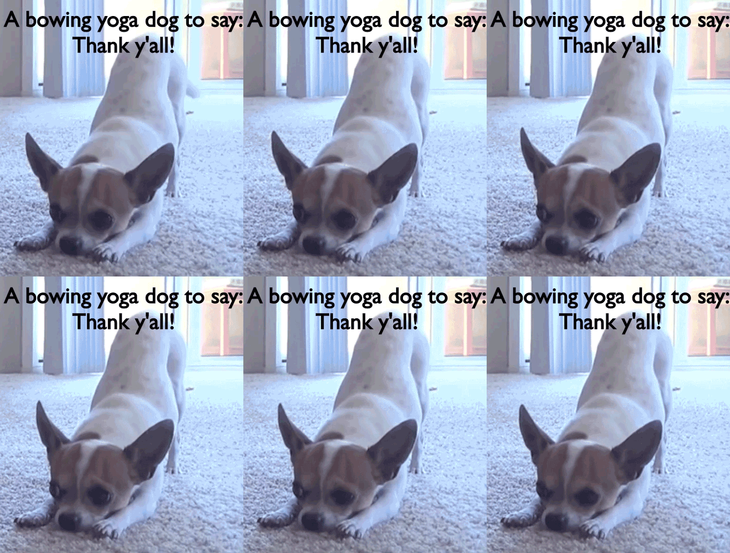
Well, I had to Storify the wonderful Daily create for my birthday.
-
So today the Daily Create hit 1500 daily prompts! A kind of a…
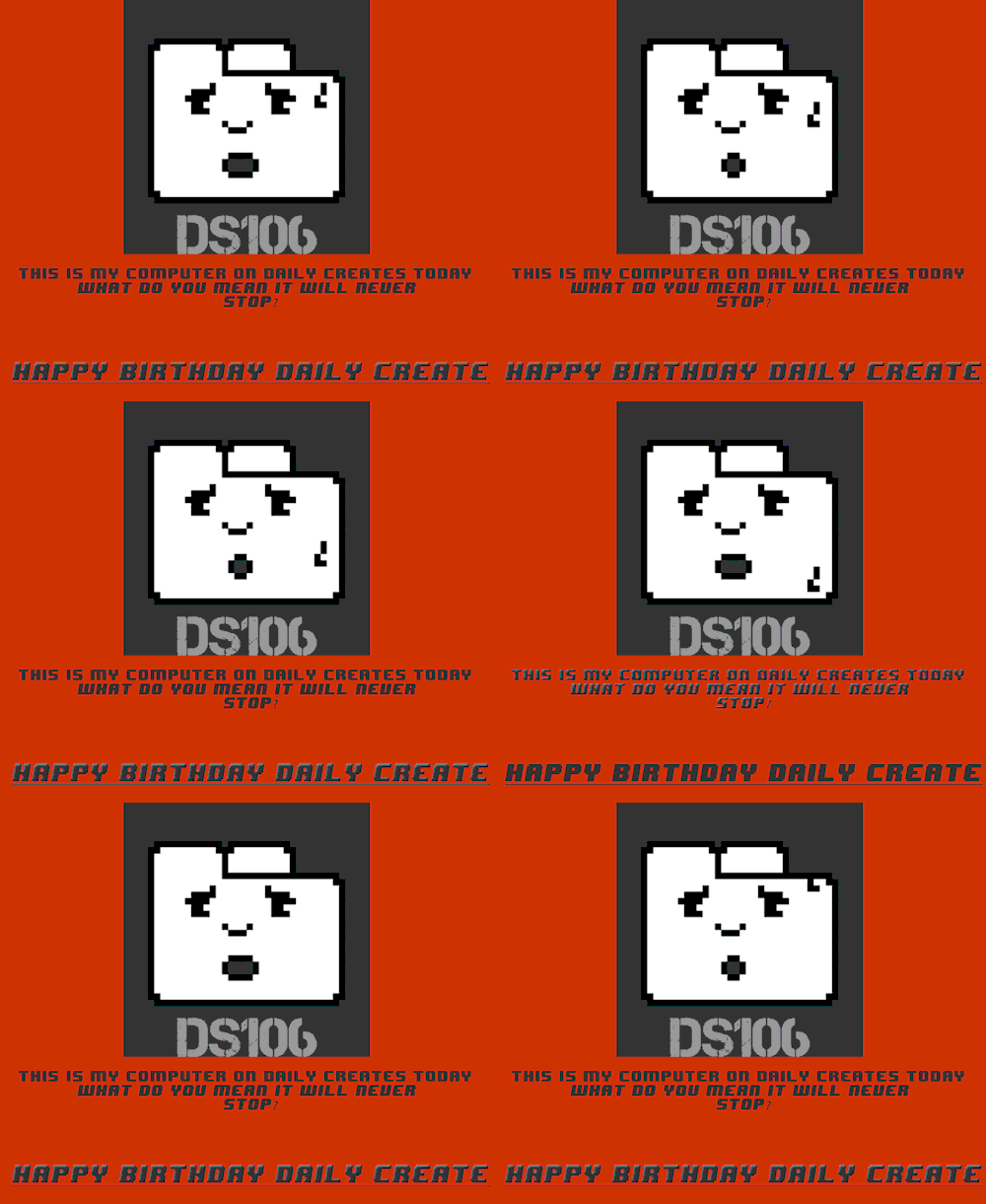
So today the Daily Create hit 1500 daily prompts! A kind of a birthday, no? I thought I would play a little more with pixel art, I did the other day and liked it. And it is right for today’s celebrations as well!

-
An open education conference I am attending in April asked us to…
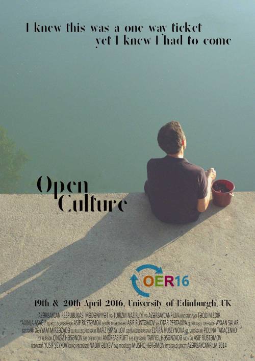
Poster 1 - A participant's view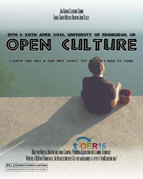
Poster 2 - Keynotes make conferencesAn open education conference I am attending in April asked us to create ‘a promo poster’ for it using our #ds106 digital skills. I am still uncertain as to what the brief is. I wonder if they want us to keep to their current theme of just make some fun posters. I went for fun posters! Others kept to the current theme - I hate that blue!
I wanted an image that spoke of ‘open culture’ as this is the theme of the conference - I spent a long time searching in Wikimedia and other spaces for public domain images that were free to use. Found one.
Poster 1
I also was not comfortable with highlighting keynote speakers as the ‘main event’ - for me the main event is about the whole community coming together to search their ideas and research. I wanted the poster to be about the perspective of a potential participant thinking about attending. The one way ticket idea, spoke to me in terms of how once you become an open online educator ‘there is not going back, it is a one way ticket’ - in one’s heart, at least. The tag line kept ringing in my head, it is probably lyrics to a song I heard long ago. The Delicate font I found recently and love the open and minimal nature of it, it seemed the obvious choice. As the poster was a non-english movie poster the credits are in a language other than English, I chose to leave that as it was as it highlighted the idea that conferences are not (or should not be?) about personalities but about egoless dialogue. The poster highlights the theme and the participant - that is all. The image give the sense of endless ocean, marking the potential of ‘open culture’ in education. I love the simplicity of this one.
Poster 2
I did the traditional thing and followed a template. The ‘movie’ has stars and they will pull the punters in. The stars at the top, the potential participant and his thoughts lower down in the image, with a smaller and fuzzier font. White highlight shows up the ‘stars’ that much more. I liked the PG rating - may not be suitable for children! This spoke to me about how we need to reflect on what it really means for our students to give informed consent to using open online education tools to learn. I really like how the OER16 logo hides behind the credits at the bottom.
I guess what really makes both posters is the wonderful public domain image. The language is Azerbaijani and the image is for a movie poster in Azerbaijan.
It has been a fun assignment, helped me reflect on how the narrative we chose to highlight in publicising conferences speaks to many of the norms that may need changing in the creation of an open culture in education.

