-
Well, I am now beginning to wonder about John. He does not seek escape. He gives little information...
-
Dear Village Committee,I keeping with my assignment at your…



Dear Village Committee,
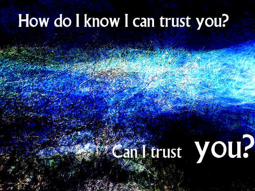
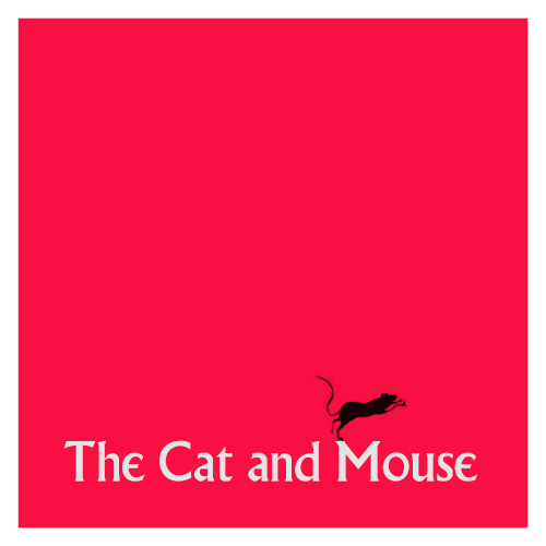
I keeping with my assignment at your village this summer. I have started investigating the signage around the village and recreating them in square format. There is a significant amount of research to indicate that square signs correlate positively with increased conformity.
I am consulting with our resident Dreamer by numbers, jjgifs, and he has offered the hypnotic blue backgrounds to this week’s quotes from the 3 dossiers you gave me to study in the Archives for this week. His research shows that this background colour and complex shapes supports this committee’s aim to keep all residents wondering ‘whose side are you on?’ in order to instigate uncertainty and enable our residents to give the committee the information they need. It appears these subliminal background messages work over time to increase compliance and extraversion. It is early days in this DS106 special assignment at the village and we hope that this work will evolve into kinetic typography with sound to enable even faster acquisition of information from residents. We are researching this process thoroughly and hope to offer a sophisticated technical innovation that will allow all residents to create their own compliance devices. Here is a prototype for your approval.
I hope that this week’s work meets with your approval and added to my viewing of the 17 dossiers that tell the full story of this village and it
prisonersresidents last week will suffice to be paid the Credit Units I need to continue my very important work at the hospital this summer s your resident psychiatrist.Be seeing you.
-
The Village Shrink in the news already?
@Prisoner106 the village shrink on the news! What Is that hospital up to? #prisoner106... -
Village here we come!
Over the next few weeks I will be on a special mission at Prisoner 106 Village. I have been hired as... -
Well, I have been told by the committee that once I resigned I…

Well, I have been told by the committee that once I resigned I need to produce…I spent the afternoon trying to turn this animated gif into my Twitter avatar for the start of DS106 Themed The prisoner. All the workarounds I tried failed. APIs that promised to do it did not, brute force ( just change the extension and upload) did not work. I am swimming like the blazes to get away from the village, production here is hard. Where is the beach? And what does the new Photoshop mean with Save For Web (Legacy)? All the other new options don’t seem to have preview or allow me to play with colours. WE WANT INFORMATION! Update: if this Save for Web glitch matters to you. Complain!
-
Gearing up for a busy summer of DS106 I decided to turn today’s…
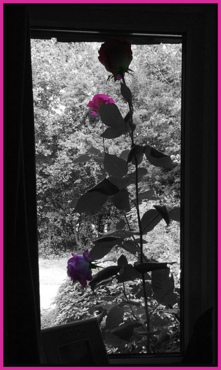
Gearing up for a busy summer of DS106 I decided to turn today’s daily create into my first proper assignment. It is called Splash the colour and I had a little help from the lovely Jack Hylan to get it done. He made a tutorial to make it easy and enjoyable.
The prompt for the daily create asked us ‘see beyond the buildings’. I looked out of my office window to see the beautiful roses outside. I wondered if I could take a photo from the inside that would show the window (building) and focus on what was beyond it (the flower). I did that.
Then I wondered if I could make one of those photos where everything is black and white and only a splash of colour. I used to have a cheap camera that did that automatically, I still miss that camera.
Then I remembered Jack and his towel. All I did was follow his tutorial exactly and then add my tacky pink frame, I could not help it. I wanted the pink to highlight the roses.
Well, that is me dusting the blog up for this DS106 summer!
-
-
Wrote an article about online pedagogy on Medium and made this…
Wrote an article about online pedagogy on Medium and made this video to highlight the importance of relationship in teaching online or offline. This is the DS106 version with spooky music added. I played with video actions on ScreenFlow to get the effects. Fun! And I made an infinite loop with it too because I can.
-
I am not feeling like work today, so I made time for the daily…
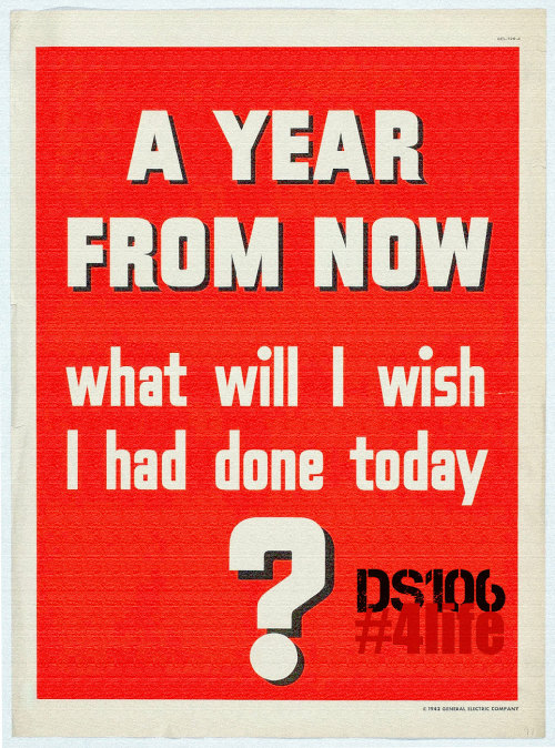
I am not feeling like work today, so I made time for the daily create. Spent a long time looking for images and was shocked at how many sites are charging big bucks for images that are as old as time. And they site I did use to find this lovely poster to edit ‘cannot guarantee this is a public domain poster’. As it is a 1942 poster, I will took a wild risk and used it. We really need to sort out copyright law people. I also reflected on how I struggle to do ‘easy’. I thought the poster looked just right with minimal changes. The Daily Create today asked us to do a poster to elect a class president. I decided the only president should be DS106 #4life. So there we have it. A few layers and blending in Photoshop and it was cooked.
-
Koinonia in DS106
<before I get going here, I hate the new editor. Tumblr sort it> So we were chatting at the... -
-
Talky Tina laid down the challenge and I have been wanting to…
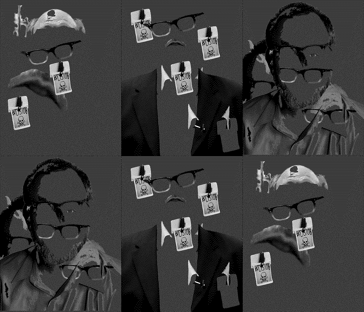
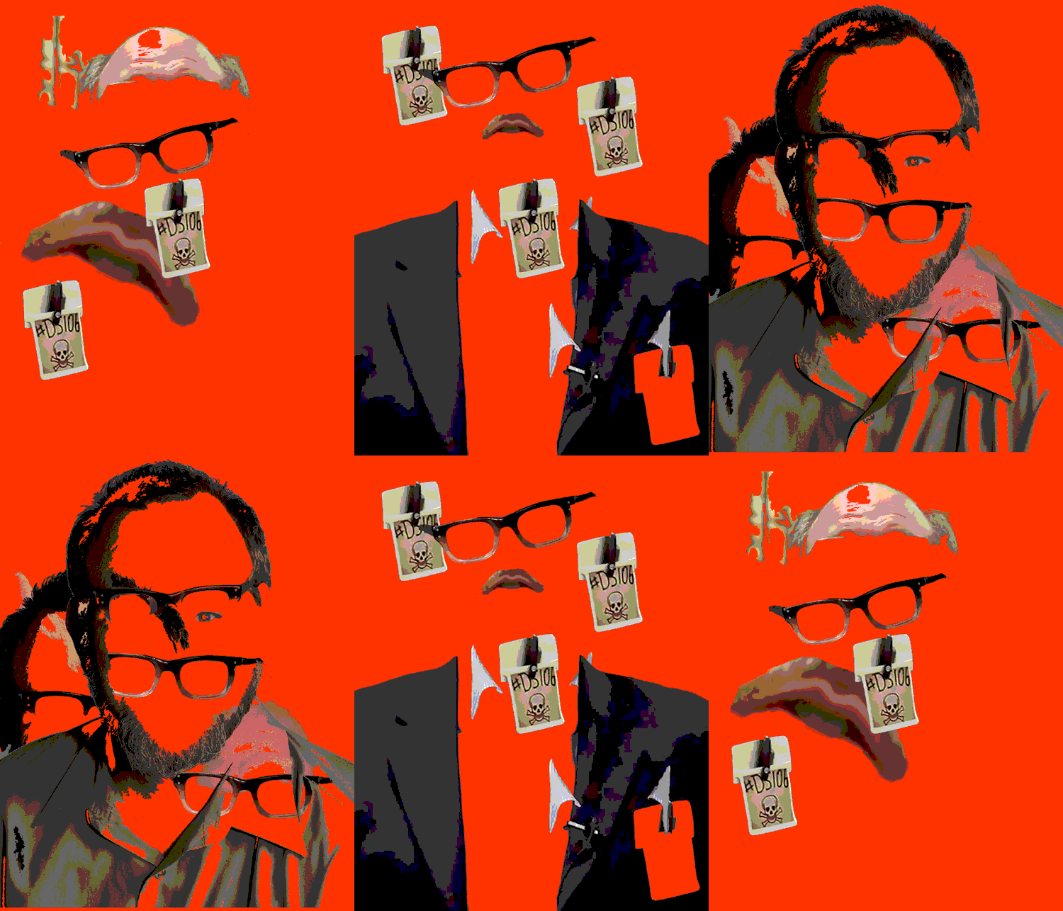
Talky Tina laid down the challenge and I have been wanting to try another gif the portrait for a while. So I looked for high resolution portraits of our jimgroom on the google, as Tina suggested. Then got to work as per Ryan Seslow’s excellent tutoring on this lovely way of making gifs last semester in CT101. I think that there is the ghost of another in this gif though….
-
Another great example of DS106 CollaborationWe started with an…
Another great example of DS106 Collaboration
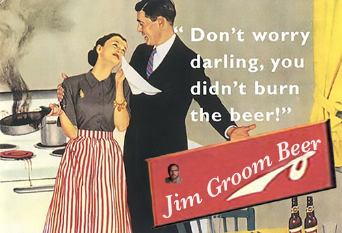
We started with an old beer commercial found by Karen Young. I decided to turn it into a DS106 themed commercial and wrote the script. Jim Groom kindly recorded his lines and emailed them to me. So did Karen with added burning dinner sound effect. The Headless Inkspots provided the music. I edited it all together, adapted the poster and bingo! We premiered the commercial as a trailer to ‘Noir on the Couch: An interview on the Femme Fatale in Film Noir with Prof. Young’ on the DS106 Good Spell tonight. This segment is part of a whole show ‘The Fabulous Femme Fatale’ to be premiered soon on DS106radio and sponsored by Rockylou Radio. Date to be announced.
-
-
An example of collaborationSo I became obsessed with friction…
An example of collaboration
So I became obsessed with friction matches in Noir and wrote about that a while back.
I created a script based on something I heard on Double Indemnity and made a video commercial. I was not happy with the voices as I did them myself and then changed them in Garageband. As we were working on a collaborative radio show for Noir106, I decided to turn it into a radio commercial and asked for help from the community.
This is the kind of thing that makes the open web so special. I asked dogtrax for help and he did the most awesome voiceover. I asked Karen Young (@karenatsharon) for help and she did the greatest femme fatale voice ever. With such great voices and script, I had to find some awesome music and who better than The Headless Inkspots to provide original noir inspired music? DS106 is pretty lucky to have them as part of our community.
In sum? I think this is the best commercial ever, and it shows how a simple idea can turn into something special as different people bring their gifts to it. Thank you all, and roll on the Fabulous Femmes Fatales Show on Rockylou Radio this March with the irrepressible Ms Talky Tina in a starring role as Daphne de Beauvoir.
Stop press: Ms Talky Tina in conflict with Rockylou Radio Productions. Read all about it!
-
Paul Miller disconnected from the Internet for a year. At the…
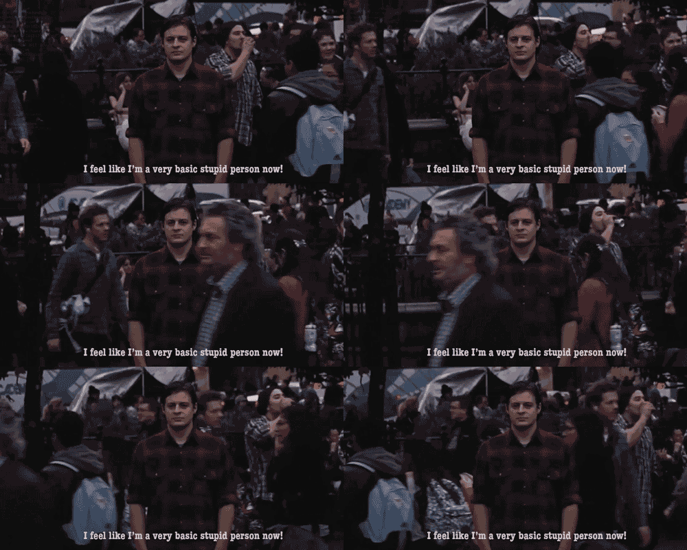
Paul Miller disconnected from the Internet for a year. At the end of that year, this is how he says he felt. Discuss.
Animated Gif by gifadog from original film footage by In Limbo TV. See better version on Gfycat
-
Well, DS106 made me do it…again.We have been watching noir…
Well, DS106 made me do it…again.
We have been watching noir films and forgive this quirky mind but it got distracted with these matches all the flawed heroes in the films have. What were they? I had never seen them. No box. Just the match and it lights up. I asked on Twitter but nobody cared about noir matches ( I wonder why…) I started to think about a commercial for these matches. First I needed to do some research. (Have I lost all my friends, yet?)

So they are called friction matches, but the famous brand is Strike Anywhere Matches. And yes, there are other eccentrics out and there is a web site with the history of matches.
Then there was the matter of the script. I remembered one line from Double Indemnity that started my current obsession ‘They always explode in my pockets’. I looked at various scripts and then decided to adapt the Double Indemnity dialogue:
I bit off the end of my cigar and put the cigar into
my mouth. started tapping my pockets for a match,
as usual I can’t find one.
I hear some smart alec in the distance:
They give you matches when they sell
you cigars, you know. All you have to
do is ask for them.
Heck, I know I say. I don’t like them. They always explode
in my pockets.
In truth I just don’t know how to light them.
Strike anywhere matches. Extra Thick for longer burn time
….but you need to know how to light them.And yes, somebody has uploaded to You Tube instructions for how to light Strike Anywhere Matches. This is what I like most on the web, I can always find someone who seems more eccentric than I am! So, we download that via Clip Converter. Then pop it into MPEG Streamclip to remove the audio and trim it.
New iMovie is pretty cool. But before that, GarageBand to the rescue to change my voice and record the script. It does female to male, deep and soulful, but there was no femme fatale…
Then, audio and video into iMovie, via an image of the matches. And yes, I think I need to get a life. I had such fun though. I plan to record this for our Radio show as a radio commercial but I am going to ask for help with the voices - Dogtrax does a mean noir hero voice, I need to get my femme fatale though. Any nominations? She just needs to record the last two lines.
Learnt about matches, about how you can find any script movie online, learnt a few more tricks in iMovie. Getting the style right is interesting: black and white not enough, you need high contrast. The transitions matter, I remembered seeing the circle open/close transition in some noir films. Used that. And others details I will bore you no further with.
…and I still laugh when I watch it. Never underestimate the value of a daily smile!
-
Driving the Daily Create Bus
I have not written one of my long reflective posts for a while. I have enjoyed just making stuff... -
-
My first creative edit for #noir106. It is tough to work in…
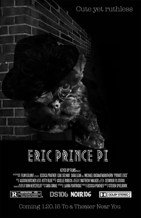
My first creative edit for #noir106. It is tough to work in black and white! Original poster by Jessica Parker, new DS106 logo by Martha Burtis, I think. And adorable puppy is Eric. Tried mixing Metropolis and Typewriter fonts to see how they blended. Enough.
-
three seasons. (final story)
three seasons. (final story): long ago, long before any of us were alive or thinking or walking or... -
Here is the HD at Gfycat worth a look! So, I am starting to…
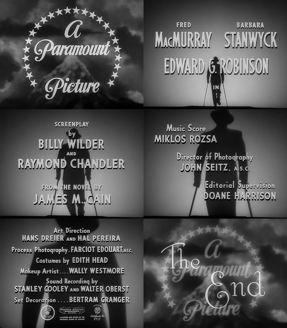
Here is the HD at Gfycat worth a look!
So, I am starting to explore Cine Noir for this run of DS106. At the risk of being burnt at the stake, I am not interested in watching the films! Yet, I love the style of them and the way in which ‘the sets and atmosphere reflect the characters inner turmoil’ or so I read in my overview google dive last night. I also love the typography and how it uses the form to express the emotional tone of the story. It is surprisingly difficult to find out detail about the original types. I have found two fonts that I want to play with: Metropolis and Stroke. It looks like Typewriter can also be used. So how do you get the ‘noir feel’ to an animated gif? Best way to see that was to make one from one of the most famous film Noir I know! Use of light, high contrast and that closed in vignette around the image. I noticed also that everything seems sharp and clean - clothes, posters, people and typography. I like that. How the figure gets closer and closer….scary!
I know nothing about Cine Noir. I now something about Tech Noir as most of my favourite films are about dystopian futures.
There is a lot to learn and, heads up, creative edits of Cine Noir posters will be a pig of a job to do!
The how of this gif will have to wait for now. The joy of being an open participant, no deadlines!
-
This one was too hard for gifadog! It needed cutting up and…
This one was too hard for gifadog! It needed cutting up and glueing and his little paws can only use a mouse so far, so the Shrink had to step in and help. I am pretty proud of this one, it feels like (dare I say it?) I actually made some art, damn... -
It had to be done. I am so sorry. It started with a DS106 daily…
It had to be done. I am so sorry.
It started with a DS106 daily create, of course. I then saw this precious little gem from Kathy Onarheim which reminded me of Brian Bennett’s excellent 'Roll it Baby!” and then I remembered 'The most boring mash up ever'.
The scene was set. The most boring plumbing commercial ever had to be remixed. I have been giggling for the last hour whilst making it, worth the smile I reckon.
-
Happy holidays everyone. The DS106 Shrink is back on January…
Happy holidays everyone. The DS106 Shrink is back on January 6th. -
Gifadog and I are trying to learn how to restore old classic…

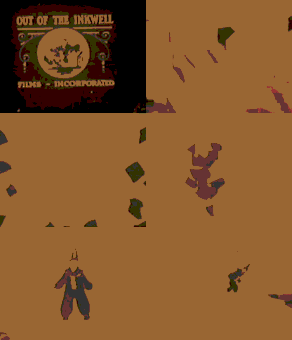

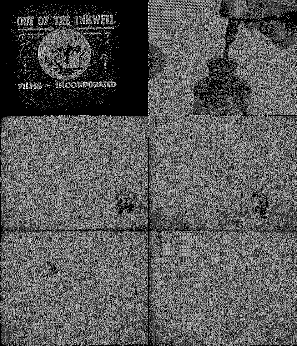
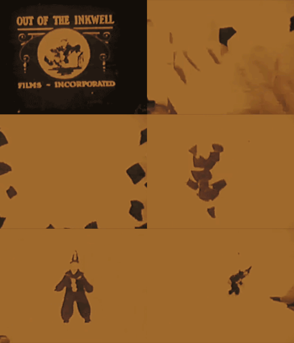
Gifadog and I are trying to learn how to restore old classic cartoons.
It is hard! I asked the Interwebz for help and bionicteaching helped with a Photoshop Tutorial and advise that it is slow work. It seems that my dream to find a way to clean up a whole video is now about learning to clean video frame by frame. stefaniesophie suggested learning painting technique. As I understand this, it is to learn the nature and type of different types of painting to enable you to restore old frames accurately.
So I turned to the animated gif for help. I took an original classic cartoon from the public domain, edited in a movie editor to get only the scenes that I wanted to improve and then started to make animated gifs of the frames and clean them up.
There are an incredible number of parameters that can be adjusted in post processing with Photoshop and Premiere Pro. I have little idea of where to start. Above are our early attempts. I must admit to feeling a little like the proverbial dog with too many balls.
-
Feel the fear and do it anyway?
Null This week’s reflections hinge around our fears about publishing our work online. I know quite a bit about that. It is about that pesky 2 year old who refuses to give up his toy. Here are the questions we are being asked to reflect on this week: “Is there work you felt you shouldn’t put … Continue reading → -
-
This was fun! Daily create today asked for a shoefie for Howard…


This was fun!
Daily create today asked for a shoefie for Howard and I decided to do it.
Yesterday’s daily create prompted us to reflect on 'the one that got away' and I struggled with the prompt for all sorts of reasons.
Today I put the two creates together.
A few years ago, when I was too old (according to whom?) to buy pink Timberlands, I bought a pair. I loved these shoes so much, but I rarely wore them. I was worried that people would think I was just ‘too old’ to wear such shoes.
They stayed in their box for a long time. One day a friend was searching for a pair of shoes for his daughter and we happened to be the same size. I gave them away.
I still miss them.
So my pink Timberlands are the ones that got away and also my ‘shoefie’ for today. I wanted to add a flavour of the ‘worst possible taste’ which we also had on the Daily Create this week with our worst album covers remixes. I searched for the ugliest frame I could find to add to my creation. Voila! 3 Daily Creates in 1:
"The worst ‘shoefie’ of the pair that got away"
For howardrheingold
-
rockylou22: Rainbow Flower Power – take 3 for GIFFight and Gif…
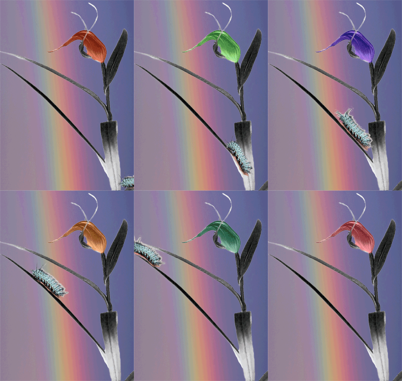
Rainbow Flower Power - take 3 for GIFFight and Gif it Up
Flower source image from the Museum of New Zealand
Background image “Rainbow” by Evan Leeson by-nc-sa 2.0 https://flic.kr/p/eovqWK
“radioactive” turquoise caterpillar GIF (CC-By-SA) courtesy of Alan Levine (@cogdog)
Art on the couch critique
What strikes me on first seeing this lovely gif are the changing colours of the flower which pick up the background rainbow colours. The lines of the rainbow flow in the same upward direction as the flower and complement it. I notice the colours as they seem other-worldly and contrast strongly with the neutral flower stem and leaves. The rainbow adds depth to the composition. As your eye is drawn to the changing colours in the flower and the rainbow, the caterpillar surprises you and appears to create balance. A 3-way attention point: Rainbow, flower, caterpillar against the neutral stem. The fine threads in grey around the flower add contrast in stillness as the flower inside bursts with life.
The movement of the caterpillar seems important and adds realism to an otherwise ethereal composition. What gives it the ethereal quality may be that the colours chosen by the artist do not exist in nature. We recognise a flower and a caterpillar yet the colours do not belong. It seems as if the natural elements put a barrier up for the viewer, we cannot reach the end of the rainbow. This effect is added to by the blurry nature of the rainbow. Then there is the creation of depth by the caterpillar appearing in the corner and seeming to go ‘into’ the picture nearest to the viewer. This makes it seem like the flower is behind the caterpillar and this in turn adds to the sense of the rainbow being unreachable.
Given the title one assumes the choice of colour was intended to give the composition a pop-art style. The flower is out of any context, there are no frames to locate the work, adding to its detached feel. I imagine it as a flower that would belong in a biosphere 2 experiment of the future or a science fiction movie. My alternative title: ‘Life thrives anywhere’.

