
Three Star Assignment
Process
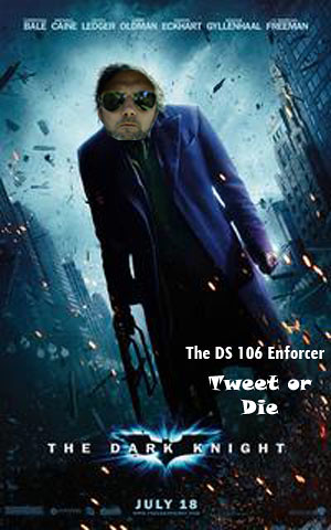
Okay by far this is the hardest and most difficult project I tried to do. I know this picture is not impressive at all but I did try my best to figure it out. The first difficulty I had with this project was finding a suitable picture of our professor Jim Groome. The shades picture was the only suitable candidate but even with skew and scaling the picture down it still didn’t seem to fit the picture right. I then used What the font to find the font used in the picture. For some reason I could not figure it out, it always gave me fonts that did not match my picture. After trial and error I found a similar font as the one used in the bottom of the picture. Even then I could not figure out a way to remove The Dark Knight without messing up the picture. I then decided to just put in the corner what I intended to more artfully craft into the picture.
Any advice anyone? How do I use whatthefont? How should I have incorporated Groomes face into the jokers face better?
Motivation
Now that I have explained the difficulties I had with this assignment I can hopefully articulate my intent. I basically tried to put Groomes face onto the Jokers face to imitate how serious our professor takes our course. I specifically wanted to mention something about the serious lack of tweeting and jamming of some of our students. Groome will come after people like us if we don’t taking serious the motto: ds106 for life.

Add a comment