
COLOR
All colors effect people differently. It can cause different moods whether it be cheerful, sad, warm, cold, lonely and so on. Most everyone has a favorite color(S) that they prefer in their lives compared to other colors. In Design it is important to use specific colors in order to reach out to the set audience in which the design is intended for. This can be a challenge and consists of “trial and error” however it just needs to be done. Color can be played with through HUE and SATURATION, filters, bright and contrast… so on. Colors that work together, that make a statement, are colors that compliment each other. Such as orange and blue, purple and yellow, black and anything. Pastels usually (at least for me) make me feel fuzzy and warm inside. It reminds me of warmth and frolicking in green meadows. This is because pastels are soft and typically warmer colors such as pinks, greens, reds, oranges.. you get the point. Saturated Colors make statements, it makes me pay attention to the design, what is the design trying to say, why does it want my attention so badly? These are stronger colors that are trying to make a statement on whatever it may be.
Here are some examples of COLORSthat I came up with… enjoy ![]()
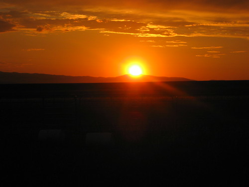
Sunset…paradise © by katherinekd101
Captured the sunset while I was in a meadow in Ohio (I love meadows?) I thought it was stunning and great use extremely dark to extremely bold colors THIS IS NOT PHOTOSHOPPED. Nature can have its moments of being naturally beautiful.
Flickr: http://www.flickr.com/photos/79114434@N05/7376548122/in/photostream
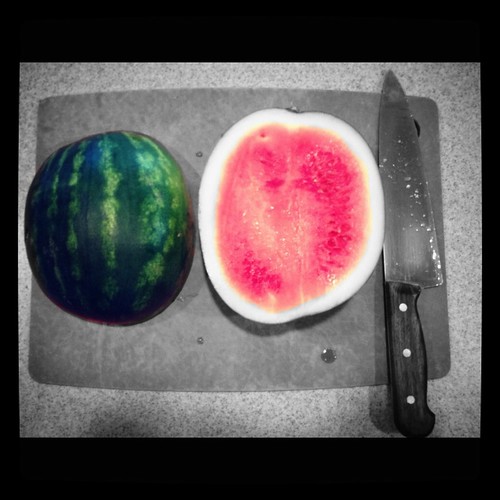
Color Splash © by katherinekd101
I used an app called “Color Splash” Its only $1 dollar I believe on an IPHONE and is very fun and worth it. The original image is on FLICKR:
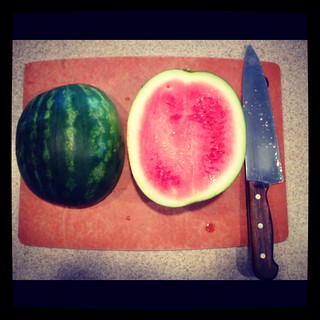
http://www.flickr.com/photos/79114434@N05/7376552956/in/photostream (colorsplashed)
I thought green and pink made a very interesting comparison and its a natural compliment of color that mother nature has provided us. ALSO we are doing a week about design, watermelons have designs on the exterior and interior. ![]()
TYPOGRAPHY
First off I will just say, never I have I taken in for account that this was a form of design (which is beyond obvious now, you learn something new everyday.) From this week I learned that there are types of typography to NEVER use and what catches the attention. This is used in design again like color to catch a certain audience. A design would never have “comic book font” if it was trying to do business. Every detail matters in design. The size, color, font, and placement of letters all matter in design and it really matters on what its layered with in an image and what the design is trying to convoy. For example a design trying to catch the attention would use bold fonts, colors, and most likely have the typography in the middle of the design. It would certainly not be a bland color in a corner with tiny font.
I ride the metro to work every Tuesday and Thursday and realized how much Typography is used just at the local metro.
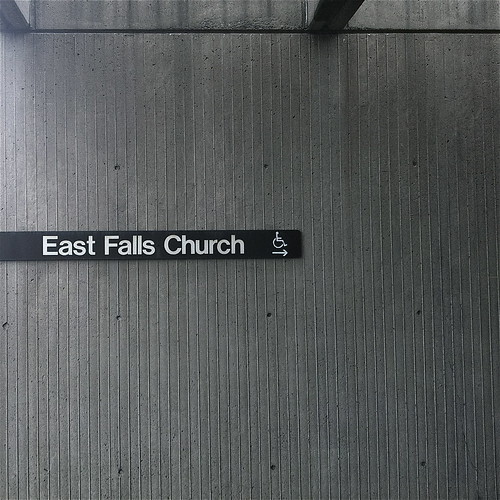
Metro ride or die © by katherinekd101
The metro can be used by anyone, but it is simple and to the point because it is a company trying to be as efficient as possible. They want to be helpful and not too distracting. I Photoshopped this image to black and white, boosting the contrast to give it a more “serious” tone. I did this because I wanted to portray to the class how I view the metro… its meant for work and honestly no fun at all to ride. If I could ride my bike to work I would.. trust me.
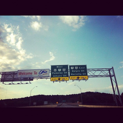
Ohio Border © by katherinekd101
I took this photo on my way to moms graduation from Ohio University (number one party school in the USA) They used different types of fonts for two different reasons. I believe the “Welcome to Ohio” sign is supposed to make the sate seem warm and friendly because they use blue (my favorite color, how did they know!) and it catches the attention of having two different fonts and colors clashing with each other. Back to the color portion of this blog post, red and blue simply do not go well together… this can be a matter of opinion but it just typically doesn’t work. The direction signs are all the same around the United States. Its repetition to help people remember what this sign is for.
METAPHORS/SYMBOLS
These designs are usually found in an ad for something “humane”, ”save the world”, “make girls feel better about themselves” and so on. Metaphors and symbols make people use their natural computers to think and ponder upon what does this mean. The most simple images and words can be used for metaphors and symbols. They are supposed to provoke emotion and be relatable. People like to feel emotions and be in touch with them (most of the time) a metaphor or symbol is one of the best ways to do that.
My Grandfather whom I was extremely close with, died a few years back. Not a day has gone by where I haven’t thought of him. I recently visited his grave in Virginia beach. He was your average American. He fought in WWII and the Vietnam War. Married a Japanese women and settled down after the army. He was a sweet man but something remarkable about him was the way he told stories. To this day he is the best story teller I have met. He could grab the attention of anyone when he began to speak. His voice was quiet but his words were powerful. He himself was a symbol of storytelling.
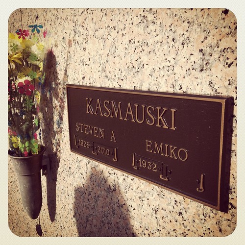
Forever Loved. © by katherinekd101
With death, comes birth. My next image is a birthday cake that I made today. I thought for Metaphors and Symbols it was appropriate to use a compliment of death which is life.
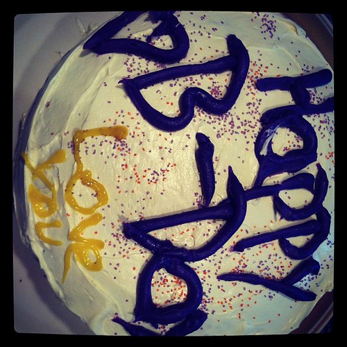
Birthdays © by katherinekd101
The last image (not to get ever deeper about life) is am image of truck that wastes gas by the minutes and a Prius which is goal is trying to be gasoline efficient. We had both parked in my drive way. It seemed ironic, weird, and interesting.
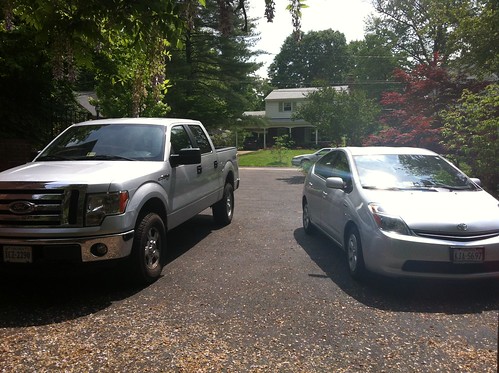
IMG_1113 © by katherinekd101
FORMS/FUNCTIONS/MESSAGE
What is shown in the Google examples is (in my opinion) only a limited amount of forms, functions, message. I used an image that depicts a function, however ALL ads and design are meant to serve as a type of form, function, or message or else there would simply be no point. Typically a form or function is used to make life for us humans easier. It can be a airplane getting us to point a to b, or an ipod, remote control, or an oven (more functions do exist) but they all are used to help us humans live on this earth and be more fluid with our lives.
I took a snapshot of a pizza oven from PAPA JOHNS, my friend works there and luckily gave me the background tour.
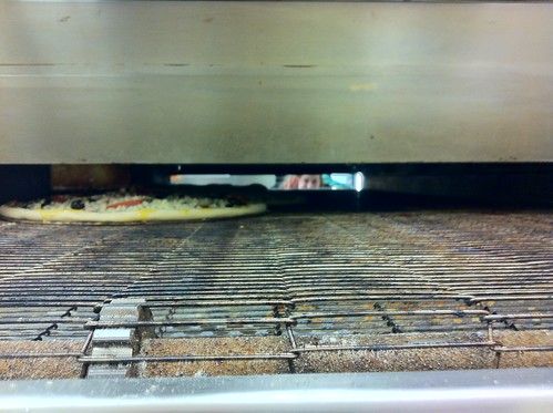
Making pizza! © by katherinekd101
If you look closely you can see my friend peeking in from the other side!
MINIMALISM/USE OF SPACE
Less is more! This is not the case for everything, but it can be effective in some designs. Minimalism is clean cut and gets to the point. An example would be my photograph of the “metro sign” I used earlier. Words, or a singular image can be used in design to create a contained use of space or something minimal. Elegant designs (to me, this is all opinion, there is no right answer) is how graphics and text are displayed. Something clean with maybe usage of 1 or 2 colors nothing snazzy with pictures, definitely less is more makes elegance.
The photograph I took is in no means elegant but its simple and fun. I had a green laser pointer and had the lights off making fun designs on the ceiling. I made a cursive like “A” and thought voila! This is perfect for my DS106 class:).
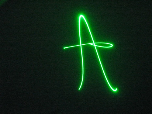
Laser Pointer © by katherinekd101
RHYTHM
Is generally used in design to distinguish a pattern or texture. This doesn’t need to be used for every design but it looks nice and can be fun to find rhythm in globally or locally. Rhythm can be synthetically made or found naturally. (Then again so can most things these days) Its a repetition used for people to remember the design that is presented in front of them.
My father works for National Geographic and recently an issue of Dogs came out. They have, in his office, I huge wall of the different cover choices for that particular issue. I went into his office one day and wanted to see this mysterious wall that people slave away for days/weeks/month to find the perfect cover. My dog “Leo” the blond Buhound with the mischievous smile is front and center (kind of). This is a repetition of different patterns.
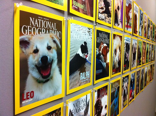
IMG_0488 © by katherinekd101
What a mouthful, I hope I didn’t lose any of you in this long blog, that I hope at least someone besides myself and parents found interesting! This week has been extremely fun, and I enjoyed writing my blog(s) about design. I wish we could continue on with the rest of the course learning about design, but I’m sure it will only get better from here!

Add a comment