
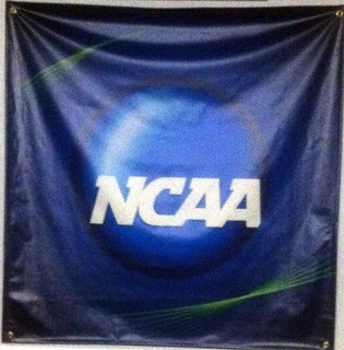
Dominance
This poster really highlights the design element of dominance. Dominance is defined simply as the first place one’s eye looks when you see something. It’s the dominant part of the design, it captures your attention, your interest.
This is a really effective use of dominance in this NCAA poster because of several factors. Your eye immediately goes to the NCAA type because it’s white, which is opposite of the mainly blue background. So immediately the color jumps out at you and to maintain your eye in that area, there is a big circle right behind the NCAA type. This forces you to only look at the NCAA type, which is the most dominant object in the poster.
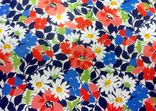
Balance
Balance is the “state of equalized tension” in anything around you. There are two main types of balance: symmetrical and assymetrical. Symmetrical balance is formal, classified, and is visually equivalent throughout the piece. Asymmetrical balance is more informal and modern with a variety of shapes, sizes, colors that attract viewers.
This is my Vera Bradley laptop cover and it is a great example of symmetrical balance. Although it uses several different colors, shapes, and sizes, it remains a very formal design because it’s very repetitive. It has big pink flowers as the biggest element in the piece but balances that with very small pink flowers mixed throughout along with medium white and blue flowers.
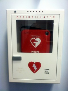
Color
Color is a very important element of design because it can be manipulated in all kinds of different ways. You can use lots of color, bold color, no color, minimal color, etc. to portray various messages and get your point across to the viewer. Color can also help to establish mood and instill in the viewer a certain emotion that may cause them to make a change or take action or consider something new.
In my first example of color, I’ve taken a picture of a Defribrillator in the University Tennis Center. This object has two main colors: red and white. The red is the dominant color because it’s very bright and bold. The designer was very clever because the color red can also be attributed to the heart and therefore anyone seeing this machine knows it has to do with the heart, and also because there is a heart with a lightning rod through it. This was a very effective design because it got it’s point across very clearly to the viewer in a very simple, yet specific way.
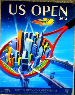
The next picture I took has many more colors than the last picture of the defribrillator. This is a poster for the 2012 US Open. Color in design also can be based upon monochromatic colors, analogous colors, complimentary colors, etc. In this picture, the designer utilized the contrast of warm colors (red, orange, yellow) versus cool colors (green, blue, purple) to concentrate the viewer’s eye on certain aspects of the poster. The tennis racket is in a bold red color which makes you bring your eye to the center of the racket. The center features both warm and cool colors placed directly next to each other. This enables the viewer’s eye to float in and out of different parts of the center and view all of the aspects. The overall blue surrounding contributes to how sharply the red contrasts against it and really forces the viewer to look at exactly what the designer wanted them to look it and was very effective.
Rhythm
To me, when I picture what rhythm is, I picture flowing music and palm trees swaying in the breeze. But it’s a little different in design elements. Rhythm can be portrayed through repetition, which is the repeated patterns that flow together to create unity.
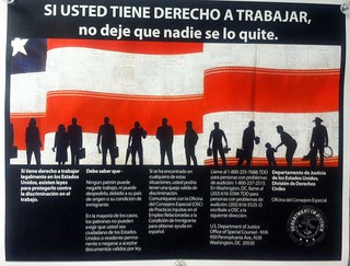
In this picture that I took, repetition is very strong and therefore rhythm is very clearly established. The flow and interruption of the flag into three parts creates visual flow and allows the viewer’s eyes to float from the left of the poster all the way to the right. The shadowed figures in front of the flag also help to create flow and rhythm and the repetition of the figures, because there are so many of them that stretch across the poster, this allow forces the viewer to see all of it in one swoop. This visual rhythm also helps to create verbal rhythm for the viewer. So as the visual repetition of the figures and the flag goes from left to right, so do the words, and therefore the reader can easily read the words. This picture is an extremely effective use of rhythm, repetition, and unity because of all the aspects of this poster work together to easily get the point across to its viewer.

Add a comment