
Monday’s DC – Take a photo of someone that is nice and cozy in a blanket.
Don’t judge.

I was on my way to class when my dog Lexi was all bundled up on my couch looking like a snuggle pup! I know the daily create says “someone”, but we treat my dog like a person so I thought it would be fine :) The red couch could be an example of the design element color because red conveys the emotion love. And I love my dog. And I would have loved if that day I could have been her.
Tuesday’s DC – If you could be any pastry in the world, which would you be?
We had to write I narrative about what pastry we would be and why we would be the best in the world. I went for creative.
If I could be any pastry in the world, I would be a glazed apple danish pastry. I would be the best, sweetest glazed apple danish the world has EVER seen. Doughnuts would be glazin’ at me, wishing they could date me. And dates would be so dry after they drooled as I shuffled by. All the other sweets would see how I am so “full of it”. However, humans would enjoy that about me. I would go so well with the best cup of coffee in the world. I would eventually rule the world. Wouldn’t that be sweet?
Thursday’s DC – Represent your fondest memory photo in a nostalgic way.

This picture was taken when I went to Aruba this past Summer. I loved it. It was beautiful! The weather is so nice there because it’s hot but always windy so the heat is bearable. I uploaded the picture to my InstaEditor app and made it blurry. Almost like it is a blur in my dreams. I actually like the soft blur in this picture and I didn’t think I would. This picture has some design elements: color, balance {kind of, the two palm trees}, and proportion {establishes depth, close palm tree and distant palm tree}.
Friday’s DC – Add a caption to a photo that makes it opposite from what it looks like it means.
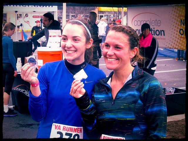
Caption = Failure.
This picture was taken right after I finished my first half marathon {13.1 miles!}. This is anything but a failure. It actually kind of hurt me writing the caption as failure when I was uploading it. I just kept telling myself that “it’s just an assignment”! This picture is a bad example of the design elements minimalism and dominance. It would have been great if there was no clutter/people in the background. But: a) you can’t get picky at these races. b) I wasn’t feeling like moving around until I found the best background. and c) this picture was last December, before I started this class. Obviously I have already learned so much! :)

Add a comment