
Yes. The title of this blog post is supposed to be said {or hummed, which ever you prefer} in the way you would Surfin’ Safari by The Beach Boys.
Because this week was design week in digital storytelling, it was important that my first task was the design safari. My first stop on the safari was the design elements Google doc, which was so helpful for me because at first, I didn’t even know what “design” really meant. This website gave me a good starting point on the elements of design. I also looked at tons of examples that were posted by previous DSers in the Google doc.
The other stops on the safari were spaced out through the week. Capturing all of the design elements just could not be done in a one day tour. Needless to say, I had to fill up my safari jeep a couple of times. Gas sure is expensive when you’re driving this thing:

Now that the design safari is over, I can explain each design characteristic that I spotted throughout the tour {my analysis of it, the effectiveness, and my example pictures}
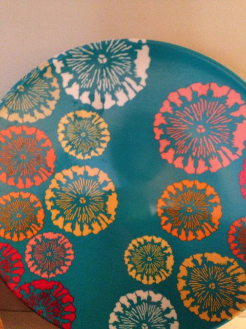
Color.
The colors in a picture evoke different emotions from us. For example, when we look at a sunset, we probably feel more warm inside than when looking at a picture of a blizzard. This is because of the warm colors in the sunset. I think this is very effective, if not the most effective, out of all the design elements because it is the most powerful. Each color is known to evoke a different emotion. Red = love, black = mourning, purple = fantasy, etc.
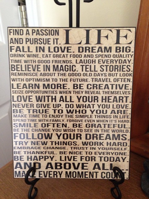
Typography.
Typography is the way words are formed. The font, color, size, and position of the words may be different. If they are different, it is for a reason. I think this design element is effective because it truly conveys the meaning the photographer/artist is trying to get out. I created a lyric typography piece this week, you can check it out here.
Metaphors/Symbols.
Symbols stand for something. Point blank. When you see a symbol and think of what it is representing, that is an element of design. I think the more simple a design is, the better. Complex ideas can be represented simply through the use of metaphors and symbols. For example, “time is money” is a metaphor for time is valuable, just like money, so don’t waste it. If you think about it, it’s kind of a complex idea that is represented by three little words. This design element isn’t as effective {for me} because metaphors and symbols have to be learned to convey some kind of meaning. My example picture will not mean anything to you unless you know what it symbolizes. The design element is not effective because it is ambiguous and subjective.
Minimalism.
Less truly is more. A design does not need to be complex. There doesn’t need to be anything in the background if you are just trying to take a picture of your dog, for example. Why would you want someone to see all your clutter in the background? You want them focusing on your dog! I think this design element is very effective because it conveys the object immediately – it’s the focus of the picture! If you don’t know what the goal of the picture was, or can’t decide if you should be looking at one object vs another, than it isn’t a minimalist design.
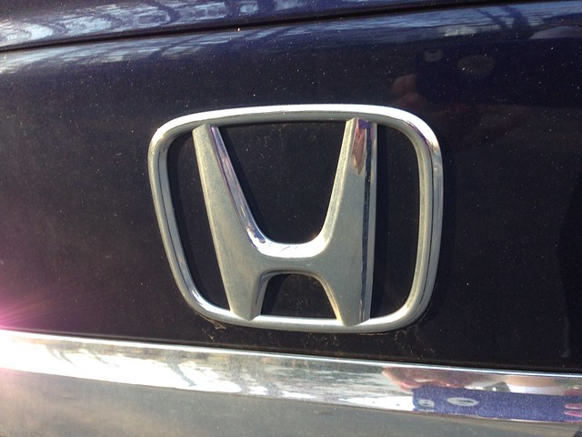
Form/Function/Message.
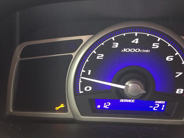
Certain symbols convey meanings. Think road signs. When you see a red octagon, you know the meaning is “stop”. I think this design element is effective to some extent. For something to convey a message or provide a function, it needs to be learned, just like the design element metaphors/symbols. You wouldn’t know the red octagon meant “stop” unless you learned it. My picture is a bad example of this design element. When the little wrench picture comes on, I know the message is “get your oil fixed”. Well, my oil light has been on for about a month now. As you can see below, I am now well over due for an oil change. Although I know the meaning of the wrench, the message is not powerful enough for me. {because I would rather be doing DS 106 work than go get my oil changed :)}
Balance.
The design element balance means just what you think it means, balance. Some kind of equilibrium, symmetry, asymmetry. What’s on one side of the picture can balance out what is one the other side, but it doesn’t have too. Balance doesn’t mean symmetrical. This was the most confusing out of the design concepts for me. Not in a “I don’t understand” way but more like “If balance can be symmetrical or asymmetrical, then doesn’t every picture have the element of balance to it?”

Rhythm.
The repetition in a piece can establish a pattern or even movement. If the repeated object is getting taller as the number goes up, then it creates the feeling that you’re moving away from or close to the object, almost as if the eye is moving in a “rhythm”. I think this design element can be effective if and only if the object that is repeating is dominating as well {but that’s just my personal opinion}. This design element occurs more frequently than we {or atleast I} think {thought}.
Proportion.
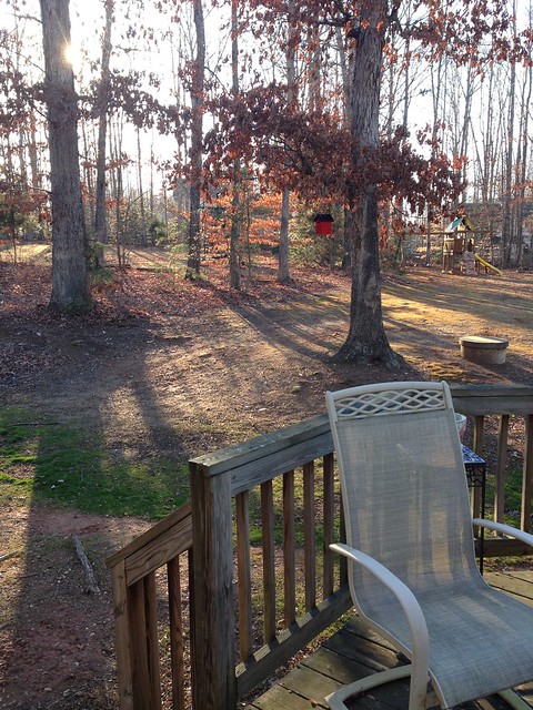
The proportion of a piece sort of acts like a measure or depth. We know that just because an object that is farther away is smaller than an object that’s closer up, doesn’t mean that said object is actually smaller. It simply just means it’s farther away. I think the design element is very effective. People use this to intensify a certain aspect of a picture. This design element is effective, if used correctly, because it almost explains the relationship between two objects, or parts of the object. My example picture just shows the proportion of the playground to the chair.
Dominance.
When someone is dominating you, he/she is taking over. That’s exactly what this design element means. One object is dominating the picture if that object is the first thing your eyes go to. It is the focal point of the picture, almost as if you don’t realize anything else is going on in the picture unless you try. I think this design element and minimalism are very similar in that both elements single in on one object. Dominance is effective because it almost has to be effective, or it isn’t dominating.
Unity.
When two things come together, they are united. Unity is the sense of a whole. The color and form are important when creating a sense of unity. I think this design element is effective if it is done correctly. I don’t know if I would be able to look at a picture and tell if the picture conveys unity unless it is very obvious.

My favorite four photos are tagged here on Flickr and I even posted them here in the Google doc too! I found this assignment to be informative and fun along the way. I learned that there is some overlap between the different design elements. And design elements can be effective if they are done right. Even though I’m done I’m still looking at objects around me, ready to whip out my phone and snap a shot. I guess that’s what a week on a safari does to me! :)

Add a comment