
Unlike the photoblitz assignment, I really disliked this assignment. I’m not sure why, but I just felt like I could find what I needed too. But that’s okay, it can’t all be fun and games.
So what did I find on my safari?
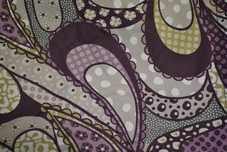
Color
I’m all about bright and vibrant colors, as I’m sure you’ve been able to tell from my other pictures. But there are advantages to using more muted and darker colors as well in design. Color adds different dimensions to designs, especially when used in conjunction with patterns, at least that’s what I believe.
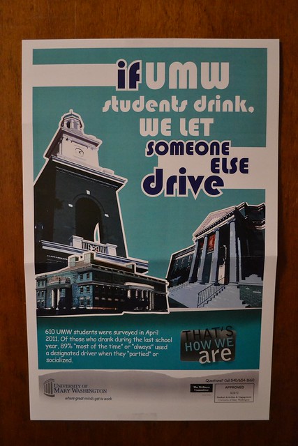
Typography
I really love typography and I knew exactly what to take a picture of to represent this. UMW puts out these ridiculous posters and all different sayings and data to support them. I’m an RA so we get tons to hang up in the residence halls and my residents always take them to “decorate” their rooms with. I think they are “popular” because of what they say, but I think UMW did a good job using typography and graphic design to capture people attention.
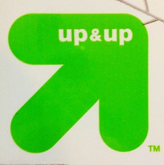
Metaphor/Symbols
Symbols are so effective in designs because one little image can define and explain so much without using any words at all. Companies use symbols to market their product, people become aware and acknowledge company symbols when shopping. For example, people can recognize a Target brand product from a name brand product because target uses and upward pointing arrow ask their store brand symbol (pictured below).
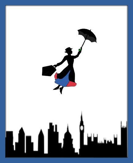
Minimalism/ Use of Space
This is the one that I had most trouble with. I understand what it means, but I had a difficult time find something to represent this concept. So I made my own. Last night Brittany, Emily (former ds106er) and I went to see Mary Poppins in an off-broadway performance! It was awesome! So that inspired me to make this. I downloaded the two images from google and then layered them in GIMP.
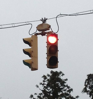
Form/Function/Message
Stoplights are Universal. In the U.S. we (typically) follow them. Red light= stop, Yellow=yield/or some people view this as speed up!, and Green= Go. While one may see a stop light in Europe, that doesn’t mean that they will be followed. But the general principle is that when you see that Red/Yellow/Green lit you know what you are to do. They are typically in a started form, we know what their function is and what the message is behind it. All three aspects go together in order for the design to work.
Balance
I like it. I enjoy looking that pictures or designs that have order, I guess that’s why I’m not a very abstract person and have difficulty understanding abstract ideas. Nonetheless, balance is a key aspect in a good design to think about because it makes us “look at images and judge them against our ideas of physical structure.
Rhythm
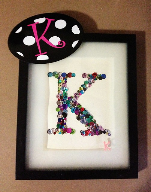
Proportion
This is another element of design that allows for balance and symmetry to come into play. I like the picture below as it show different proportions of the letter “K”. I think it’s appealing to the eye an interesting to look at.
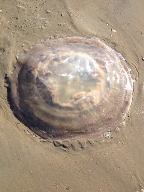
Dominance
When I picture this word, I imagine something huge and taking over the whole “design”. For this picture I Safari-ed back in time to January 2013 when I was at the beach with my mom. We have a home in the Outer Banks, and have been going for over 20 years now, each summer. I’ve seen tons of little baby jelly fish and some bigger ones with tentacles (gross). But nothing prepared me to see this. HOLY HUGE JELLYFISH! There were two of these on the beach and they were very Squishy and jiggly! Talk about DOMINANCE!
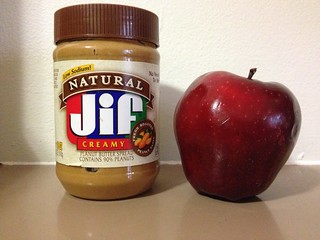
Unity
Like peas in a pod. “The concept of unity describes the relationship between the individual parts and the whole of a composition.” I think this picture describes this relationship perfectly. Nothing better than peanut butter and apples, together and separate.

Add a comment