
For this week’s Design Safari, I decided to focus on posters that I found around my dorm. There are a ton of them hanging up and although I see most of them every day, I have never stopped to think about their design.
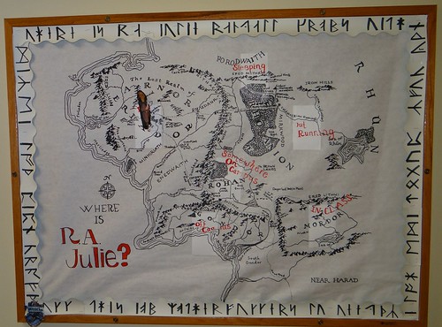
There is unity in the design of the “Where is my RA?” bulletin board outside of my RA’s door. It is a map she drew from Lord of the Rings and although complex in design, the simple color scheme make it unified, easy to read and interesting.
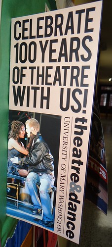
I love the typography on this flier from the theatre department. The simple all capitalized san-serf font fills up most of the space at the top of the page while the rotated logo on the bottom next to a photo from last year’s production of Rent contrasts nicely on the bottom. The use of gray for the ampersand in the department logo is also a great use of typography as it makes it stand out but not ostentatiously so.
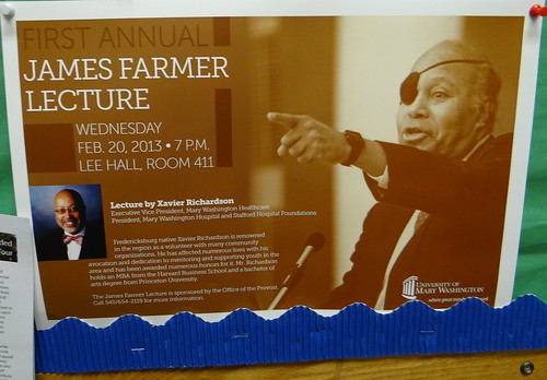
Using a monochromatic color scheme for the background of this poster is a great use of color. It shows James Farmer, whom the lecture is in honor of but does not overpower the information about the lecture.
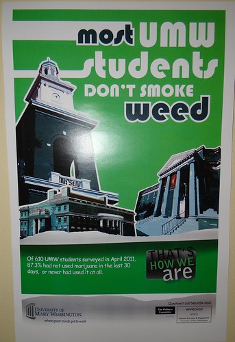
The form and function of this poster are not the best. Due to the use of color in the typography of the photo, “Most” and “Weed” stick out the most on this poster, meaning at first glance, one may think that most UMW students smoke weed, when, in reality, the poster is sending the opposite message.

Add a comment