
There was a lot of Disney this week, mainly because I had so much freedom to do anything I wanted with Design week. I really really enjoyed this week, it seems that each week I like this class more than the week before!
This week I embarked on a magical journey about trying to find different aspects of design that are used in real life, and I was shocked to see what I found. While the pictures I took were just in my apartment, I still was very aware of how things are placed a certain way in any kind of advertisement, poster, or even picture. This once again was a great eye opener to how I need to pay attention to different design aspects while making my own work. Which I certainly did in the star assignments. I think the one that I really like the most is balance. Being a mathematical girl you always want to have balance, so I believe that is the main reason for my roots. The design aspect that I like the most after that was color, if you can’t tell by my blog design I love color. That being said, let’s now explore a journey through the stars, my design assignment stars that is.
To start off with my stars:
2 STARS (Star total:2)
For a two star assignment I really focused on balance and color while creating an icon that represents me. All inside of a clover, I focused on having the black and the red opposite of each other on the leaves so that the picture stays balanced. This also focuses on different symbols because they need to be well-known symbols in order to get the message across, however I would say that this is not too minimalistic because there was a lot of action going on throughout the icon, just like my life.
2 STARS (Star total: 4)
This assignment called for creating a word with just font and nothing else. It was certainly a challenge but I then decided to do, especially because it is all about the typography!! I found myself really focusing on the font and the size as well. I decided to curve it a bit to make it look like a tiara and majestic but I really enjoyed this challenge a lot!
3 STARS (Star total: 7)
This assignment was all about making a warning symbol for something that is imaginary. I really focused on coloring in this one when it came to coloring the wand, and I also focused on the function and message from this design. I also believe that this uses unity because the colors are all very similar to each other and the stars look similar to each other as well. Magic always comes with a price, but designing awesome things don’t!
3 STARS: (Star total: 10)
This assignment really focused on the minimalism of the design element, after all it is all about creating a movie poster in the most simplistic way possible. I also really focused on the color here by making a color that would stand out to make the poster stand out from the rest. Just three simple elements between the symbol, color, and font make something that can tell a whole entire story. It really was an interesting assignment to take away the bells and whistles of design and just focus on pure design elements.
2 STARS (Star total: 12)
Creating a design of four nouns to describe a movie was an interesting challenge. This design was very big on the message and the minimalistic aspect as well. The order of all of this really matters in order to help tell the story, and the spacing needed the be perfect as well in order to help maintain a balance. I also liked how this was all in black and white, so that way the colors don’t impact the way the audience sees the photo and they can make their own ideas about it.
3 STARS (Star total: 15)
Possibly the hardest design to do was the one was was all about the content, the Venn Diagram. This assignment was all about the message, and I just simply chose simple colors when dealing with it. I focused a little bit on the typography by making different colors as well as fonts to keep it visually appealing. This assignment really had me break the movies down and focus on different aspects of different characters and it was interesting to see how bad guys and the good guys have similar qualities and it’s just how you use your characteristics that define you. While this was a large challenge I’m extremely glad that I was up for it all.
1 STAR (Star total: 16)
Last, but certainly not least, is one of my favorite designs from this week. Making a what people think I do was a lot of fun even though it was a lot of work. I thought that the best way to portray the message of the design was to make it be a GIF. By doing this, it told a lot more a story than anything else.
I really enjoyed all of these design assignments, and I am glad that I was able to use different elements that I learned about earlier throughout the week.
Next up on the agenda was the daily creates, where I channeled my inner photographer while taking a picture of a monster in a comfy blanket, edited a photo that made me remember my good times from freshman year, and designed my own ds106 bumper sticker. Once again, I found myself thinking about the audience the story that I could tell before publishing what was going on, and I was pleased with what I ended up with. By taking the time to just make sure that everything is right really makes a difference and I think I will be sure to do that a lot more.
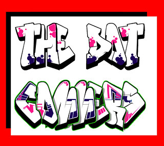
Finally onto the radio show. Tiffany and Kristen and I all were talking via twitter throughout the week about our radio show, which we ended up deciding that the theme would be social issues. Kristen is very passionate about social issues, specifically feminism and environmental, which makes me really excited to work with her! Tiffany is always a sweetheart and brings such a creative twist to things that I am excited to see what she will come up with next. We were between an interview and a discussion theme, but we all agreed that a discussion theme would serve best for us. When I heard social issues I knew what I wanted to do for a logo, even though it was a bit strange. This whole week I’ve been dealing with Disney and now I’m thinking of social issues, what a turn of events! The logo that I decided to go with was dealing with graffiti. Graffiti is a great way for people to express what they believe especially if they are sticking it to the man, so I thought it was appropriate to do. I really also focused on the colors to try to make it stand out. I really enjoyed the shadowing aspect of it as well. What do you think? Let me know! I created it using a graffiti maker and then messing around with the colors in GIMP
Thanks for reading!
Princess Karissa

Add a comment