
So this week Jim asked us to go on a “Design Safari” to learn more about the concepts of design that DS106 encompasses. Below are my four examples of: form/function, unity, typography, and color.
I found my design elements and #designblitz images around where I live in Arlington, Virginia. At first I thought I wouldn’t find such variety–I was pleasantly surprised.
My first example is of typography:
:
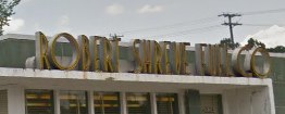
The 1930s vibe of this Robert Shreve Fuel Co. sign is tucked away less than a mile from my house at a corner of the W&OD Trail. It’s a great example of how something that’s specific to its time and dated can still look really good and, in a way, modern. I love the bold “O” shapes and the skinny “Rs.”
My second example is of form/function message:
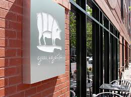
This is the outdoor sign for Clarendon’s Green Pig Bistro. One look and you know it’s all about the pig, all about pork…and butchery, with the knife that the pig is standing on and the “sections” in the pig. Since Green Pig Bistro is dedicated to “nose to tail” eating, their sign really does the job communicating their mission. I didn’t have my camera with me so I took this photo and the next one from the web.
My third example is of unity:
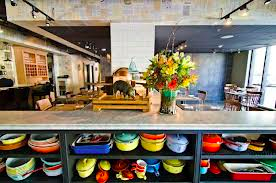
This is also from Green Pig Bistro; these are shelves in its dining room filled with enamel pots and casserole dishes. Even though they are all different shapes and sizes and ages they are unified by being enameled and French. My mother has a lot of these kinds of pots in different colors so this caught my eye.
My last design element is an example of color:

This is the logo for a travel website called “Skift,” I encountered it while on safari, the web browser that is ![]() , and immediately saw it as an example for my “design safari.” A “skift” is a sort of little boat, but they didn’t use a boat for the logo; they used a luggage tag, something all travelers are familiar with from boats, trains, buses, and planes. They use a stark and muted palette, which I thought was weird since traveling is usually such a colorful experience. I would consider this a bad example of color and poor design.
, and immediately saw it as an example for my “design safari.” A “skift” is a sort of little boat, but they didn’t use a boat for the logo; they used a luggage tag, something all travelers are familiar with from boats, trains, buses, and planes. They use a stark and muted palette, which I thought was weird since traveling is usually such a colorful experience. I would consider this a bad example of color and poor design.

Add a comment