Touch the firehose of ds106, the most recent flow of content from all of the blogs syndicated into ds106. As of right now, there have been 92792 posts brought in here going back to December 2010. If you want to be part of the flow, first learn more about ds106. Then, if you are truly ready and up to the task of creating web art, sign up and start doing it.

  1. mdvfunes

    I have been desperate to try week 2 assignment to break down a…

    by


    I have been desperate to try week 2 assignment to break down a commercial in 5 seconds increments - I did not even look at the list we were provided as I had a commercial in mind. 

    I used Vialogues to break it down and make notes. As Christina Hendricks says in her post about this activity, it is not only fun but really revealing. if you want to join me in Vialogues and make your own notes on the commercial you are welcome. I made it public so anyone can comment. 

    I have seen this advert/commercial many times and it is an all time favourite. I never stopped to ask why or what was the shape of the story. In week one I explored the story spine technique through a video I made. A series of unconnected images that seemed to come alive in a story just by the addition of the story spine structure. This was fascinating to me. How humans add stuff that is not there, just to make a story even when there isn’t one. 

    Here is the story spine for my advert:

    Once upon a time there was a cat that saw life as ‘meh!’
    Every day passed with cat just lying there whilst the world passed him by
    But one day whilst lying bored on the sofa he had a thought that changed his life. Why be so cat?
    Because of that he ran outside in the sunshine
    Because of that he started to do all the things that dogs do
    Because of that he felt full of life and ready to Carpe Diem
    Until finally he was accepted by a pack of dogs as one of their own
    And ever since then he lived happily ever after!

    Is this what you want for you own boring life? Then join the O2 cell phone network.

    Is it a contagious story?

    Mystery? 
    Empathy?
    Surprise?
    Revelation?
    Admiration?
    Astonishment?
    Contagious Awe?

    Yes, to all the above. It opens with a usual enough sight, a cat lying down in a kitchen. The voiceover soon tells us that it is ‘the cat thinking’. We cannot hear cats thinking normally so this is mysterious. We pay attention. 

    Who has not experienced the feelings cat is describing? Boom we have empathy.

    It all seems to be going downhill to clinical cat depression and then the surprise. Cat gets an idea. 

    The idea reveals to him that life could be different if only he could be more dog! As Flash Gordon music starts to play and he flies out of the cat flap, we want to be Cat, we admire his courage and feel more and more astonished at what Cat can do, culminating with Cat ‘becoming’ a dog represented by him running with the pack and then in the back of the car. 

    Contagious awe turns out to be a key emotion that makes stuff goes viral. I do not think it is far fetched to say we (I imagine only if we like animals and can empathise with protagonists) as viewers are awestruck by this clever little cat that decides to carpe diem - it must get the oxytocin and the cortisol going. The cortisol when we see his dead end life at the start, and the oxytocin when we see it grab life by the Frisbee. 

    If you want a non-animal version of this same advert, you can watch the film below. The video has the same pattern: compares boredom with awe and tells us why humans will do anything for a bit of awe!

  2. mdvfunes

    The Daily create today asked us to write a poem about our…

    by


    The Daily create today asked us to write a poem about our birthplace. I felt I could not write one as the tango sung by Carlos Gardel is the definitive ode to my birthplace. I love it. So I entered the lyrics at the website and felt like I was cheating…so I made a video about it all! It has been so cool, to visit my place of birth, listen to a favourite tango and even found a photo online of the hospital I was born in and (unbelievably) the door of the neonatal unit in that hospital. Ah, this web of ours.  

    Searched for photos, clips in YT, found best recording I could of the song, used new iMovie to put it together - detach audio on clips, add my audio, mess around with the clips, transitions, etc. and upload to YT. Used a few new filters and I am getting to know the new iMovie and it is not bad.

    I still struggle with credits - I cannot find a smooth workflow for those. 

    I wanted to have the lyrics in English dancing on the screen…but I did not know how to even try to do that. 

  3. mdvfunes

    itscolossal: The World’s Smallest Sandcastles Built on…

    by


    itscolossal:

    The World’s Smallest Sandcastles Built on Individual Grains of Sand by Vik Muniz and Marcelo Coelho

    Well, this sent me down a rabbit hole…

    and then I learnt about the camera lucida and after learning about the praxinoscope from Jim Groom i am spoilt for choice of gadgets to play with. I think the camera lucida wins - it undermines notions of original artwork and what it means to copy, it shows us that artists through time have used devices that help the process, it speaks to the relationship between art and technology and can buy me a portable one today! I do not need to invest in an antique:

    Wow! History and me have not always been best friends…could it be that as well as challenging my preconceptions on art and artefacts DS106 will also teach me to love history? 

    I am ordering me a camera lucida and playing with it…I know, I can do that with layers. But a tool that was used to build a sandcastle in a grain of sand? How can I say no?

  4. mdvfunes

    giphy: ARTIST SPOTLIGHT: ELLE MULIARCHYK What GIF best…

    by


    giphy:

    ARTIST SPOTLIGHT: ELLE MULIARCHYK

    What GIF best describes how you are currently feeling?

    I love any of the gifs on ThePop. When you press on the screen you see the “punchline”. 

    I love the DIY ones that kids do on the spur of the moment. 

    Right now I’m about to go to bed so I will feel like this guy in the gif. He turns off the light but then realizes that he had forgotten to plug in his phone so he desperately stabs into the wall in the dark. It’s so silly and goofy and “low-production”…. but I think about this GIF every night and laugh every time. 

    When did you first start making GIFs? What was the first GIF you made?

    About 2 years ago. I did just a couple back then, but now I’m a total convert and addict!  

    What attracts you to the GIF format?

    It’s a more organic and intuitive medium to relate an experience - more so than a photo or a video. Think of how we recollect memories: close your eyes and think of something from your past. You don’t see a frozen still image - you see GIFs! Even when we dream at night we see fragments of events that collectively create some kind of narrative which we assemble into a story when we wake up. Even when we daydream we don’t watch a full-feature uninterrupted film in our heads - we think in fragments, often non-linear. 

    There’s a real sense of fun and joy in your GIFs, something fashion photography isn’t exactly known for. Do you think the GIF medium lends itself to a more lighthearted mood in fashion shoots?

    Yes, I do! Comparing to GIFs photos and videos tell a story in a very “epic” way. They feel like something that happened long in the past. They are always so perfect, set in stone and immovable like the great statues in Rome.  GIFs, on the contrary, feel very “NOW” and ephemeral. I don’t know why, they just do. They feel like a medium where experimentation and mistakes are allowed. That’s why there is more fun and ease about them.

    Along those same lines, the light tone gives the GIFs an almost improvisational feel to them, but they’re also very tightly constructed. Do you have a vision of exactly the way you want them to turn out, or do you play around with a lot of different ideas?

    I create original content for my GIFs. They require a different approach than the ones created by extracting a fun moment from an already existing content. Which, by the way, I consider creatively equally valid and challenging. For me, however, I need to edit them in my head long before I create them. I often practice using myself, dolls ets before I get a real model. Once my storyboard is complete I will experiment with speed and crops. I find GIFs extremely difficult - much more so then a video or a photo. The fact that they have to loop in a hypnotic way is the hardest.  There are certain works of art that SEEM to have a repetition, but it nothing remains static forever. Phillip Glass’s music is repetitive but always evolving. But the great GIFs you can watch forever without getting annoyed. There is no formula of how to do it - it’s a kind of magic. I play with mine until they reach the certain “groove” where I could watch them forever, Then I know it’s right. Once I was looking at my own gif for 15 minutes while riding the subway. (now THAT’s what I call narcissism, lol)

    Do you see GIFs as the future of fashion photography?

    Absolutely! I want to be one of those who will create this future! 

    Who are some of your favorite artists?

    I like Kasumi

    Current favorite GIF? 

    Any fun projects you are currently working on and can share with us?

    The model go-sees with girls playing with cutouts from their portfolios is my latest project.

    Want to see more of Elle’s GIFs? Check out her page on Giphy.com. And, if you have a Mac iOS 10.7 or higher be sure to download the fashion-fun screensaver.

  5. mdvfunes

    thisistheverge: The era of Facebook is an anomaly To boyd,…

    by


    thisistheverge:

    The era of Facebook is an anomaly
    To boyd, social media isn’t new. It’s just the latest scapegoat for America’s obsession with overprotection. She took a few minutes to speak to The Verge about her new book, human nature in the age of Snapchat, and where Facebook fits in an increasingly fragmented social landscape.

    It’s complicated. We need deception. Hmmm…

  6. mdvfunes

    Huize Heyendael – A spine chilling tale  This week at the DS106…

    by


    Huize Heyendael - A spine chilling tale 

    This week at the DS106 Open Online Participant Offices (OOPO) we have been exploring the structure of story in different ways. Inspired by one of our co-workers over at GMU I decided to play with Ken Adams story spine idea. In his blog ‘bcodelson’ (I do wish our colleagues at GMU gave us a human friendly name to call them) wrote a sweet story spine about 'The shape of the sneetches' . Ron over on Google Plus has been creating some lovely atmospheric photos, animated gifs, videos using the Diana App. I thought I could put some of this stuff together into a video story spine. I called it ‘Huize Heyendael - A spine chilling tale’. I found this simple frame for creating a story helpful - there is a child-like quality to it. It feels like a game we can play the kids and make up lovely stories. I like that.  

    It is also a helpful checklist to remind us that the spine of the story never contains all the details:

    The Story Spine is not the story, it’s the spine. It’s nothing but the bare-boned structure upon which the story is built. And, that’s what makes it such a powerful tool. It allows you, as a writer, to look at your story at its structural core and to ensure that the basic building blocks are all in the right place. Now, of course, turning your Story Spine into a story is a whole different topic…

  7. mdvfunes

    engineering: Who doesn’t love animated GIFs? Believe it or not,…

    by


    engineering:

    Who doesn’t love animated GIFs?

    Believe it or not, support for GIFs at Tumblr was a happy accident! When Tumblr put together the code for handling JPEGs, support and GIFs (and PNGs) happened to also work using the same code. Perhaps even more surprising is that the tools used to handle GIFs at Tumblr hadn’t changed much from those early days. 

    The image above is an original from sukme that could not be posted to Tumblr last June. It also would have failed if he’d tried last Sunday. If you click-through to the original post, you will see a muddy, reduced-saturation mess. All this because our resizer couldn’t handle the original. 

    I’ve got ninety-nine problems and the GIF is one

    There is a lot of misinformation about GIF limits on Tumblr, so let me set the record straight: We don’t count colors or frames or pixels. We only count bytes and seconds. Every image that comes in is scaled to a number of smaller sizes and the smaller your image is, the fewer resizes need to happen, which means less time. 

    We had two core failure modes in our prior resizer: Some images would take as much as several minutes to convert. This was not directly attributable to color, dimensions, or frame count, but a mysterious mix of all of them. Some images would balloon in size (600KB at 400x400, 27MB at 250x250).

    The unpredictability of these failures made our GIF limits feel arbitrary and terrible to the end users. Some have gone so far as to threaten monkey kicks. I don’t want to get kicked by a monkey, so we started working hard late last year to fix it. 

    A proposed solution

    Some of you may have seen this post where the performance of our current converter was compared with a new “mystery” converter. The mystery converter was roughly 1000x faster on the “slapping” GIF and happened to look great, but had quality problems on other images. Those were more fully explored in here a couple of days later.

    If you haven’t figured it out yet, the mystery converter is gifsicle.

    Getting a better handle on it

    To get an unbiased test set, I took a random sample of roughly 90K GIFs that Tumblr users tried to upload, not limiting the corpus only to those that succeeded. These were tested against the current converter, resizing down to the next size we produce. Each resize is given up to 20 seconds to complete in our application, but all resizes must complete in 30 seconds. All resizes must be under 1MB or we will convert the first frame to JPEG and call it a day. 

    2.6% of my 90K GIFs took longer than 20 seconds to resize. This is an underestimation of how many GIFs would be rejected for time because this is only one of several resizes required. A whopping 17.1% of all GIFs were over 1MB. Even if we bump up to 2MB, the rejection rate is 2.75%. The converter was making over 25% of all resizes larger than the higher-resolution originals! The total rejection rate for my sample set was 4.46% of all original GIFs uploaded. 

    Using gifsicle is so much faster that our CPU rejection rate drops to 0.00 on my test set. Also, just under 99% of all images were smaller when resized than they were at their original resolution. The size rejection rate was a much lower 0.59%.

    Gifsicle problems

    As compelling as the performance of gifsicle is, the quality problems are too much to ignore. We played around with the code a bit, but eventually we just got in touch with the author, Dr. Eddie Kohler. The specifics are in this post, but the short version is that Eddie was able to improve quality by adding some more advanced resampling methods as well as palette expansion for small-palette images. This increased our size rejection rate to 0.68% while still keeping us well under our CPU budget. 

    Proving it

    Image processing is all about choices. How do you resample? Do you sharpen? Where in the workflow is gamma correction applied, if at all? The list goes on and on. 

    As you can imagine from the performance differences, our previous converter and gifsicle take very different approaches to GIF resizing. The output images look different. Sometimes it is slight, sometimes it is significant, but there is no way we could put out a converter that messes up your images, even if it messes them up quickly. 

    We set up a qualitative study. The goal was simply to prove that we weren’t doing worse than our old converter, not necessarily that we were doing better. This study was opened up to all Tumblr employees, as well as some “randomly selected” outsiders (my friends and family). Participants were presented with one of two questions:

    1.) Given an original and 1 resize, decide whether it is ok, unacceptable, or completely broken.

    2.) Given an original and 2 resizes (randomly choses which was left and which was right, sometimes they were identical), choose the better image or say there is no difference.

    The results were everything I could have hoped for. The “acceptable” test showed that users found gifsicle better at producing acceptable results (87% vs. 84%), but not by a statistically relevant amount (p=0.086) and that gifsicle produced fewer broken GIFs (0.71% vs. 1.38%), but again not enough to say it is definitively better (p=0.106). The “better” test found users preferring gifsicle 37% of the time, the prior converter only 16% of the time, but users also preferred one identical image over the other 27% of the time. Again, it is hard to say that gifsicle is better, but it is clear that it is no worse.

    Putting it all together

    The development and testing described above took from late October until the beginning of March. Packaging, deployment, and integration took only a couple of weeks!

    We aren’t done. There is work underway exploring how we handle JPEGs and PNGs. There are a slew of features that we can go after. This was a big step, a necessary step, but not the end for sure. 

    We are a community, it takes a village, there’s no “i” in GIF

    This project couldn’t have happened without the excellent work of Eddie Kohler in creating, maintaining, and enhancing gifsicle. Tumblr’s Site Reliability Engineering group packaged and helped deploy gifsicle onto hundreds and hundreds of machines in our datacenter. Tumblr’s Security Team vetted the code, both by inspection and by attacking it to make sure we stay safe. This was all for the awesome Tumblr creators, but I have to mention qilme/sukme (same dude, two blogs), reallivingartist, and especially gnumblr for their help in understanding and ultimately attacking this monstrous problem.

  8. mdvfunes

    The importance of history – advise to new students One of the…

    by


    The importance of history - advise to new students

    One of the things I most value about being part  of the DS106 community is that it makes come alive years of theory and research on the creative process. 

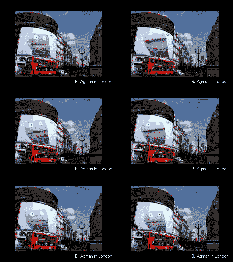
    On this post I want to talk about Bagman, a character that is part of the DS106 oral tradition and how it relates to a systemic theory of creativity. 

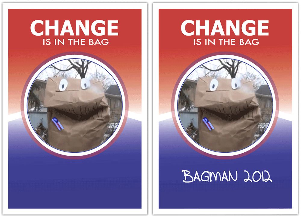
    I started the week looking for a photo of ‘the little paper bag character’ I had seen on Twitter some time ago. I thought it was created by Martha Burtis but soon found out that it was Brian Short’s original idea, that it was called Bagman and that he had ran for president in the past with a comprehensive campaign being staged by past DS106 participants. He has become an assignment on the DS106 bank.  

    His most recent appearance was to claim his own domain at UMW, a trailer well worth watching. Search for him on the google and there are pages of fun art to listen to and watch, all to do with this little paper bag creation.

    Why bother writing about him? Other than the obvious prima facie reason that he is awesome, there are those out there who need a rationale for having fun, if that is not too much of an oxymoron. Sheep! I needed a rationale to join this cult #4life not too long ago.

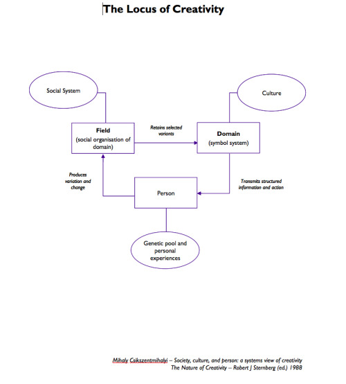
    So let me be serious for a minute and bring to bear my academic expertise as the DS106 Shrink to the important subject that is Bagman or B. Agman as I believe he is known on Linkedin.  The dry and boring diagram on photo set  above, explain systemic creativity. I put it here for completeness but will only focus on what is relevant to this story. 

    As I was digging into the history of DS106 through finding out about this little character, I had a lived experience of what Csikszentmihalyi (the guy responsible for boring diagram) means when he says that we need to ask where is creativity? Rather than, What is creativity?

    In psychology often the focus is on the person and how to develop individual creativity. Until I came across this model I used to focus all my workshops on individual creativity too. But the individual is not an island and in order for creative output to obtain, we need to look beyond the ‘I’. The individual belongs to a field or craft. In that field there are colleagues, journals and review processes that determine what becomes part of the domain of that field. The acceptance of a given output by the field into the domain determines what future students learn as the symbol system for that field that they can then deviate from - the symbols they will manipulate to become creators. A key thing the theory proposes and one that is often forgotten by those who want to encourage creativity is the need of years of training and practicing to learn that symbol system - in other words you will not become Einstein without learning physics. 

    This is similar to what Ira Glass says about practicing your craft. You will suck for a long time as you learn your craft, what you do will not be accepted in the field and even if your taste is impeccable all the way through your output will not match your taste. Do read Alan Levine’s latest post to understand more about this and learn a lot about what teaching means within our little DS106 community.

    What does all this have to do with Bagman?

    I have always struggled to explain this theory to my students. It seems self evident to me, but not often to others on first seeing it. I can now explain it with Bagman. Tracking his story this morning taught me a little more about the people who ‘are’ DS106 today, this will help me join the conversation. It is always tough to come into a party where you don’t know anyone; knowing their war stories, their recurrent jokes and developing an ability to contribute to their interactional currency will help you join in. In some ways, all we have online is this narrative history to establish relationships within an existing social system.

    If you are coming in new to DS106 it would pay you to study it narrative history or as I think of it, its oral tradition. 

    The open web is a great repository of this tradition as many students before you have engaged with the course and produced creative outputs for it. DS106 has a symbol system and it is not so obvious without studying a little history.

    The characters and the creations of the students involving each character were the medium through which students became part of the social system that is the field of DS106. If you look at the content only (the tools, the assignments, the weekly announcements) you will miss a core element of what makes this community special. The way to be accepted within it is also by knowing its history through narrative. You can then locate individuals and their roles within the community through the history they share.

    The big difference between being a DS106 student and being a physicist is of course that neither the social nor the symbol system through which people interact is made explicit when you join it. You have to dig for it, and realise that it matters. It matters not because Bagman will change your world or teach you digital storytelling techniques (although he might), it matters because it is a history that the community shares and often talks about. 

    I am also very aware in making artefacts that there is a difference between making things for the DS106 community, with the intention of engagement and interaction and making things for a wider social system. Much of what I make within this community is pretty meaningless to those outside it or new to it. From an individual creativity perspective I am practising digital storytelling whatever the content.  If that is your intention in joining the social and symbol systems may be do not matter.

    Yet, seeing DS106 as a domain of knowledge in itself with a symbol system embedded in its oral tradition, its content maintained informally by the social system interacting around these symbols, may enable new open participants to participate more fully in the learning process.

    And we are all pretty vain, so we love to be asked about what we have made and why we have made it! If you are joining us on March 18th for the first time, welcome to the party. 

    Campaign gif source; http://blog.neverthesameriver.com/change-its-in-the-bag-design-assignment/

    Video for Bagman in London gif: http://youtu.be/mdxolXh3U60 

  9. mdvfunes

    The Altered State Gif TechniqueJust for you Michael…But also…

    by


    The Altered State Gif Technique

    Just for you Michael…But also for me: take a look at this gif. Awesome.

    So, now for instructions. It started with this Tweet:

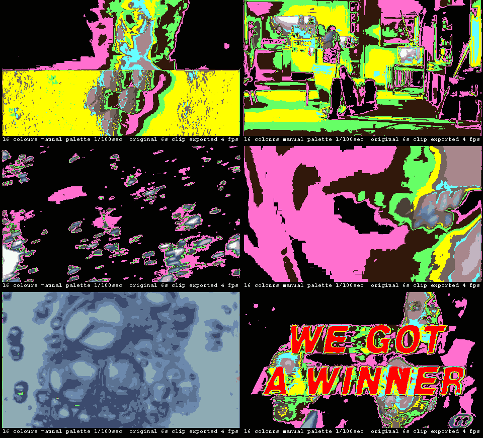
    @mdvfunes find a fast cut bit of video 6-12sec. Throw-out as many frames as secs. Crop to liking. Save w/o dither. Only 12-16 colors. Crazy.

    — Michael B Smith (@mbransons)
    February 19, 2014

    I tried but failed to make anything work in my previous post. Michael visited my post and tried to help me in more than 140 characters. It worked. 

    Here are the instructions that produced this lovely gif.

    1. Find a fast cut bit of video 6-12sec – This was referring to a piece of footage in which there are number of cuts in a short period of time. The most famous example of this of all time is definitely the shower scene from Psycho. There’s probably 50 some cuts in a two minute scene. That’s rough a cut every two seconds.
    2. Throw-out as many frames as secs – I’ve come to a rule of sorts with the maximum number of frames in a single GIF given it seems to work with Tumblr which has some often perplexing GIF rules. The file has to be less than 1MB and 500 pixels wide. But at times the GIF meeting those two requirements still gets rejected. At times by tossing out frames and hovering around under 30 frames in the GIF seems to do the trick. So with film/video being a medium that is 24 to 30 frames per second, I will throw out a corresponding number of frames based on the number of seconds long the video clip is. So for a one second video, I would use all the frames. Two seconds, I would use every other frame. For a six second clip I would use one in every six frames. Photoshop has this option while importing video to layers. I’m not sure if GIMP does this.
    3. Crop to liking – This is for Tumblr rules and aesthetic ones as well. Particularly if the original video is HD resolution or higher, sometimes focusing on an area of the frame rather than the entire frame is more interesting to me.
    4. Save w/o dither – Dithering is a form of digital noise added to the image to try and smooth the visual transition in color gradients. Think of a sunset’s reds to oranges to yellows. Without a dither, the transitions between colors can be very blocky/pixelated. Also without dithers, the size of the GIF tends to be smaller as there is fewer changes in pixel color assignments between frames.
    5. Only 12-16 colors – GIFs have a maximum color palette of 256 colors, which if you think about how good the image/animation can look it’s amazing. By intentionally reducing the color palette to a few colors, the image becomes ‘posterized.’ And for the same reason as no dither, the file size is typically smaller.
    6. Crazy – because the results were surprising and visually interesting. I really liked the even faster cutting of the image and the limited palette that holds it together.

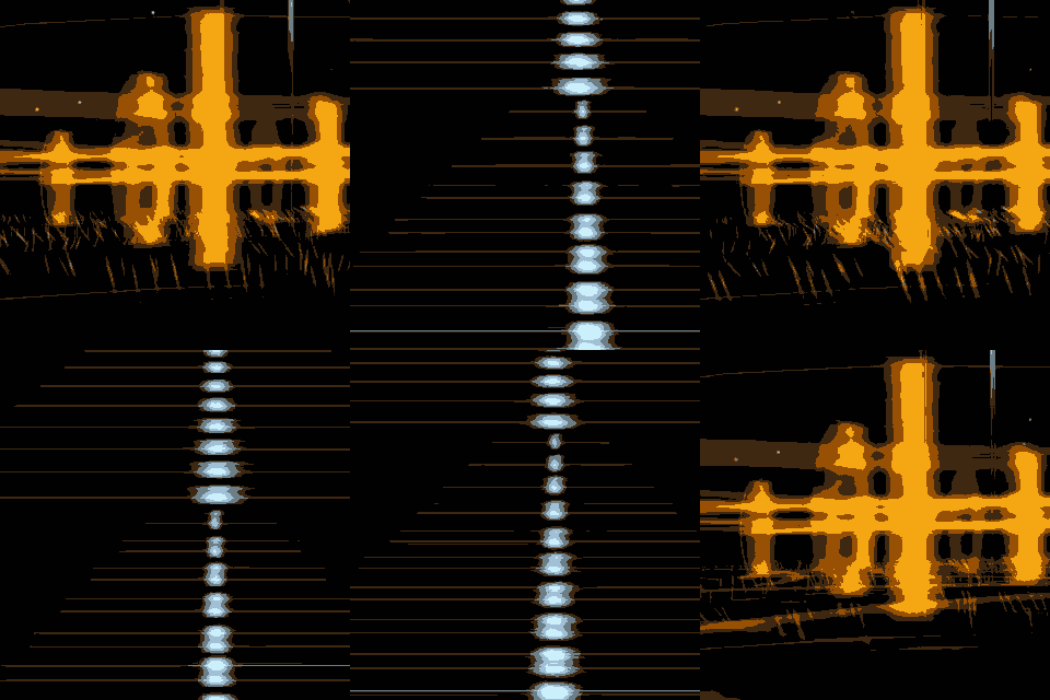
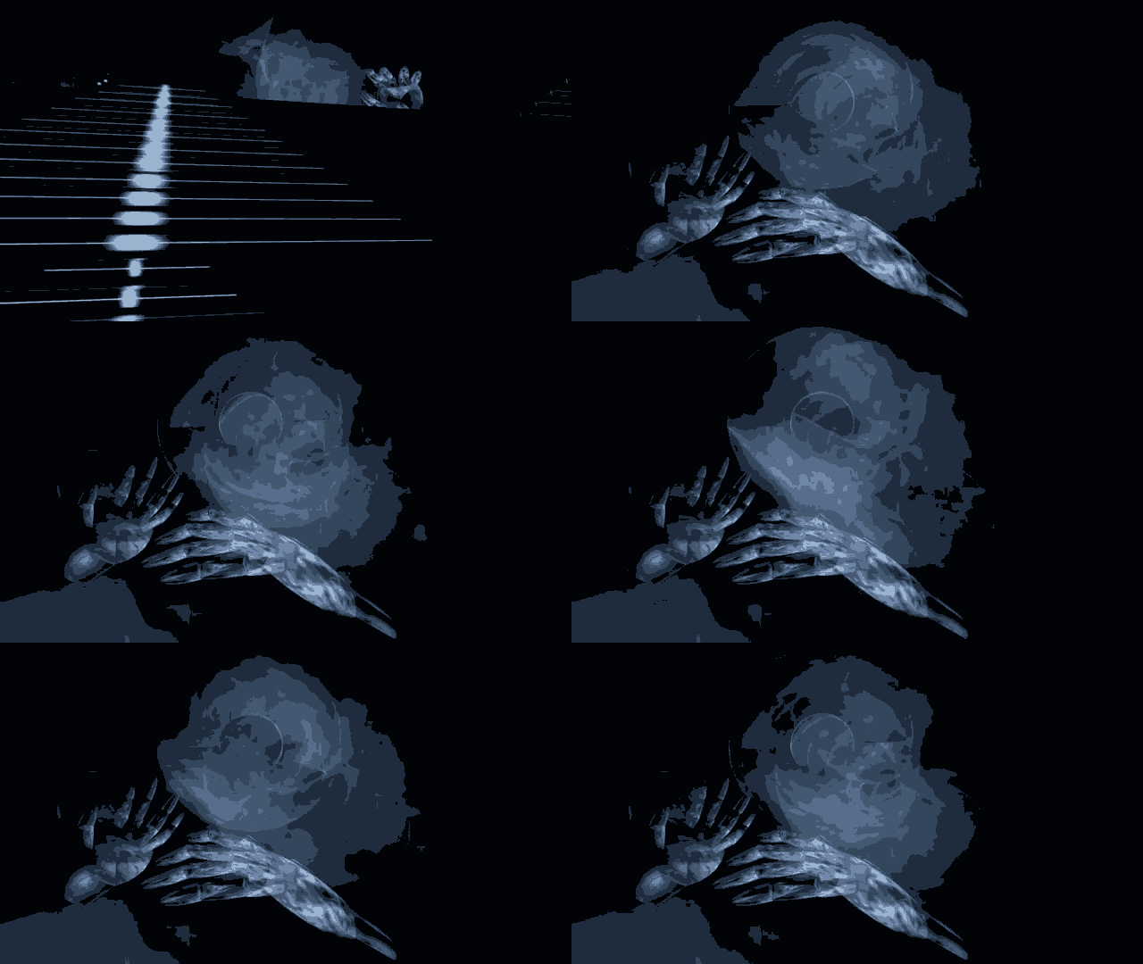
    It is so simple when you have good directions. These remind me of glitch art and I have learnt something about the aesthetics of choosing a gif moment. It is all in those instructions, read carefully. 

    Here is to you Michael, thank you.

    12 second clip from: https://www.youtube.com/watch?v=s1OdeqIztt8

ds106 in[SPIRE]