-
-
October Friends
Now blue October, smoky in the sun, must end the long sweet summer of the heart...
-
Giddyup for Western106!
Howdy! There’s gonna be a ds106 full of western stories and movies that I will be teaching next Spring for Kansas State University. Bill Genereux has been a long time ds106 partner in teaching a Kansas State University course on digital storytell... -
Call for Proposals on Professional Development in K-12 Online and Blended Learning
Journal of Online Learning Research Call for Special Issue Proposals on: Professional Development in K-12 Online and Blended Learning As the popularity of online and blended learning escalates in primary and secondary education, the need for quality professional development for… -
SourceTaking a break for a couple of weeks!
SourceTaking a break for a couple of weeks! -
Moving Mickey
The doctors say she's in great shape for the shape she's in, so her granddaughter Tristan Lockard said, "Why don't we be roommates?"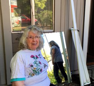
-
Check out! Designing Digital Learning
Designing digital learning from George Veletsianos -
Sorry, I Could Stop Help Myself from Remixing
When John Pederson (or “Balki Bartokomous”?) launches a softie like this These audience reaction shots are exactly how I feel while watching @djakes and @shareski keynote. https://t.co/CCgozydkZG — Balki Bartokomous (@ijohnpederson) ... -
Call for Chapters: Educational Technologies: Challenges, Applications and Learning Outcomes
Call for Chapters: Educational Technologies: Challenges, Applications and Learning Outcomes Editors: Dr. Lijia Lin, East China Normal University, China Dr. Robert K. Atkinson, Arizona State University, USA Introduction The book provides an opportunity to showcase how a variety of technologies can… -
patrick r. lowenthal 2015-09-21 14:10:59
20 cognitive biases that screw up your decisions by Samantha Lee and Shana Lebowitz -
Cosy morning with Cherries and the little Lady #tdc1348
My little green Lady was still here this morning.I wonder how long time she allows me to enjoy her cosy company.Gif created in Gimp. Screenrecorded in Jaksta.Combined with the music in iMovie.Music: Four pieces by Nathan ShirleyCherry: Momofukufor2&nbs... -
tdc1348 Green little lady
Yesterday I had a look at DS106 again for the first time in too long time. So much has happen. I have left Belgium and now live in Copenhagen. I hope now to find more time to play around with the digital creativity.And I was lucky. As I stood there loo... -
Nuit Blanche Edmonton Video
A few weeks ago Tom and I heeded the call from the Nuit Blanche Edmonton festival committee and showed up in Churchill Square wearing red shirts. This is what happened Nuit Blanche takes place September 26. Come to Churchill Square and experience how over 30 local and internationally renowned artists transform downtown Edmonton.
The post Nuit Blanche Edmonton Video appeared first on Rhonda Jessen.com.
-
ALT-C 2015 reflections: a heffalump in the auditorium?
In summarising my trip to the Association of Learning Technology 2015 Conference I find myself asking “why am I doing this”? Not in the sense of “why haven’t I won the lottery yet”, but I suddenly find myself questioning the motives … Continue reading → -
How to break through the glass ceiling?
I need your real-life solutions for a real-life problem. I’m looking for something more challenging at work, and a role that aligns with my learning and teaching experience. You can see the kinds of things I get up to from … Continue reading → -
-
Mind On Fire 2015-09-13 23:59:59
Mind on Fire Digital Storytelling Sandy Brown Jensen, Digital Storyteller Please to Enter ... -
Tuco No Ugly
I do not even want to look to find out the last time I officially completed a ds106 assignment (probably last time I taught, Spring 2014). But I was so inspired by Bill Genereux’s new one, A Scene We Didn’t Get To See: Create a short video tha... -
-
-
Whale Rider Mask
Its very simplicity tells me it is the work of a master carver.
-
Imaginary Bestseller! “Tweeting Alone” (and the making thereof)
Twas not my plan to make a mocked up book cover, even before breakfast. But so it goes, when the urge worms its way into my cranium. I cannot let go til I try it out. I woke up to back scroll twitter, finding the eminently sarcastic, funny, insightful,... -
#ds106 Good Spellin’ on a Sunday Afternoon
I got a message request from Mariana Funes Want to do new bumper for 106 spell starting Sept 6 can you record “Under the #106spell on a sunny Sunday on #ds106radio” for us when you have a moment? with a link to the song by The Kinks. She is... -
DS106 tales is up and running….scared. An assignment went…
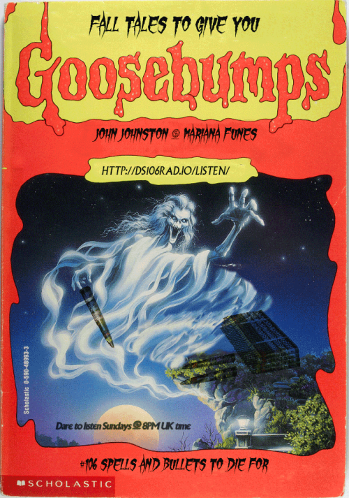
DS106 tales is up and running….scared.
An assignment went up about DS106 as a Stine book and I had never heard of Goosebumps! I confess I love horror as a genre, for reasons to explain another time. So, I went to mother google for answers.
As I think this may be an assignment UMW students do when course formally starts at the university, I am outlining my process in detail in this post. I personally prefer how-I-did-it-posts that offer clear bullets (bullet points that is), so I am doing that here. As bullets in this case imply an order, below is a numbered list of what I did and another one about what I would change. Start self-assessing your work early, boys and ghouls, best way to learn. If I could press rewind and redo: What would I change? Makes it easier for others to make improvement suggestions too!
What I did
1. Find out what these books are on Wikepedia
2. Google ‘Goosebumps book covers’ to get an idea of design assignment is after. I was taken by the notion of ‘creating an appropriate title’. I have not read the books so had to go with parsing lots of titles to get feel for it
3. I learnt there are many series to choose from, that Stine book covers are a thing and many people collect them and love them
4. Found a cover that suited my purposes. Now, find a high resolution file. This took some searching but Neil came through! A true fan
5. Find font. Here one could go mad as clearly fonts had to be extreme horror. I was also searching for legibility as my purpose was to use the cover as a poster for an actual radio show. I settled for Gypsy Curse but there are so many free fonts to choose from. Just google ‘horror free font’ and be damned
6. Install font in your editor.
7. Load up all the images you want to use for the creative edit as layers in one file in your editor. I use Photoshop. #EZPZ here: File
8. Make sure you know where files come from for correct attribution: My main image came from Neil, the bullets came from jjgifs in his other blog.
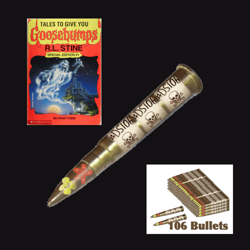
9. Now time to play boys and ghouls!
10. This is where the screencast would be if I was doing a tutorial. I played for a long time with Photoshop. Main tools used: Clone stamp tool to clear from original image what I did not want. Healing brush tool to tidy up. Blending option multiply to blend bullets into main background. Skew tool (used badly) to make bullet stack blend more into image. And a word of advise: always find you pink guides! Guides to align everything exist in most editor, find them. They are a life saver.
11. Now play with fonts. I used Gypsy Curse but applied several options using the cmdT option with text selected. I also used blending options to highlight text like the time for the show. For legibility I decided to use Village plain (homage to a previous DS106 run) on URL and times. Little squiggle that divides names did not exist in Village plain. Copy/paste hopefully blended the fonts a little better when added to time information.
What I would do differently
1. I need to learn how to use that Skew tool properly - I cannot get the bullets to appear as if they are lying on the rock
2. Multiply was okay to blend but there must be a way to make the bullets show up more clearly
3. I spent a long time thinking about the title. The curse of DS106 Horror Show got me last night and I lost all my work. I thought of a title this morning, but I am convinced the one last night was better…the serious design point is that it mattered that in the assignment we are pointed to think about that - it is the thing that pulls the cover together
4. I decided early on not to do the back cover, I think it should be possible to create a poster with both sides of cover and I would have more space to say what is coming in the new season of the show….this has taken long enough for now
Finally, our new season of #106spell starts on September 6th, make sure you listen!
-
Just a little story about serendipitous connections on Twitter…
Just a little story about serendipitous connections on Twitter around another daily create. I wrote about this the other day and this is the story told for cogdogblog and his stories of open sharing.
Behind the scenes
Hmmm… Don’t ask.
It was going to be my first black background video. It was not to be. I learnt that making video with back background that do not make one look like a ghost is just plain difficult. I then tried Touchcast on the iPad. Well, I should know better. I am sure the app is cool once you learn to use it but
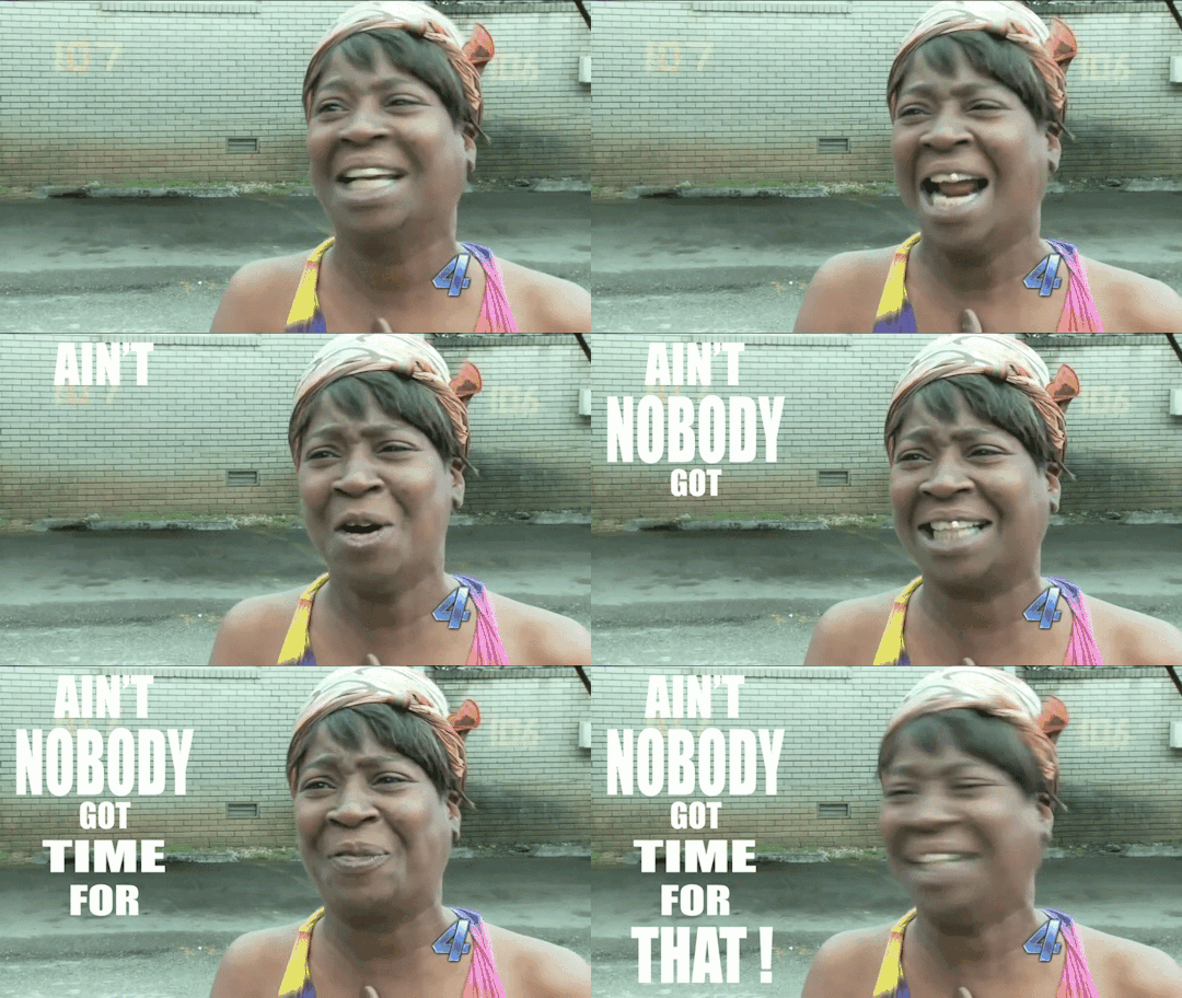
So I decided the ‘easy’ way would be to create it in Animoto. I have made one other video sucessfully on Animoto, but have tried several that #bigfail. It is not a transparent platform it has many rules that are there to encourage you to upgrade and you often get stuck after you have gone to far into your project to ditch it. I refuse to collude with dishonest commercial behaviour so I ditch the project rather than be forced to pay. I have an education account, you would think they would behave transparently, they do not.
This time i worked out all their rules. Clip length, audio length, number of songs (1), free theme, total length of video allowed, maximum size, size of photos…. and I am not kidding!
The damn editor still cut my soundtrack by 2 seconds. I could not get around the problem in their editor. I think it has something to do with the addition of their logo at the end but i was not going to be forced into another way of paying to test that out. I rendered the video with faulty sound track and downloaded it.
I then brought it into iMovie and edited it. Detach soundtrack, add new on, shift a few clips to make it flow, add titles and a little music. Bob is your uncle, as we say in the UK. Done.
What is annoying is that it has a lot of potential. Animoto that is. If only they gave clear free options and then offered upgrades. They even try to force you to upgrade for better quality video download. If I wanted that I would have asked for that when I signed up!
Come back One True Media! That was a fast and easy way to produce video, and I did not mind paying them. They still went to the island of dead tools…go figure.
-
Another poster with wisdom from @everyadage and for my…
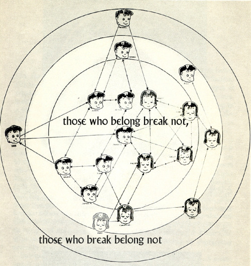
Another poster with wisdom from @everyadage and for my typography collection. I did not play with font and kept it Village Plain so we can use it around the village.
Source of image: A targeted Sociogram by Mary Northway of a first grade class, drawn by hand by Grant, one of her students, in 1952. I am writing a post about what I feel this expresses about open online learning and social networks elsewhere but here I want to talk about getting this into a shape I could use.
I originally found this:
As you can see not much could be done with it. Yet, I knew I wanted the contrast of Twitter bot wisdom with a human social network not an impersonal set of nodes. I had the idea that this could be ‘then and now’ not just in terms of evolution of visualisation of networks, but also ‘then and now’ as in childhood playground network and the online networks of today.
I searched and searched. I found a better image but not a great one and decided I would learn about how to restore and image in photoshop. There must be something the mighty photoshop could do beyond just image size, which was all I could think of doing. I searched some more. I found a tutorial about giving old pictures new life. I followed it. It was awesome. I even managed to highlight one little girl at the edge who had only two unidirectional arrows, I wanted her to be the focus for the ‘those who break’ part of the adage. You cannot read them, but can see that each ‘node’ has a name as well as a face. How human and touching was that way of analysing interactions?
The poster speaks to the shadow side of online connecting - not all belong and some break and leave. Often early on.
I think this is worth many work units and should keep electricity on in my tree house ( I know the transporter uses up a lot of it getting back and forth to Bovine). I am so pleased with the result even though it is so subtle and in some sense changes nothing of the original image. To me, it is like it has come back to life!
-
-
Distance Teaching & Learning 2015 – Social Presence and Online Video
Distance Teaching & Learning 2015 — Social Presence and Online Video from Patrick Lowenthal -
Uggie, the star of The Artist, died today. He was 13 and had…

Uggie, the star of The Artist, died today. He was 13 and had cancer. He had a fab little life after a tough start and (apparently) loved hotdogs… I did not know that when I made this gif or the caption could have read: Anyone said hotdogs? You were the cutest JR aside from my own gifadog of course. Rest in peace, buddy. Here he is doing tricks for Ellen, so brilliant!
-
August 12th and all ptarmigans and teaching teams run for cover
Today is August 12th and marks the start of the shooting season for Grouse, Ptarmigan and the Common Snipe. It also, entirely uncoincidently, marks the release day of the 2015 National Student Survey results in the UK. With much discussion … Continue reading →
