Touch the firehose of ds106, the most recent flow of content from all of the blogs syndicated into ds106. As of right now, there have been 92792 posts brought in here going back to December 2010. If you want to be part of the flow, first learn more about ds106. Then, if you are truly ready and up to the task of creating web art, sign up and start doing it.

  1. bridghi

    “My People”

    by

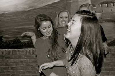
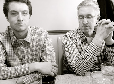
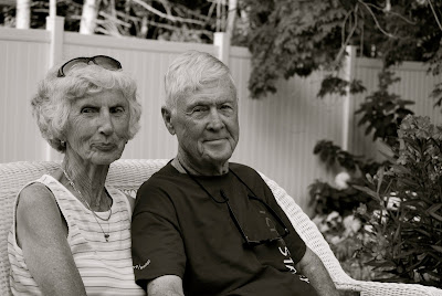
    For my photo essay, "My People", I chose to do a collection of photos of the individuals in my life that mean the most to me, my family and close friends. I wanted all of the images to capture these people at their happiest or most content moments, because that is the how I envision these people when I think of them. 


    At first this seemed to be a daunting task, to take good pictures of people in their element without forcing them to look a certain way. It’s still amazing to me that in just over one month I could get these pictures to turn out the way I wanted them to, for the most part. 

    I wanted to take quality photos but because I was interested in getting spontaneous shots, I found myself switching between a Nikon and my iPhone to capture the photos. The Nikon produced higher quality photographs, but my favorite photos in the group are the ones that came from my iPhone. It just reminded me that having high quality or clarity in a photo does not necessarily mean it will always be better than a lesser quality photo that may better capture a person or idea.  


    As I said, I originally intended for the photos to capture “my people” at happy moments because I like to think of them like this. What I didn’t anticipate was that every photo would capture the personality of the people in them. My sister is a total goofball, and that shines through in her photos. My best friends make me laugh incessantly, and when I look at their pictures I want to laugh along with them. My dad is a very serious person, and I can see that in his photo. My grandparents are quiet and conservative, and I can see their demeanor in the picture I took of them. Even the shot of my dog is spot on, because she is always giving me inquisitive looks. I do not think these photos could do a better job of capturing the subjects exactly as I know them.


    As you can see from the photos, I chose to make every image in the collection black and white. I did this for several reasons, the first of which is a little obvious: because it made the group of photos cohesive and also made some of the shots appear to be more meaningful and thought-out (when in fact, most of them were spur of the moment, and I had no idea what I’d end up with). 


    The second reason is that while a few of the shots were focused on the people I intended to photograph, others include some background faces or colors, which I found to be distracting. The black and white effect seems to eliminate those distractions from the photo and brought the focus back to “my people”. 


    Finally, the black and white filter gives the photographs a sense of nostalgia or memories, which I found to be important to my essay and what it means to me. Soon these photographs will act as more of a memory of the people I used to see on a regular basis, and I wanted them to always reflect that idea.


    This project forced me to create a collection of photos based on however I interpret the given title. For me, the title meant exactly what it says, and I liked that it gave me a reason to take these pictures of the people that I value the most in my life. 


    The essay is something I can take with me into my future as reminder of how lucky I am to be surrounded by such amazing, inspiring, and happy people. In less than two weeks from now I will be packing up my life in Ann Arbor and leaving U of M behind, and in less than a month from now I will be packing up my life at home and moving to Madison, Wisconsin. 


    These people, currently playing such important roles in my everyday life, will no longer be the faces I see on a regular basis. This assignment has been a special opportunity for me to capture the moments that I will want to remember when I am no longer surrounded by “my people”. 
  2. bridghi

    Possible first photo for Photo Essay

    by
    This is a photo I am considering using for my Photo Essay. It was taken over Spring Break (if only it were actually that beautiful outside), and it captures something about my grandparents that I can't really explain. I've decided I am going to make al...
  3. bridghi

    Weekly Summary

    by
    My team at NationalsA LOT of things have happened in the past week. So many exciting things have happened, not to mention that the semester is wrapping up along with my time here at U of M. The two most exciting things that happened were that my volley...
  4. bridghi

    Response to Masters of Photography

    by
    CC flickr J. Scott 2My first reaction: woah, Diane's daughter, nice hair. I realize that was the style in 1972, but I couldn't help but laugh just a little. Once I got past that, I thought it interesting that this was a video, about photography, put to...
  5. bridghi

    What is a portrait?

    by
    The next aspect of photography I chose to learn more about is portraits. That's because to be honest I have no idea what makes a photo a portrait, or what photographs would qualify as portraits. Or if it even matters.A portrait I snapped of my grandfat...
  6. bridghi

    Black & White

    by
    This is a picture I took of my cousin Shannon. I think it looks better in black and white because in the original, the colors are dull, and I think it is a nice close up of her but the color was lacking. Making it black and white gave it a different, m...
  7. bridghi

    Exposure

    by
    I chose to look more closely at exposure because I know it's something that I have the option of playing with on all my pictures both when taking and editing them, but I had no idea what it really meant. It turns out that exposure is how much light fal...
  8. bridghi

    Response to “Jon”

    by
    This was a very interesting short story, a little confusing at times but I thought it was fun to read because it held my interest the entire time. The detailed descriptions and the way the story was written made it so easy to envision exactly what Jon ...
  9. bridghi

    Weekly Summary

    by
    This week was spent mostly on visual design. I'm familiar with Photoshop, so when we did the in-class editing with it, I was completely comfortable. However, on my computer, I have Gimp, so when I had to do my design creates it took way longer because ...
  10. bridghi

    Response to Minimalism

    by
    I found this example of minimalism online, a movie poster for the film The Social Network. It caught my attention because all it is is the Facebook "friend request" logo, and so it makes it clear that the movie is about Facebook. The image of a friend ...
  11. bridghi

    Original Creation

    by
    I took my original creation from the DS106 Assignment Bank. I chose to do "The Ultimate Merger", by creating a logo to combine 2 famous companies. This is what I came up with:+=
  12. bridghi

    Design Create #4

    by
    Minimalist travel posters: Narnia? Downton Abbey? Skeepers? Make a minimalist poster showcasing your favorite/least favorite plcae. Or a place that you have complicated feelings about. Or a place that you can think of now.My feelings towards Rick's are...
  13. bridghi

    Design Create #3

    by
    If movie posters told the truth: Take a movie poster and make it say what the movie is really about, or what it is really like.To start this design create, I though of my favorite movies and which one of them could be renamed to make more sense. Pretty...
  14. bridghi

    Albums Without Sound

    by
    I took a look at the Albums Without Sound blog and was very impressed. The idea for the project was really cool, and I like that he set standards for it so no matter what the image, article, or quote was, he had to make it work. My favorite album cover...
  15. bridghi

    Design Create #2

    by
    Splash the color.This is the original image I found on the Flickr Creative Commons. I then used Gimp to desaturate the photo, add a mask, and then paint over the mask to reveal the color. This was the easiest one I have done so far, maybe because I am ...

ds106 in[SPIRE]