Touch the firehose of ds106, the most recent flow of content from all of the blogs syndicated into ds106. As of right now, there have been 92792 posts brought in here going back to December 2010. If you want to be part of the flow, first learn more about ds106. Then, if you are truly ready and up to the task of creating web art, sign up and start doing it.

  1. tpcm

    m y :. p e o p l e

    by
    The photos that ensue are a compilation of people I love, things I know, events I attend and instances I capture. They are the result of smiling, squatting, snuggling, and snapping. These are, in their best-represented form, my people.

    [[ please click on each picture to make it larger - it greatly enhances the experience]]


    My people are creators. They are activists, artists, historians, environmentalists, critics and more, but above all, they create. From stir-fry dinners to activist campaigns, from dish-washing procedures to engaging events, from kitchen dance-offs to trips around the world, they will be creating the spaces in between and the ends at which they meet. Their most redeeming quality is their warmth; their love and their affection, their radiance and strength. In knowing all this, in representing them in the light they deserve, I give you their spirit.


    One of the most important things I decided about this project was that I wanted to make it warm. Upon hearing the prompt, I knew that I wanted to take pictures of the people most important to me, because they are, indeed, mypeople. The second important aspect of my project is the bedroom. What is a better way to represent and express yourself than through your room? Room arrangements and designs are the most important, communicative and raw expressions of individuality. Rooms are where we spend some of the most important time in the world – sleeping. In capturing my people in their most uninhibited states, I was able to show these feelings and hopefully communicate with the audience an inside look at my people.


    I loved taking pictures of the various people you see. I tried to have no overhead lighting in any of my shots. I wanted each photo to have warm reds, oranges and yellows, because I felt that represented the theme very well. For this reason, I only wanted small desktop lights to light the rooms of my housemates (my people, if you will). It ended up working pretty well, and every shot (with the right adjustments) turned out just about how I wanted it. Taking the pictures wasn’t exactly the hard part. After learning about the rule of thirds in class, as well as negative space and composition choices like conflict within a frame, I felt I was pretty prepared to take on the challenge of capturing “my people”.


    The hard part for me was editing my photos. Nothing drastic, as you can see – just some stylistic choices like contrast change, de-saturation, and grayscale. I wanted my photos to seem soft, almost used and old. For this, I lowered the contrast. This made the darks fade to a lighter, more gray color, which added a softness to the photo without completely changing the color scheme of each photo.


    I also wanted my colors to seem palette-like. Quick sidetrack, but I love Wes Anderson movies. My favorite thing about his movies is his color choice. Colors are pale but persistent, exuberant but mellow. These poppy colors are some of my favorite things in movies, and I tried hard to have this same, palette-like sense to my pictures. I wanted these smooth colors to reflect the warmth within my people.


    This photography project taught me so much. I loved taking pictures of people I know and capturing what they mean to me through photographs. Capturing, composing and editing pictures is something I’ve always loved to do. Most of all, I’m glad this class has been such a great creative output. Even beyond that, this class as a whole has helped me express my interest in digital art, as well as explore the various fields of digital storytelling. This photography project, probably one of my favorites so far, is an excellent way to sign off. Until next time, UMDSt.


  2. tpcm

    W E E K L Y review

    by
    This was a surprisingly calm week, but I'm just waiting for the mess of a hurricane of work that is about to attack me. I can already feel it and it's already making me anxious, so here's to one of my last free(ish) evenings!This week I:Took so so many...
  3. tpcm

    response: masters of photography

    by
    First off can we talk about how amazingly 70s this documentary was? The hair, the clothes, the drugged-out speeches from different people interviewed - it was perfect. And I really really loved that.This was an absolutely amazing documentary. I really ...
  4. tpcm

    windows & doors & doors & windows

    by
    For this "new thing to create or explore" through photography, I had to look up some interesting photography project ideas. A lot of them were what you might expect - 365 projects, working with black and white, etc., but I liked the ideas that had you ...
  5. tpcm

    MACRO

    by
    For my research on an aspect of photography to share, I came across the world of macro photography. As you probably know, macro photography is taking big pictures of small things – "zooming in", if you will, on something to give it a lot of detail. This can be done in many different ways, especially if you have a professional camera (which I do not).
    While there were many posts out there about having the perfect lens and being at the perfect distance from your subject in order to get the perfect macro shot, I unfortunately couldn't take in every aspect of macro photography from my iPhone. I tried my best though! I learned a couple things about shooting macro shots that I'll share with you:

    • Exposure is an important part of macro photography – you want to have a high exposure so you can really focus on what you are taking a picture of. Since exposure is the amount of light shining on any part of a picture, you want a high exposure if you're going to be focusing on something small that you're very close to with your camera.
    • Lighting, in turn, is important because it goes hand in hand with exposure. You want to make sure you have a lot of light on your subject since it is the only thing in your frame (macro pictures are usually of one small thing that takes up most of the frame)
    • Focus is the main point of macro photography, because you want your lens to focus on the right thing inside your frame. Since macro deals with focusing on mainly one small thing, you want to make sure your focus is on point so that your subject is clean and clear to see
    Here's a macro picture I took using my acquired knowledge:


    So that's about it. Macro photography is really cool! I always like how macro pictures turn out, and learning how to compose them in a better way was really great. Cheers.


  6. tpcm

    “jon” response

    by
    flickr user riekhavoc

    So this story was pretty interesting to read. Interesting meaning...I didn't really know what was going on, but I'll give you my take on the story:

    So there's all these kids/young adults (the age was never really specified) in this sort of camp where they are told to masturbate, test products, and fill out assessments for them – the products, not the masturbation. Apparently they test a whole range of products from medicine (Aurabon?) to children's toys when they were younger – it seems like they have been here their whole lives. So anyways they go through all these trials like having kids and getting married other shenanigans, and once a day they need to be "plugged in". Into what, we don't really know. In the end the main character eventually makes it out of the camp (I think) and faxes his "wife", who I believe is still in the camp, and they talk about their future lives together, and then it's over.

    What struck me about this story wasn't necessarily the plot line, but more so the writing style. While it was a little confusing at times, I thought it had a strong voice and was full of character. I hesitated when discussing the age of the characters because the way the story was written, one would think (or at least I did) that the voice was from a younger person, probably a child. The simple, plain speech with inconsistencies in verb tense and confusing descriptions made me think of a toddler trying to tell a story. Since the characters were probably older than a toddler (they were having kids), this maybe means that they were all suffering some sort of mental disorder? I couldn't really tell. Either way, this story was pretty unusual and interesting, however hard to keep up with and fully understand.

  7. tpcm

    W E E K L Y . S U M M A R Y

    by
    WHAT I DID THIS WEEK:

    • made an image from a poem
    • posted about albums without sound
    • made a design create - color splash
    • talked about minimalism, design, and repetition
    • design create 3
    • design create 4
    • made an original design project
    This week went by much too fast. With finals sneaking around the corner, I've had a lot of preparation to do as well as basic everyday life obligations that always keep me on my toes. This section of the class has been my favorite thus far – I love working with, talking about, creating and discussing design. I've really enjoyed all of the media we've been working with as well as using photoshop (NOT Gimp). I think it's great that we can create completely new designs just from one image, which is exactly what photoshop allows us to do. In opening new doors to the world of design we can add to the never-ending field of creativity that we each individually contribute to.
  8. tpcm

    original project – album without sound

    by
    So I really, really liked Eric Sena's Albums Without Sound project, and I decided I had to do one of my own. The instructions are on his Tumblr (side note - he followed me back!) and are fairly easy:

    1. Go to wikipedia, click "Random Article" - Band name
    2. Go to quotationspage.com and click "Random Quotes" - last 4 or 5 words are the album title
    3. Go to Flickr and click "last seven days" - the third picture is the album cover
    From then on, it's all up to you and your creativity! I went through this process and this ended up being the result...


    I really like the picture that was chosen – I think it was called "A Soldier's Goodbye" or something like that. I especially like the cat because I love cats. The typeface works well with the image because it is rather simple and futuristic, while the actual photo is grainy and vintage. In contrasting these two themes I think I ended up with an album cover that really works.

  9. tpcm

    d e s i g n create 4

    by

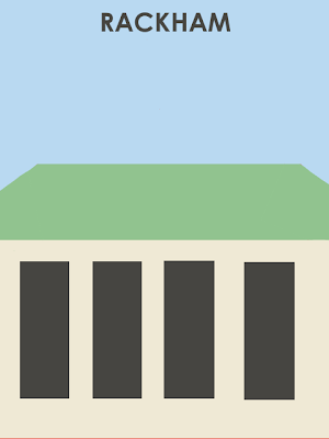
    The assignment for the fourth design create was to create a minimalist travel poster of your favorite or least favorite place. The Rackham building is my favorite building on campus, so I thought I would make a poster in it's honor. 
    This was actually a little bit difficult to make mostly because, again, Gimp is so so hard to figure out – there isn't even a tool to make a triangle shape! Some of my corners are uneven and I think the last window on the right is placed a little bit off, but this is only because I could not figure out how to fix a lot of things, even after looking at gimp for so long. Anyways, my process was fairly simple:
    1. Fill blue background
    2. Make beige rectangle, add same-size rectangles to make the windows, color them gray
    3. Make green rectangle
    4. Make angled rectangles for sides of the roof by rotating them, color in with blue paintbrush to make seamless (this was the worst part)
    5. Add text
  10. tpcm

    D3S!GN C R E A T E #3

    by
    [original image from flickr user TED Conference]So this image is pretty small but if you click on it, you can see it a lot better.The assignment for this create was to take an image of a TEDx conference and make it fictional. Since there are so, so man...
  11. tpcm

    Minimalism, Contrast, Repetition and Repetition

    by
    I think I have told you before that I am a minimalist.

    For this reason, this part of our design unit was especially enjoyable for me. I spent a lot of time looking at minimalist images on flickr, google images, tumblr etc. and I honestly couldn't pick a favorite, so I have a couple example of minimalism that I really like that I will share with y'all.


    Allard One on Flickr

    airows on Tumblr

    artssake on Tumblr

    Let's start with the first image. There isn't a lot going on here, but the contrast of the blue and red definitely defines the image. Though it is pretty simple, the bold colors show a perfect example of how contrast can help a minimalist image. This image is compelling because we don't exactly know what is going on - where are these chairs, who previously sat in them, why are they here? From the dark edges and bright colors, we get almost an eerie feeling from this photo - again exemplified from the contrast. The two red chairs also help this image because they gives us one of the main design elements discussed from Williams: repetition. This repetition helps the image by giving it a bold blast of color and, as discussed by Williams, an element of recognition.
    The next image doesn't contain much content, but I really enjoy it. Again, this is a prefect representation of Williams' discussion of both contrast and repetition. The same circles, same frame around the words, same font – repetition is a main theme of this image and ties it all together. The contrast is also very obvious. Like Williams discusses, "don't be a wimp about it"; either go big or go home. Don't contrast navy blue with royal blue, but instead contrast red with black, which is perfectly portrayed in this image.
    This last image is probably one of my favorites. While there are plenty of different colors in this picture, they are all fairly similar and are repeated throughout the image – each square has (more or less) the same color scheme as the next. There is obviously repetition throughout the image, and this consistency helps bring the image together, once again bringing a sense of recognition to its viewers. The contrast is once again obviously by comparing each square to the next, since the colors contrast and compliment each other nicely.

    All of these images are great representations of Williams' discussion of design through repetition and contrast. Each have repetition, or stick to a certain theme that evokes a feeling within the viewer, as well as a contrast that helps keep the image interesting, unique and beautiful.


  12. tpcm

    Design Create – Color Splash

    by
    Ok, so did sort-of the inverse of the project, but I think this looks better than the other way around of color-splashing. I especially like the color of the rocks - I didn't even edit the color, they're really that bright!This project wasn't too diffi...
  13. tpcm

    albums without S O U N D

    by
    I really enjoy Eric Sena's style on all of his imaginary albums in Albums Without Sound. I also think the whole process that takes place in order to make these is so unique – a great excuse to get creative. While it was hard for me to pick a favorite album cover, I did manage to find one I really liked:


    When it comes to design, I'm what you might call a "geometric minimalist" – a term I just invented. I really like shapes, lines, patterns, small details, curves...you get the idea. First of all, I think the colors in this cover are spot on. Complimentary colors (yellow and blue) obviously work really well together, so I really love how the artist chose to match these colors together (I don't know if he altered the image or not, but either way they work really well). 
    The typeface is also very interesting. I love unconventional fonts, but really don't like when they're tacky, hard to read, and unoriginal. This font is exactly the opposite: the triangles being used to make up the letters end up forming an intricate, interesting pattern to look at, the words are not hard to read, and the transparency of the letters makes them look light, pleasant and almost fragile. The triangles also work well with the large yellow one , and the smaller one reflecting in. I really love the pattern inside the large yellow triangle – it reminds me of a corner of a building in Chicago that I really like.
    I could definitely see this as a working album cover. It's pleasant to look at and beautifully simple, and I even think the artist name and album name sound completely legitimate. The relationship between the two also works really well, especially since "Yvonne Rudelatt" is an actual name that could definitely be an artist's name. 
    Great cover filled with shapes, lines, and nice, complimentary colors; the perfect recipe for a perfect design.

  14. tpcm

    W E E K L Y . S U M M A R Y

    by
    Not-so busy week consisted of:Dating Someone 10 Years Older - Audio project 1Interviewing a House - Audio project 2Images ReviewTwo Visual CreatesThis week the course load wasn't too heavy for this class, mostly because the audio creates took a bi...

ds106 in[SPIRE]