Touch the firehose of ds106, the most recent flow of content from all of the blogs syndicated into ds106. As of right now, there have been 92780 posts brought in here going back to December 2010. If you want to be part of the flow, first learn more about ds106. Then, if you are truly ready and up to the task of creating web art, sign up and start doing it.

  1. Christina Hendricks

    Making Mr. Clown look very nice

    by

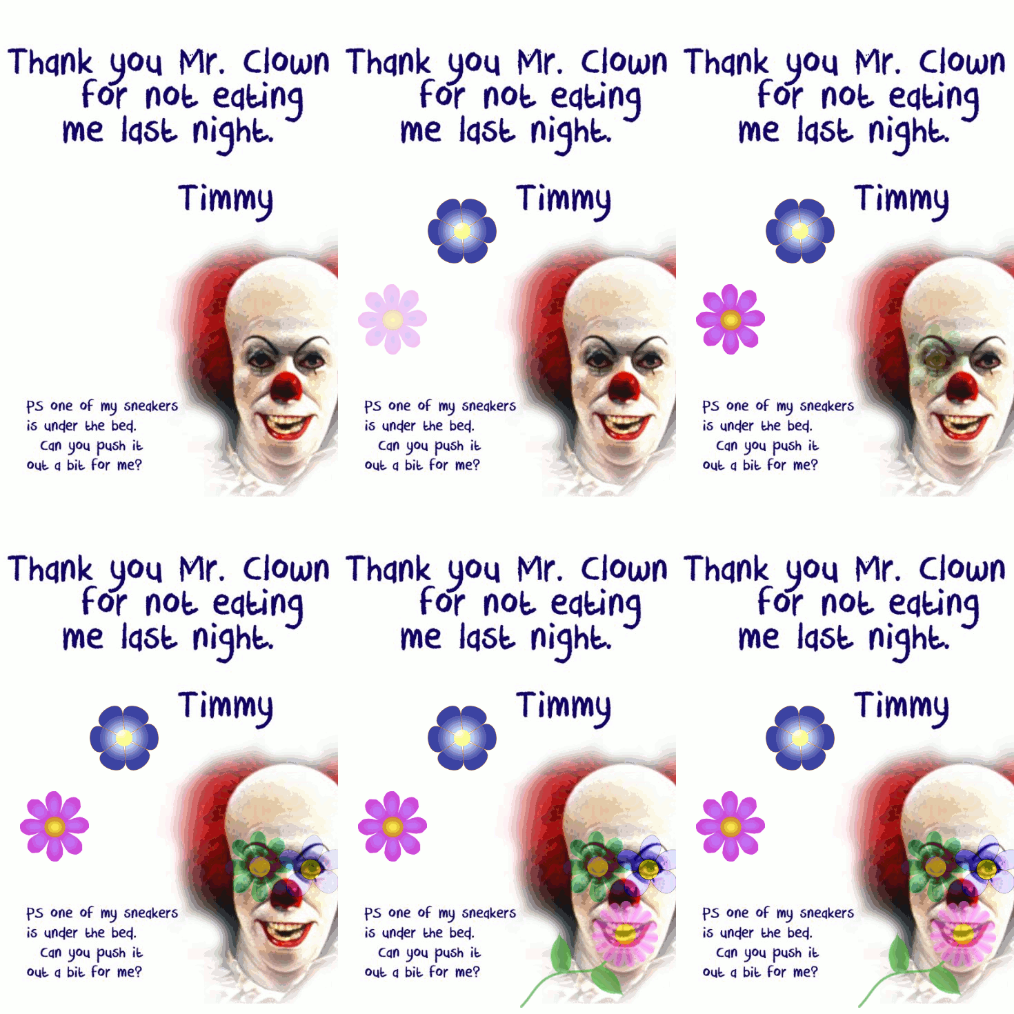
    August 2013 Animated GIF challenge #8 is "Add some flower power!"

    The idea is to make something not so nice look nicer by adding some flowers.

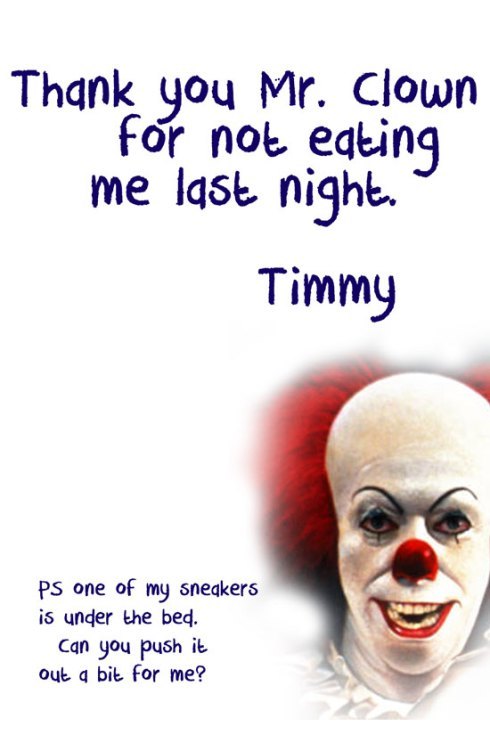
    Todd Conaway made this scary picture the other day, for a thank-you note to a childhood fantasy character.

    image

    I thought this one could use some serious flowering.

    So I made this. I think it takes some of the creepy out of him by covering his eyes and mouth with flowers. Right?

    image

    This actually took me MUCH longer than I had expected. I’ll note that in another post, because I would like some  help with a particular question about why something I tried didn’t work.

    What I did here:

    I got the flower images from a site Talky Tina pointed to in her blog about this assignment: http://www.clker.com/search/flower/1

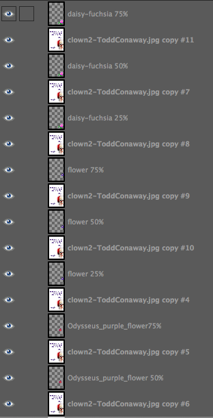
    1. Duplicated flower images three times, adjusted opacity of each so 25%, 50%, 75%. Also played with the “layer mode” on GIMP of some of them to get funky colours (the two on the clown’s eyes).

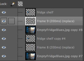
    2. Duplicated the original clown image to put under each of the first flower layers (the blue one on the left)—so a clown image under the 25% opacity of the flower, then one under the 50% and 75% opacities. Then merged down so had three layers of the clown image plus flower at different opacities. The idea of what I did is given in the screenshot below, even though it is for different flower layers. This is before merging down.

    image

    3. Duplicated three times the layer with the blue flower at 75% that had been merged with the clown image, and then put one of those under each of the next flower layers (the purple one at left, in 25, 50, 75% opacities). Merged down.

    4. Repeat with other flower layers.

    5. I duplicated the last flower layer (daisy on the clown’s mouth) several times, so the whole image with all the flowers would stay for a bit longer at the end. That worked fine until I “optimized animation for GIF” in GIMP (Filters->animation->optimize for GIF). I didn’t do that at first, but then the image was too big to animate on Tumblr. Seems it needs to be less than 1MB to animate. Optimizing it makes it MUCH smaller (this one is just over 140 KB), but it got rid of the duplicate layers at the end, so the image with all the flowers didn’t stay very long. What it did was add “combined” to each layer, though I don’t know what that means. So to fix this, I after optimizing I just duplicated the last layer a few times again. Worked like a charm.

    6. I don’t like how GIMP has been making the GIFs look all pixelated. This is probably due to the optimization stuff, and/or the GIF format? Yes? No?

    I wanted to have the flowers fade back out again like they faded in, but by the time I got this far, I had spent way more hours than I had planned, and decided this was good enough.

    I tried what seemed to me a much easier way of doing this, but it wouldn’t work like I thought it should. Next post: please help me figure out why that didn’t work!

  2. Christina Hendricks

    So I was out of town for a week, and when I got home I opened…

    by

    What the H-E-double-L is THIS?!


    Merging a shelf/Jim layer onto a fridge background layer.

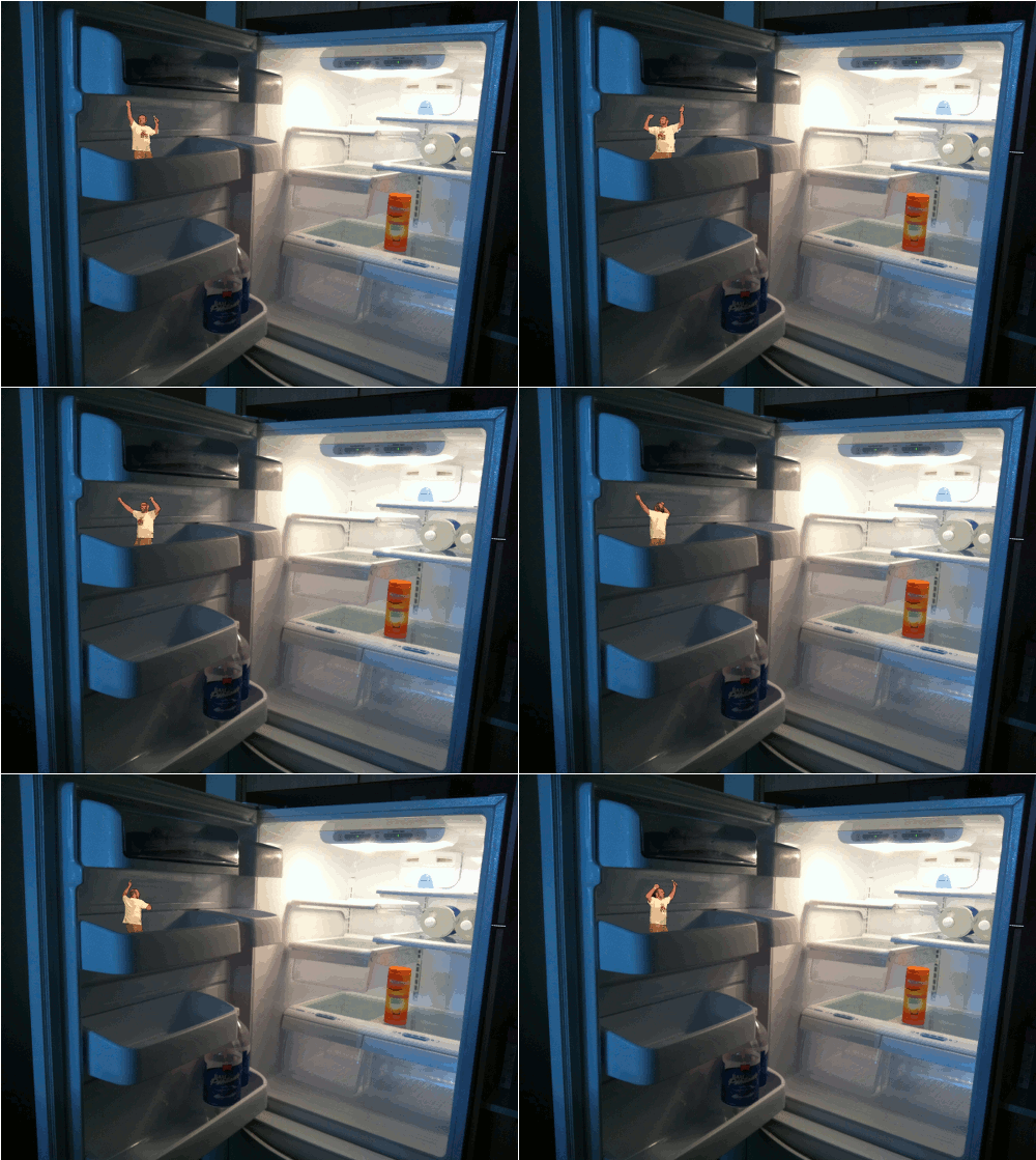
    So I was out of town for a week, and when I got home I opened the fridge to…what the H-E-double-L is THIS? Jim Groom in my refrigerator? Okay, I’m a bit creeped out now. At least he seems to be having a good time. Maybe he ate all the food and just left the sparkling water and the Metamucil.

    This is the Dancing Jim All Over the World ds106 assignment, as part of the August 2013 GIF challenge created by Talky Tina.

    This one was not as difficult as I feared it might be, in large part thanks to some very helpful instructions posted by Rockylou and Brian Bennett.

    I used an earlier image I made for a ds106 daily create as the background and foreground for Jim.

    The process

    (You can see screenshots of some of this by clicking the tiny arrows next to the image at the top! Or clicking on the image, which will give you access to all the images in the post)

    1. Opening and duplicating the background image

    I opened (as layers) the wireless mic version of the Groom template that Talky Tina created into GIMP. Then I opened (as layers) the almost-empty-fridge-blues image I had from the earlier daily create assignment.

    I put the fridge image on the bottom so that I could see the Jim layers above it—this made it easier to see where I needed to scale and move Jim’s layers.

    I then duplicated the fridge image so that I had the same number of fridge layers as Groom layers.

    2. Scaling and moving the Groom layers

    There were 9 layers in the Groom gif, and in order to move them together and scale them together, I had to do two different things, as explained in an earlier post.

    In order to scale all the Groom layers together (rather than one by one) I put them all into a "layer group" (click the link to see how to do this). Then I could scale them by right-clicking (or control-clicking) on the layer group folder and choosing “scale image.” I made Groom the right size to fit into the fridge shelf.

    But I also needed to move all the layers together so they’d be in the right place. Unfortunately, due to some strange quirk of GIMP, you can’t move layers together in a layer group. Instead, you have to "link" them. Then you can move them all at the same time.

    3. Creating a foreground in front of dancing Jim

    I already had 9 fridge layers to act as background for the Groom layers, but now I needed to create a foreground for him too. To do that, I duplicated the fridge layer one more time, and then used the “lasso” or “free select” tool to select the shelf that would go in front of Jim.

    I then created a layer mask on that image (go to Layer->Mask->Add layer mask) and clicked “selection” in the dialogue box. This made it so only the shelf was visible and the rest of the image was transparent. In GIMP you also need to “apply layer mask” to the image after adding it. You can do this by clicking on the layer with the mask, and going to Layer->Mask->Apply layer mask.

    I needed 9 of these foregrounds as well as 9 of the original image as backgrounds. So I just duplicated the image that had the layer mask applied.

    4. Putting Jim between the foreground and background, and merging

    I first put a fridge layer under each Groom layer so that each Groom has a background. Then I put a fridge shelf layer above each Groom layer, so each Jim has a foreground.

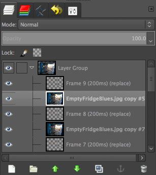
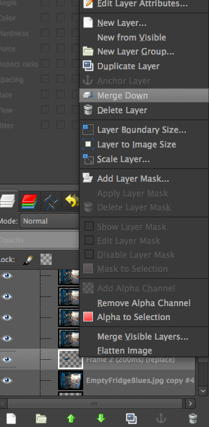
    Time to merge down. First, I merged a fridge shelf layer with a Groom layer. Select the top layer and right or control-click to get the dialogue box and choose “merge down” (see screenshot). Then, I merged the fridge shelf/Jim layer with the fridge background layer beneath it using the same process. And repeat for each threesome of shelf, Jim, fridge.

    5. taking layers out of the layer group

    You can’t animate the layers in GIMP if they’re in a layer group, so you have to take them out. You can do this anytime after scaling and moving them, but I kept them in for awhile just to make sure they were in the right place.

    Move the layers out by just clicking and dragging each to the top or bottom of the layer group, keeping the same layer order. Then you can delete the layer group by clicking on it and control- or right-clicking and choosing “delete layer.”

    6. Changing the animation speed

    Jim was dancing too fast at first, so I exported as gif again and changed the dialogue box on export to read 200 millisecond delay between frames. That got him about right, I think!

    Now, if only I could get my act together and add some music! But I’d have to do it in WordPress, I think.

    P.S. I have learned over the last couple of GIFs that if you put one on Tumblr over 1MB, then it won’t animate on the blog. It will animate when you’re editing the post, but not when it shows up on the blog. At least not with my theme! Even 1.1MB didn’t animate. Had to make it a smaller image.

  3. Christina Hendricks

    Who is really running the show? Here is my headless self (see…

    by


    Who is really running the show?

    Here is my headless self (see also here)—though actually, it’s less headless than showing some other head hidden behind mine.

    Truth be told, who is really running the show is my 6-year-old son, but since I don’t like to show his image in public on the web, I used one of my cat Snapper instead. I was on sabbatical in Australia for a year, and during that time my cat was staying with my mom in Idaho. I’m there right now to visit and take Snapper home.

    Talky Tina has started an August animated GIF challenge for ds106, and given how long this one took me, my chances of doing one every day are very, very low. But I’ll do what I can!

    This was really, really challenging for me. I honestly wasn’t sure how to even start. And it didn’t turn out how I’d like—the wicker chair behind my head got animated at the top of my head and I honestly can’t remember how or why I did that. And my chin doesn’t disappear until Snapper’s head comes through. Can’t recall why that happened either.

    The process

    Here is a lesson for me (and others): if you’re going to blog about your process (which beginners like me sure do like because we learn a lot that way), then it’s good to take notes and screenshots while you’re doing the process rather than waiting until the end. Because I tried so many different things just to see what they would do, that by the end I wasn’t really sure what I actually did do that worked. And since I merged layers down after making layer masks and such, I no longer can get screenshots that show the process before the layers were merged.

    Here’s what I remember—some notes I took last night right after I finally got this to work. I’m not sure it entirely fits what I did.

    I used GIMP for this project, and two pictures: one of me, and one I took of Snapper yesterday.

    1. I used the “lasso” or “free select” tool to do a rough selection around Snapper’s head. Then I used “create layer mask” on his layer, “to selection,” so that just his head was visible and the rest of the image was transparent. I also did the same thing around my head so that my head disappeared but the rest of the image stayed, so that then I had an image with my body and Snapper’s head. I had to move Snapper’s layer a bit to make his head fit into the “hole” I had made in my picture’s layer.

    But that didn’t end up working well, because Snapper’s face shape doesn’t fit mine, of course, so I had to figure out how to get the wicker chair background behind Snapper’s head.

    2. On a layer with my image, I created a background of wicker chair over my head with the clone tool. That was tricky—getting it to look reasonably realistic. I am still not entirely happy with that, but after spending a lot of time on it, doing it over and over, I finally just went with what I had.

    What I can’t remember is how I determined how big to make this cloned wicker background so it would show up behind my head when my head disappeared and Snapper’s appeared.. Whatever I did, it didn’t fit exactly—more of the wicker chair animates than needs to.

    3. I then put the image of me with wicker over my face under the Snapper head layer. Next, I made several Snapper head layers, each with a graduated opacity: 25%, 50%, 75%, 100%. I put the image of me with wicker over my face under each one, so that when Snapper was partly transparent, the wicker showed through. I then merged the Snapper head layers down onto the wicker chair head layers.

    4. To do the same thing with my own face, I made a different layer mask on my layer than I did originally—one that allowed my head to show through and the rest of my body to be transparent. I put that one on top of the image with wicker where my head should be. I then created several versions of my head layer, again with different opacities: 100%, 75%, 50% (I just went to 50 on this one, not 25), and put the wicker char background layer under each of these—again so that when my head fades out there is wicker chair underneath it. I merged each “head” layer with the “wicker chair” layer under it, so each layer had my head at different opacities with the wicker chair underneath it.

    5. I ordered these layers so that it started off with my full opacity image, then my head fades out 75%, 50%, then Snapper’s head appears 25%, 50%, 75%, 100%. Then I just duplicated layers so that the process went backwards in reverse order. And tried animating.

    6. But GIMP animates from the bottom of the stack up, apparently (at least it did with this one…does it always? I don’t recall), so it started off with Snapper’s head, which faded out to mine, and back. So I had to reverse the layers. Searching on the web, I found that there is a tool in GIMP for doing this automatically instead of moving layers one by one (which I now vaguely remember doing at some point on another project). You just go to Layer->Stack->Reverse Layer Order, and voilà! It animated in the right order!

    7. Lastly, I had to play with the timing of the frames so it animated a bit slower than the default. When you “export” and save as a GIF, you get a dialogue box that gives you a choice of milliseconds to delay between frames. It was at 100, but I changed it to 300. Then I had to click the check box saying to use that delay between each frame.

    I expect there is an easier way to do this that wouldn’t take so long. If you know of one, please let me know in the comments!

  4. Christina Hendricks

    Turn that frown upside down! This one has a bit of a story…

    by


    Turn that frown upside down!


    This one has a bit of a story behind it.


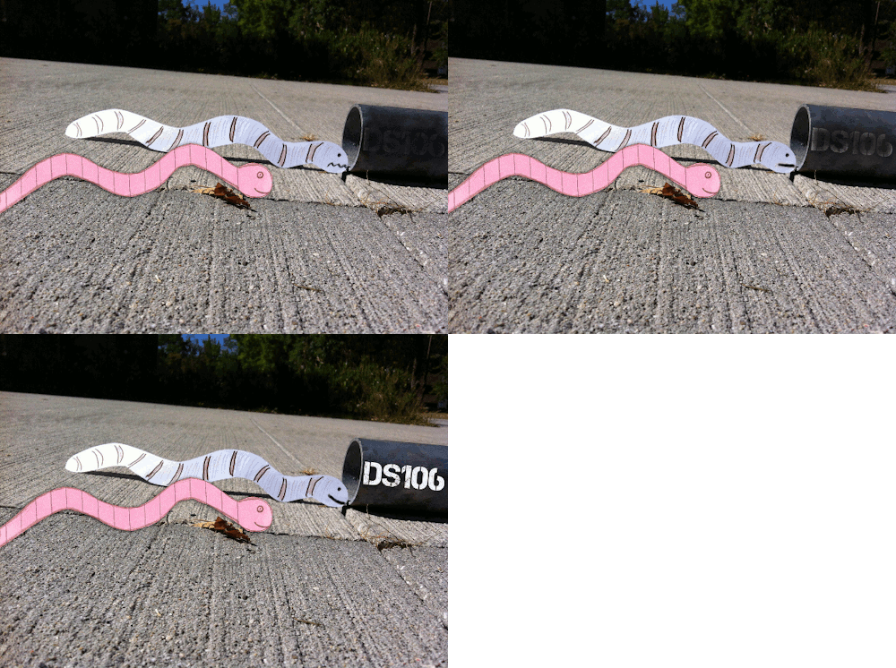
    First, there was a ds106 daily create that asked us to make a photo from the perspective of an earthworm. Here’s mine.

    Then there was a ds106 daily create that asked us to make a photo story with a paper cutout in it. Rockylou made this one, which inspired me to make a worm one too, relating it back to my “perspective of an earthworm” shot.

    All fine and good, except then Mariana Funes suggests we make the worms mascots for the Headless ds106 course in the Fall.

    So of course we play along. Rockylou pulls her worm out of the trash and puts our two worms together in a photo. Nice! Except mine shouldn’t have an unhappy face when going into ds106.

    So I decided that the more it became clear to my worm that where it was headed was ds106, the happier it became!

  5. Christina Hendricks

    #ds106zone Animated GIF trading cardā€”Young Martin Sloan,…

    by


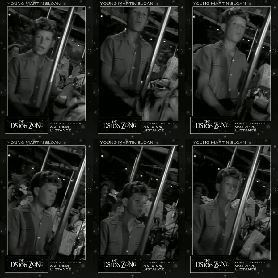
    #ds106zone Animated GIF trading card—Young Martin Sloan, from the episode, “Walking Distance.”

    ————————————————————————————————

    HELP! This animated gif card is 300 x 450 pixels, but Tumblr makes it into something huge! Any help on how to fix that?

    I fixed it! It was something in my theme, called “scale images.” I now see why—otherwise, you get a black space around the image. But that looks better than the nasty pixelated thing I got when it scaled.

    ————————————————————————————————

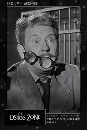
    I created a #ds106zone trading card earlier for Henry Bemis in “Time Enough at Last” (that one is also 300 x 450, but Tumblr made it huge as well), and I really wanted to make one that was animated. Finally, I managed it!

    I had some extra hours in an airport due to a delayed flight, and I thought I’d just kick this one out quickly, since I already had the video bit I wanted. Ummmm…no. That I thought I could do it quickly shows how little I still understand of gifs and layers in GIMP.

    The process

    First, of course, I needed to make an animated GIF. I used the process described here, using MPEG Streamclip and GIMP. That’s really quite simple, once you get into the programs. You don’t need to know anything about either program to make a GIF this way—just follow the instructions.

    I worked really hard to try to get Young Martin’s chewing animation to be smooth, as if it were just him chewing forever, but there’s still a blip. It was the best I could do, after numerous selecting of clips!

    Then, I downloaded the ds106zone trading card template that Andrew Forgrave made, here. He’s got a nice set of instructions there that work very well for the still image trading card. But the animated trading card is rather more complicated, as I discovered.

    In managing to do this, the following posts were invaluable: Andrew Forgrave’s post on scaling multiple layers in GIMP, and Jim Groom’s tutorial on making an animated GIF trading card.

    To put the template together with the GIF in GIMP, here are my steps, following the instructions in the two posts linked above:

    1. I first made sure the template layers were on top of the GIF layers.

    2. I changed the text in the template to give the right character name, season, episode, etc.

    3. Then I merged all the template layers into one layer, using the “merge down” feature in GIMP. Select the layer you want, then use Layer->Merge down (or, on a Mac, use control-click on the layer, and select merge down from there). This is because it’s necessary, according to Groom’s tutorial on making an animated GIF trading card, to put a copy of the template layer above each of the GIF layers, and I needed just one template layer to do that.

    4. The GIF layers were not the right size for the template, and I had to do two things.

    — First, I scaled them so they were big enough to fit into the template correctly. I followed Andrew Forgrave’s scaling instructions here (the post linked above). I had to create a layer group and put all the GIF layers (21 of them) into it, then scale the group itself. I selected the layer group and went to Layer->Scale Layer. That scaled all the layers in the layer group at once, which was handy. Of course, I had to move them all into the group individually in the first place, which is not so handy. Apparently GIMP doesn’t allow you to select multiple layers at once?

    — But when the GIF layers were scaled, they weren’t fitting into the template correctly, so I had to move the layers to centre them better. But apparently you can’t use the move tool on the layer group even though you can scale the layer group. It didn’t work for me, anyway. So after some poking around on the web I found that one could link layers and move them together that way. Next to the “eye” icon to the left of each layer there is a space to the right, and if you move your cursor over that and click on it (it looks like a box when you move your cursor over it, but otherwise is invisible!) then you get a “chain” icon. Click for all the layers you want to link together. When I linked all the layers within the group together, I was able to move them all as one. I don’t know why that didn’t work using the layer group. But maybe I was doing something wrong.

    — And yes, I did check to see if you could scale the layers together using the linking function instead of the layer group, and no, that didn’t work for me. So I had to scale using a layer group and then link the layers to move them as one. Again, maybe I’m doing something wrong, but that was the only thing that worked for me.

    5. When I tried to use Filter->Animation->Playback, though, the GIF would no longer animate. I had to take the layers out of the layer group (one by one, again) to get it to animate. Not sure this is absolutely necessary, but at least it worked.

    6. Following Groom’s instructions for an animated GIF trading card, linked above (and also here), I duplicated the template layer and placed a duplicate of it above each GIF layer.

    7. Again, following Groom’s instructions, I then merged the template layers down into each GIF layer, so each GIF layer was the image layer plus template. I selected each template layer and used Layer->Merge down (or, again, on a Mac, cntrl-click on the template layer and use Merge down” on that menu that pops up). So then, I had 21 layers total, which was the same number of layers my original GIF had, only now each layer also had the template on it.

    8. This should have been it—voila, fini, etc., but I realized then that my GIF layers were too big for the image, because when I scaled them to get the height right, the width was too big. I cropped the layers using Layer->Layer to image size. I did this one by one, though maybe if you used the “chain” function you could do it together? I don’t know.

    9. Oh yeah—one more thing. Andrew Forgrave says in his post with the ds106trading card template that the template is designed to output at 300 x 450 pixels, so he suggests using a “save for web” option and resizing it then. I could find no such option in GIMP, especially since in GIMP you have to export it rather than save it in order to get a .gif file. So instead I just scaled the whole thing before exporting it as a GIF. I used Image->Scale image and set the width to 300 and height to 450 (automatically sets the height correctly if you set the width, as long as the “chain” icon next to the numbers in the scale dialogue is connected together).

    And THAT is voila, fini!

  6. Christina Hendricks

    What we should have said: An alternative ending to The Twilight…

    by


    What we should have said: An alternative ending to The Twilight Zone, To Serve Man


    I got the idea for this video from the ds106 alternative ending video assignment, except that one asks you to create a video, while I just did a mashup of other Twilight Zone episode scenes instead.

    I wanted to do something that would use most, or ideally, all, of the episodes that all of us were to watch in the ds106zone (the May/June edition of ds106), sort of as a way to end my video work for the class by using things we had all seen. So I found clips that would work as what humans might have said and done to the Kanamits in order for “To Serve Man” to have a different ending.

    Unfortunately, I couldn’t clips from every one of the episodes that were assigned for all to watch. So, for example, there is nothing here from “Eye of the Beholder,” or “Nightmare at 20,000 Feet.” I can’t recall if there is any other episode we all were to watch that didn’t make it in. I also added in some scenes from a few episodes I watched on my own, including “Howling Man” and “The Lonely” and “Bewitchin’ Pool.”

    The process was fairly easy, though time consuming—rewatch episodes and decide what to use, then get the clips and import them into iMovie, where I put them together. Usually I didn’t include any transitions; only in one place did I use a cross dissolve—where Michael Chambers is lying in the spaceship at the beginning, and there is the wavy dissolving of his scene, showing a flashback. I used a cross dissolve to make the transition to the next clip smoother. Otherwise I just put them together with no transitions (what’s that called…jump cut?).

    The only problem I ran into is that the video quality on some of the clips is no good. I think that’s because I had to import them into iMovie as “large” files rather than “full size,” because my poor little laptop is nearly completely full and I couldn’t make two copies of all of the clips (one original, one in iMovie) full size. The one from “The Invaders” at the end is especially egregious, though in a way it looks kind of cool, like comic-book style. When I get back home to Canada and have a computer with more space, I can do better video work!

  7. Christina Hendricks

    Tina and Telly: A story of true friends This video is a remixed…

    by


    Tina and Telly: A story of true friends

    This video is a remixed version of, and a response to, Brian Short’s "Tina and Erich: A Love Story."

    Though Brian’s video is great in many ways, I thought a truer video would be one that showed how lovable Talky Tina is, and how Telly Savalas would, behind the scenes, love her and do nice things for her. That’s a real love story, not that mean one Brian Short did.

    My goal was not only to make this video much nicer to Tina than Brian’s, but also even cheesier. Thus, I added super cheesy music and video effects.

    The process

    I took Brian’s original video and imported it into Apple iMovie, then cut out some parts by selecting them and choosing “split clip” (under the “clip” menu). I then selected the parts I wanted to cut and used the “delete” key.

    I also wanted to make some of the clips in the original video run backwards to create the effect that Telly is actually being nice to Tina, not mean. I selected the parts I wanted, then used “split clip” again to separate them. Then, I clicked on the little “gear” symbol on the clip itself, and, under “clip adjustments,” ticked the “reverse” box.

    I played around with slowing some of the clips down through the same route—under the “clip adjustments” section after you click on the “gear’ on the clip there is an option for slowing the clip down by any percentage you choose. You can also choose “slow motion” under the top “clip” menu in iMovie, but that gives you fewer options for speeds.

    Brian’s video had some great repeats of clips, in which the same thing is done a few times, or the same shot is shown several times, moving in closer each time. I tried to replicate something like that in my own version, with a shot of Telly. I added a repeat of one of the clips of him, with the cigarette, by just selecting the clip and copying/pasting it right after the first one. I also used a “cross dissolve” transition between them to help it look smoother rather than a jump.

    I did it originally three times, but that was a bit much, so instead I chose one repeat plus a “Ken Burns” effect on the last shot of the clip. This was done by selecting part of the clip, using “split clip” again, and then clicking on “crop, rotate and Ken Burns” on the middle part of the screen, right below where you edit the project. I had to play around with that a few times because I needed the “start” of the Ken Burns pan to be in the same place as the end of the previous clip, or the shot would jump going into the Ken Burns effect.

    Finally, I used a special effect on the last clip: under the “clip” menu at the top, click on “special effect.” I used “flash and hold last frame,” which is how I got the last clip of the video to look as it does.

    Of course, I added a few cheesy transitions here and there, lengthening them for effect as well.

    Music

    This was actually the part that took the longest. I did most of the editing on the plane to Northern Queensland (from Melbourne, Australia) where I’m on holiday right now—3.5 hrs. Then I spent two evenings looking for music. I wanted something really sweepingly emotional and over the top, something that would fit with the repeated shots/clips that seem overly romantic in the video. I just couldn’t find anything that fit exactly, so ended up with something that is a bit too happy and bouncy in comparison to what I was looking for.

    I was only looking in two places for music at first:

    Vimeo Music (which has some CC-licensed songs, and others that cost $1.99 for a license that allows you to use it for one project only, and http://incompetech.com/music/royalty-free/, which has music by Kevin MacLeod, who seems to compose music for film and stage projects (that’s a guess).

    After an internet search I also found the Free Music Archive, which has lots of great music, but I didn’t find anything there either.

    So of course, I turned to Twitter and asked people where they like to find free music, using the #ds106 and #ds106zone hashtag. I got several very useful suggestions from @cogdog, @techsavvyed, @scottlo, @indieschoollib.

    ccmixter.org

    jamendo.com

    archive.org

    soundcloud.com (which has some cc-licensed music)

    And Ben Rimes has a nice page with several resources for “copyright and royalty-free media.”

    The song I used was from ccmixter.org, called “We are in love,” which says it’s by “nhomas, featuring Shannonsongs,” though I don’t quite know what that means.

    Questions:

    1. The music I used is licensed CC-BY-NC, so I think that means I should license the whole video that way? Right?

    2. But the only option on YouTube for licensing was CC-BY or “standard YouTube license,” so I chose CC-BY and tried to make it clear on the  description that the video is licensed CC-BY-NC. Why doesn’t YouTube allow more CC options? Or does it and I just don’t know how to find them?

    3. The video quality of my version is significantly worse that Brian Short’s original. I used the “export” function on iMovie and exported it as a “large” movie. Maybe it’s because I downloaded from YouTube and then edited and then re-exported, and it loses quality that way?

    P.S.

    I have another video project in mind that requires pulling numerous clips from Twilight Zone episodes, but with the very spotty wifi and phone data service I’m experiencing while on holiday, I don’t think I’ll be able to get those clips onto my computer well until I get back home to Melbourne next week. So I’ll be a bit behind in getting my second video project done!

  8. Christina Hendricks

    ds106zone LoDown #31

    by

    I had a Skype conversation with Rocky Lou last week to do a reflection on my experience in the ds106zone, and I decided to add some more audio and make it a full LoDown episode.

    I wish I could say that I was sitting outside in the nice warm sunshine while talking with Rocky Lou, but no. It’s been rainy and cold here in the Australian winter, and I just recorded some ambient sounds from outside and added them to our conversation—a little trick Rocky Lou taught me to help cover up any places where you’ve edited pieces of the audio out. I thought it might be useful for others to hear that piece of advice. It worked really well.

    At first I recorded ambient noise outside on my back patio, but I didn’t like the sound very much. Lots of just boring old hum/city noises and not too many birds. So this morning I stopped at a local park after dropping my son off from school and recorded there. I managed to record an Australian magpie, the sound of which really reminds me of being here…so I’m quite happy about that.

    Rocky Lou and I talked for about an hour, so I had a lot of editing to do to get this LoDown down to less than 15 minutes. I don’t even want to say how much time I spent on this. Let’s just say I have even more respect than I already had for Scottlo, doing it every day for so many weeks. Wow.

    I had to upload this as an .aiff file because the mp3 sounded really weird for some reason—sort of distorted, and with a weird echo. I didn’t have time to figure out what was going on before I had to catch a plane to leave town for a week.

    Update a month later: Just looked back at this post and realized I never wrote down what Talky Tina told me on Twitter as a way to help solve this bad-sounding MP3 problem. She said that when you export to MP3 you get a dialogue box and you should set the kbps to 192 for better quality MP3 sound. I haven’t tried that yet, but wanted to write it down for future reference for myself and others.

    Amateur tip: don’t record your own voice when your sinuses are stuffed up.

    Here’s the intro video I did for ds106zone, which I play a couple of clips from in this LoDown.

    I got the music from the Vimeo Music Store. At first I tried to find things for free from http://incompetech.com/music/royalty-free/, but I couldn’t find anything I like. So instead I downloaded “Infinity Bitch” by Los Halos. Cost me $1.99 U.S., but I think the song works. Too bad the licenses on Vimeo Music only allow you to use the songs for one project. Grrrrr.

  9. Christina Hendricks

    ds106ā€“audio assignments

    by
    In case any readers of this blog are interested in what I’m doing for ds106 lately, all my audio work from the last week can be found here, including a radio play written and produced by a great group of open online participants in ds106! Share on Tumblr
  10. Christina Hendricks

    ds106 Commercial–AgainAgainAgain

    by


    For the radio play I helped to create, I also decided to make a commercial—we had two commercials in our play, both of which were made by one of the members of the group.

    I decided to make a commercial for ds106 itself. I didn’t even look to see at the time if there was such an audio assignment; I just looked now and there is not, so I think it’s time to create one.

    My first thought, and the one I went with, was to use various clips from what others have done or created in this summer 2013 version of the course, the ds106zone. So I started thinking about what I had heard during audio week, and what would fit an ad for ds106.

    Then I just added in some narrative to suggest reasons why one might want to participate in ds106, including the ability to make gifs, make audio, and get smack-talked by Jim Groom. I also wanted to highlight that it’s something you can do anytime, not just during a specified time period.


    The process

    I used Audacity for this project, and downloaded the audio I wanted to use from other participants through Soundcloud (see credits, below).

    I then used Soundflower and Audacity to record some audio from Jim Groom’s ds106zone LoDown #18, in which he talks a great deal of smack about some recent audio work. That part was really fun. I had a hard time picking and choosing what to include, as there was so much smack talk available. I decided not to pick on any one person and what he said about their audio, and just to combine a few of his reactions, such as “what?” “what is going on?” “I mean, come on!”—hoping thereby to capture the flavour of what he was saying without singling out any participant’s work.

    Finally, I used Soundflower and Audacity to record some audio from Scottlo’s ds106 LoDown #15, which included a Scottlo Drive By Counting Lesson by Andrew Forgrave, which asks Scottlo to learn to count by twos to twenty in Hindi. I just took out the “can you dig it?” and “again, again, again” portions; the first seems to be a recurring theme in ds106 radio, and the second is something that fits, to me, ds106—one can keep doing it again, again, again.

    During that counting lesson, Scottlo says at one point: “you can do it at home,” meaning his listeners could try to count along at home with him. But it fits perfectly as an ending for the ad, since, of course, one can and often does do ds106 at home.

    I recorded my audio first with the mic that is on my Apple earbuds, but I didn’t like the sound quality. I didn’t think I had any other choice, so I went with it, and got version 1 of this commercial.

    But when I sent out a tweet saying I needed to buy a decent mic, my partner showed me that he had already bought one last year. Cool! So I used that for this second version, and it sounds much better, I think.

    Credits

    Here are sources for the elements I used in this ad—thanks to all of them! I love building on work by others!

    ds106 bumper mashup by Rochelle Lockridge soundcloud.com/rochelle-lockridge/ds106-bumper-mashup

    “Moonglow” by Brian Short soundcloud.com/brian-short/moonglow

    ds106zone LoDown #15 by Scottlo scottlo.com/?p=1614
    — which included audio from “Scottlo Drive By Counting Lesson,” by Andrew Forgrave: soundcloud.com/aforgrave/scottlo-driveby-counting

    ds106zone LoDown #18 by Jim Groom: scottlo.com/?p=1648

    Parts of The Twilight Zone, "It’s a good life" episode.

    License

    This commercial is licensed CC-BY-NC-SA, since one of the elements used in it is licensed as such. This blog post is CC-BY, though.

  11. Christina Hendricks

    Not just for life, but for existence

    by

    Here is a radio play written, recorded and edited by five open, online participants in the May/June edition of ds106—the ds106zone, entitled Not Just For Life, but For Existence. Or perhaps, Not Just #4life, but #4existence.

    Hint: Listen with headphones so you can hear it in stereo, and see if you can hear what we did with the L/R channels during one of the scenes.

    Collaborators:

    Brian Bennett (blog, twitter)

    Paul Bond (blog, twitter)

    Andrew Forgrave (blog, twitter)

    Ben Rimes (blog, twitter)

    Christina Hendricks (that’s me). (twitter, plus a different blog than this one)

    Special thanks to Scottlo for his major part in the play!

    The Story

    Nope. I’m not going to give you the story here and give it all away! You need to listen to the play itself.

    I will say that it may not make as much sense to those who are not participating in the ds106zone as to those who are or did. I’ll just say this:

    • All the UMW students in the course had to create a radio play in groups, and the open online students could choose to do so and form their own groups, which we did.
    • There is/was a daily podcast for the ds106zone course, called the #LoDown, done by Scottlo, who is living in Saudi Arabia. (Search for “LoDown” on Scottlo’s radio blog for the episodes). There has been a bit of discussion in the course when Scottlo said in one of these that it’s a fair bit of work to produce them each day, and he invited others to fill in as guests sometimes (which they have).
    • Scottlo came up with the idea of participants doing a radio play, and in the process he introduced us to the radio dramas of Arch Oboler. You can hear many of them on the internet archive, here. We included part of one of them in our play.
    • Jim Groom, the instructor for ds106zone, talks a lot of smack in ds106, including to Scottlo for whining about doing a LoDown every day and trying to get out if it by getting guest hosts. Groom himself did a LoDown episode, during which he talked a good deal of smack about certain assignments that had been done that week.
    • Talky Tina has been quite a presence in the ds106zone, on twitter and in her blog. She doesn’t like being called “creepy.” Ben has been calling her “creepy” on twitter (e.g., here) and creating pictures and poems about her (in response to her poem about him) that bug her and now she has taken the gloves off. If anyone knows who is “behind” Talky Tina, they’re not talking. 
    • Hank Soda is a major player on ds106radio. I think he may be a character that someone else plays, but I honestly don’t know.

    Process:

    We came up with the idea and wrote the script collaboratively, using Google Docs and also a collaborative scriptwriting site called “Plotbot” (http://www.plotbot.com).The Plotbot site worked fine—it allowed you to use a script structure, with dialogue, actions, transitions, etc., and it allowed anyone in the group to make changes. It kept track of versions and comments, though I couldn’t get the links to previous versions to open for some reason.

    At the moment, though, the plotbot website seems to be down. Good thing that didn’t happen while we were recording or editing! Let that be a lesson: be sure you have backup copies of your work in case the application you’re using goes down, or loses data, etc. I didn’t make a backup of our script, which was stupid. Lesson learned.

    We recorded our parts together, in a Google Hangout—Brian recorded it, using the method he discusses here. Then Scottlo recorded his separately. We found sound effects on the web (see below for attributions) or recorded them ourselves. I found some music through this website, which provides soundtrack music for audio and video projects with a CC-BY license.

    Then it was time to edit and put sounds and music together with dialogue. We distributed this work by scenes or sections, with one person trying to do a whole scene so the mp3 file could just be uploaded to a shared dropbox folder.

    That didn’t work with the middle scene, though, which was quite long—I did a lot of that one, but had to stop at 2am one night and hand it off to Brian. But that caused some difficulties, though, because I had to give him the Audacity files (rather than an MP3, say), which are very, very big. My computer spent all night trying to upload them to dropbox, and failed. Brian then suggested zipping the files (duh!), which only took 3-4 hours to upload. But it worked, and he was able to finish the scene and put all the scenes together.

    I don’t know how much time others spent editing, but let me say it was a very long process for me, much longer than I expected. I spent at least 10 hours doing the editing and mixing for the music & narration in scene 1, some of scene 2, and all of scene 3. I really, really enjoyed doing it, though. I spent time not only timing the sound effects with what was going on, picking the right parts of the sound effects, etc., but also adjusting levels during our group conversation in scene 3 so that the quieter voices came up in the mix more. I also played around with ways to distort Scottlo’s voice when he starts to fade out and fall asleep; I wanted it to get all choppy like it was breaking up, but I didn’t know how to do that and ran out of time to try to figure it out.

    I found that I have a passion for this stuff, that I really, really liked doing the mixing and editing. I didn’t mind spending a lot of time, though I certainly haven’t gotten much sleep over the past few days.

    Thanks

    A huge thanks to all the members of this group, who all contributed to the project in various ways, from helping to write the script, to finding/recording sounds, to making commercials, to editing. We all rock.

    And special thanks, again, to Scottlo for agreeing to record some material for our play, even though he said he didn’t have time to participate in making the play in a deeper way. Your role was pivotal!

    License

    This radio play is licensed CC-BY-NC-SA, partly by agreement of the participants, and partly because one of the elements in it is licensed as such.

    Attributions/Credits

    Many of the sound effects came from the freesound website, and many of those were licensed CC0 (more or less public domain; no attribution required). The ones that do require attribution are listed below, along with some other credits.

    Sound effects:

    1918 mantel clock ticking, by daveincamas:  http://www.freesound.org/people/daveincamas/sounds/27086/


    Ship’s horn, by inchadney:  http://www.freesound.org/people/inchadney/sounds/157284/


    Bird chirping (used for Twitter sound), by jppi_Stu: http://www.freesound.org/people/jppi_Stu/sounds/130233/


    Water filling up glass from faucet, by Ch0cchi: http://www.freesound.org/people/Ch0cchi/sounds/15287/


    Mouse clicks, by Eelke: http://freesound.org/people/Eelke/sounds/158056/


     Computer gibberish, by lysander darkstar: http://freesound.org/people/lysander%20darkstar/sounds/60136/


    Radio static, by digifish music (www.digifishmusic.com): http://freesound.org/people/digifishmusic/sounds/74929/


    Chair squeaking (when sitting down), by MaxDemianAGL: http://freesound.org/people/MaxDemianAGL/sounds/120174/

    Music:


    Title music (beginning and ending): Phantasm, by Kevin MacLeod (http://incompetech.com)

    In Scene 2, over parts of Scottlo’s dialogue: Darkest Child, by Kevin MacLeod (http://incompetech.com)


    Other


    Scottlo LoDown ending from this episode (#19): http://scottlo.com/?p=1655 

    Scottlo LoDown beginning from this episode (#15): http://scottlo.com/?p=1614

    Beginning of Arch Oboler radio play, “Where are you?”: http://archive.org/details/otr_devilandmro

    Talky Tina commercial by Paul Bond

    Radio static plus the songs “Twilight” (by The Band) and “Twilight Zone” (by Golden Earring), by Paul Bond

    DS106 commercial by Christina Hendricks
  12. Christina Hendricks

    Bird Call for Martin Sloan

    by

    This assignment for ds106 asks for a “bird call” one might use to attract a particular character (such as someone from a film, tv episode, book, or other narrative). I made one for Martin Sloan, the lead character in the Twilight Zone episode entitled “Walking Distance.” 

    I cheated a bit, b/c it’s only supposed to be 30 seconds long, but it’s nearly 1 minute. That’s b/c I added a bit onto the end that wouldn’t attract Sloan, but does indicate that “you can’t go back” (see below).

    I chose this project because I wanted to practice getting sound effects, knowing that I’d be working on a radio play for ds106 (which I did, and it is just now finished…more on that later!). This was a great way to get to know the freesound.org site and learn to put sounds together to tell a story without any words.

    The “Walking Distance” episode

    (WARNING: Plot spoilers ahead! If you don’t want to see what happens in this episode, don’t read on!)

    Martin Sloan is a 36-year-old ad exec (according to the Wikipedia site linked above…I can’t remember exactly what he said in the episode his profession/title is) who ends up walking from a service station to his hometown one afternoon while waiting for his car to be repaired. (It’s “walking distance” from the station.)

    When he gets to the town (“Homewood”) he discovers that he has gone back in time to when he was a boy, 11 years old (if I remember his age correctly). He meets and talks with his boyhood self and with his parents. He is especially attracted by the good memories of summer as a boy in his hometown, as a contrast to his current hectic life in New York City.

    In a pivotal scene, his boyhood self is riding on a carousel, eating popcorn, and Sloan is chasing after him, trying to tell him to enjoy that time of his life, because it is the best time. The young Sloan falls off the carousel and gets his leg caught in the machinery underneath. Turns out he is fine, except that he’ll walk with a limp for the rest of his life—and the adult Sloan does too, later in the episode.

    The bird call for Martin Sloan

    I created a bird call that would attract the adult Sloan, because it includes sounds from his childhood that he wants to relive: a carousel, popcorn popping, and someone eating popcorn.

    However, I gave my bird call a twist: at the end I added the sound of a carousel squeaking as it goes around, without music. To me, this is a sombre sound, and one that reminds me of the idea that you can’t really go back to the past like Sloan wanted to. You can try, but the experience will be very different. It’s not that you can’t have new and interesting experiences, of course, but if you try to relive exactly the same thing it will ring hollow somehow.

    So this bird call might attract Sloan, but would also be a reminder that any carnival he attends now will be a different experience from what he remembers as a child (and yet could still be a good one).

    This could also almost count as a "5 sound story," except it’s only 4 sounds. I tried to think of and find a 5th sound that would fit, but came up empty. I started with the “bird call” assignment idea, and decided to stick with that and keep it at 4 sounds.

    The process

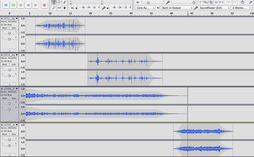
    I used Audacity for this project, and four sound effects (see attributions below): a carousel with music, popcorn popping, someone eating popcorn, and the squeaking carousel without music.

    I started with the carousel music to set the scene and mood, and then turned the volume down on it when the popcorn popping and eating came in. I adjusted the volume/amplification levels on those so they could be heard well, but not be too loud. I then faded both the popcorn eating and the carousel music sounds using the “envelope” tool, and brought in the carousel squeaking sound at the end.

    Here’s a screenshot of the four tracks. I didn’t need four; I could have put the popcorn popping and eating on the same track, and the carousel music and carousel squeaking both on a second track. But it sounds the same, regardless!

    image


    Attributions

    I got all the sounds for this project from www.freesound.org

    Most of them were licensed CC-BY; the carousel squeaking sound was CC0, but I list it here in case anyone else wants to use it!


    Eating popcorn sound came from digifish music (www.digifishmusic.com): http://www.freesound.org/people/digifishmusic/sounds/59714/


    Carousel music sound came from klankbeeld: http://www.freesound.org/people/klankbeeld/sounds/120368/


    Popcorn popping sound came from digifish music (www.digifishmusic.com): http://www.freesound.org/people/digifishmusic/sounds/59712/


    Carousel squeaking sound came from Felix.Blume: http://freesound.org/people/felix.blume/sounds/137720/

  13. Christina Hendricks

    What was that? ds106 radio bumper

    by

    I was inspired to do this bumper by this one over at raptnrent.me. I loved how audio from a Twilight Zone episode was used in that bumper, and it gave me an immediate idea for how to use some audio from the Twilight Zone episode called "The Midnight Sun."

    I remembered that there was a scene in which Norma and Mrs. Bronson are talking in the hallway and they hear a noise from upstairs—the unnamed man who comes and threatens them to get water. I thought it would be cool to have a bumper with someone saying “what was that?” and it being just ds106 radio.

    The process was quite simple, actually. I found out about Soundflower from the Scottlo #ds106zone daily podcast, the #LoDown, who got it from the raptnrent.me blog linked above—this is an application that lets you record audio playing on your computer, but unfortunately for some it is only for Macs (I have a Mac, so it works for me). Following the directions here, I used Soundflower and Audacity to record audio from the episode while it was playing on my computer.

    The dialogue between Norma and Mrs. Bronson didn’t have any music behind it, which turned out to be a good thing because I wanted to cut some of that dialogue (and if there were music it would have skipped weirdly). I was able to easily cut some of the dialogue because there were just silent spaces between (or heavy breathing from Norma, from the heat). I  wanted it to start with Mrs. Bronson saying she hadn’t heard a thing, but then go straight into “what was that?” afterwards. I skipped a few other parts of the dialogue as well.

    BUT, I wanted there to be music throughout the bumper, so I recorded a section of the episode that had mostly just music. It was some part in the middle where Norma is just in her apartment and there is that oppressive “sun” music. At one point she goes to her window and burns her hand on the ledge beneath it. That’s when she does the quick suck-in of her breath you hear right before I start talking in the bumper.

    So what I did was just start the music I had recorded as a separate track beneath the dialogue, and used the “time shift” tool to move it so that Norma’s breath-suck came right after the door slam at the end of the dialogue. The music seemed to work well when time shifting it that way…it built up very nicely as the audio was going along.

    Then came the somewhat (but not very) tricky part. After Normal sucks in her breath, I wanted to do the bit where I talk, and I wanted music with that too. So I recorded some of the soundtrack to the episode from here into Audacity using Soundflower, onto a separate track. I wanted some background music as well as something that would be good to end the bumper with, so I chose a couple of sections from what I had recorded and cut and pasted the two different parts together.

    But of course, if you just put sections of music together that don’t belong together, they sound weird. So here’s what I did. I added some silence (by cutting and pasting from a silent part of one of the recordings) right after the breath-suck-in, and then started the first piece of music over which I would speak. The nature of the music worked with just silence before it. I then  used the “envelope tool” to fade that first piece of music down and transition to the last piece, the chord that ends the bumper.

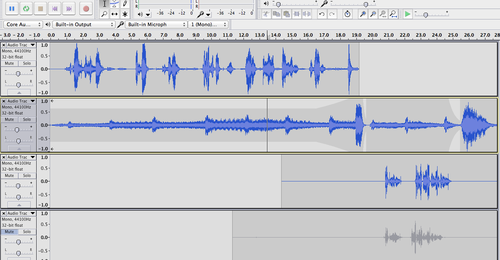
    Here’s a screenshot of what I’m talking about, with the top level being the dialogue between Norma and Mrs. Bronson, the middle being the music, and the bottom being my voiceover. You can see the “envelope” I created in the music.

    image

    The fourth level is an earlier version of my voiceover. I did several takes, and kept all the versions just in case.

    I should also say that when I first began I used “duplicate” on the dialogue and music tracks, to make sure that when I started cutting and pasting, I’d still have the original version of each track in case I didn’t like what I had done. Yes, you can use “undo” to go back to earlier versions, but if you’ve done a lot you have to go back a lot. And this way it’s easy to just start from scratch.

    So this Audacity file has a lot of tracks right now—the original dialogue/the edited dialogue; the original music that goes before my voiceover/the edited music before my voiceover; the original music I cut from to go during my voiceover/the edited version of music during my voiceover, plus all the takes of the voiceover!

    This was really, really fun to do, and only took me about 3-4 hours total, over two nights. Looking forward to doing more audio assignments!

    P.S. I used to do this sort of thing a lot when I worked in college radio as an undergrad, but (and this is dating me) we used (gasp!) physical tape. We had to cut and splice tape with scissors and, well, sticky tape. All my work from that time is sitting on a reel to reel tape in a box somewhere in my house, or recorded onto a cassette in some other box in my house. This way is MUCH easier.

  14. Christina Hendricks

    Cmdr Hendricksā€™ final transmission

    by
    I have not been doing any ds106 “daily creates” for a few days, so I figured it was time to get back to them. Today’s was a lot of fun. Here’s the text of today’s daily create (actually yesterday’s, for me here in Australia…by the time I get the daily create announcements (the next day here) […]
  15. Christina Hendricks

    Creepy little spaceman is even creepier now. Here is what I…

    by


    Creepy little spaceman is even creepier now.


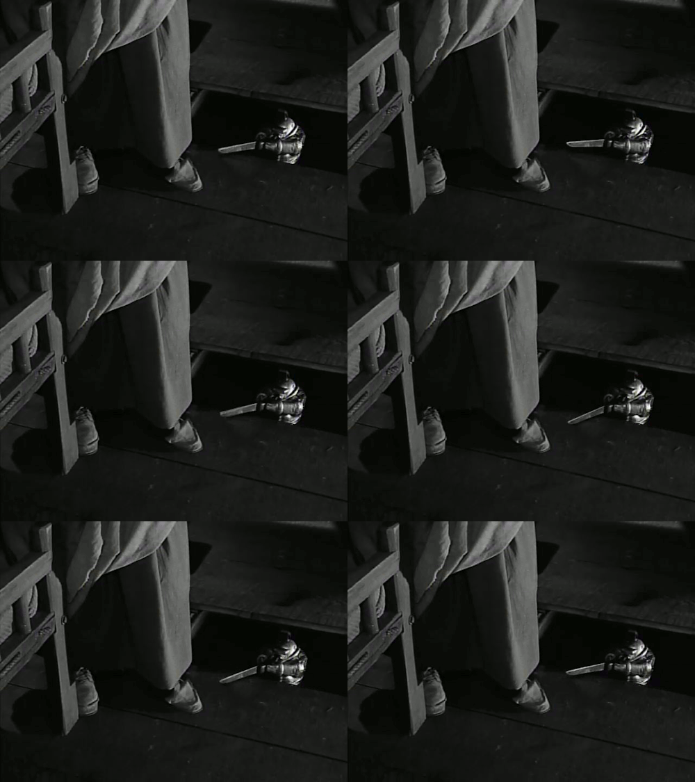
    Here is what I managed to do to fix the jumping image in the first animated gif I ever created (see previous post). The part of the image with the dress was moving around a lot, but the spaceman’s movements looked pretty good. I asked for help with this on my previous post, and voilà, I got it! Andrew Forgave suggested using a mask to keep the dress part still and the spaceman be the only part that’s moving.

    I’m using gimp to make these gifs, so I watched some gimp tutorials on layers and masks just to get my head around them. I found this one pretty helpful and straightforward, and I also watched this one, which didn’t quite get me what I was looking for, but gave me some ideas on just what the heck a mask is and how to make one by painting.

    Neither of these told me how to do what I needed to do, though: create masks that will apply throughout all the layers in an animated gif, so that one part of the image remains still and the other part goes through all the layers as an animation.

    I tried my best to figure out how do that on my own, but didn’t get very far. Basically I was making the part I wanted to animate transparent, which made sense to me b/c I thought I’d want those animation layers to come through. But it wasn’t working; the dress part was still animating too.

    Then followed a frustrating web search for things like “gimp animated gif layer mask,” or some such, and I was just about to give up when I found…I should have known…a tutorial by Jim Groom on exactly what I’m trying to do.

    That tutorial shows a simple, though somewhat work-intensive (repeating easy steps over and over) way to animate just part of a gif. And after several tries of getting the selection right, I got something I’m pretty happy with. It’s not perfect, as I could still use to tweak the selection a bit so that less of the stuff around the knife animates, but I’m quite happy at this point.


    And now it’s time for bed here in Australia. With a sense of accomplishment!

ds106 in[SPIRE]