
Photo Essay: My People
Photo Essay: My People
When I first approached this topic, my initial impression of “my people” was my ancestors. I pictured old black-and-white and sepia photos of unsmiling immigrants. Those are the people from which I descend and to which I feel very connected in many ways. But these aren’t people I can photograph - most of them are still thousands of miles across the ocean, and I while I feel connected to them for a lot of reasons, they are not the people I am surrounded by most often.
While thinking through this, I realized that at this moment in time, what “my people” really means, to me at least, is the people I surround myself daily. Thus I decided to go about this as a simple mission to capture portraits of close friends that best capture what I feel to be their personality, as well as the context in which I interact with them on a regular basis. In acquiring my photos for this project, I decided not to plan out when I would take pictures, but instead allow the situation to pop up, and showcase a typical day surrounded by these people.
I’m not much of a photographer, but I knew that I wanted each picture to have vibrant, sharp characteristics. I found that this felt more natural to me than approaching more shadowed pictures with cooler tints or perhaps black-and-white filters. My relationships with my friends are bright and loud and, even in calmer times and settings, colorful and interesting, and I wanted the composition of my pictures to accurately reflect that. Additionally, because I tried not to specifically plan when I would take these photos in order to make them more candid, I could rarely control the lighting or composition of the original photo, so I had to make changes to their composition on the computer.
When editing my pictures, I paid special attention to sharpening the quality of the photo, increasing saturation, and giving most of them warmer tints. Depending on the photo, I also upped the contrast to make the colors stand out more. Additionally, I altered some of the shadows on the pictures to make them a little brighter without washing them out, as well as make it easier to accentuate their coloring.
Because of this, I chose not to make my pictures incredibly diverse in their composition. I wanted them all to be colorful - and not only in terms of literal colors, but in the subjects as well. Two of my pictures have white backgrounds, but the expressions of the people, both captured candidly, stand out to me as worthwhile additions to my set, because I believe that they stand out as much as some of the pictures that are more colorful in composition, but have less of the close up emotion that these pictures do.
Thus I feel that while my photos are not incredibly diverse in composition, I believe that they are diverse in the moods and attitudes that they convey. I wanted most of these pictures to be candid because I feel like they best showcase a typical conversation or event with my friends, my “people.” I think that candid photographs are the most organic and accurate ways to describe my relationships with these people, and the types of attitudes and emotions with which I surround myself. I wanted to capture various emotions, both with single subjects and between multiple people, to convey a typical day surrounded by “my people.”
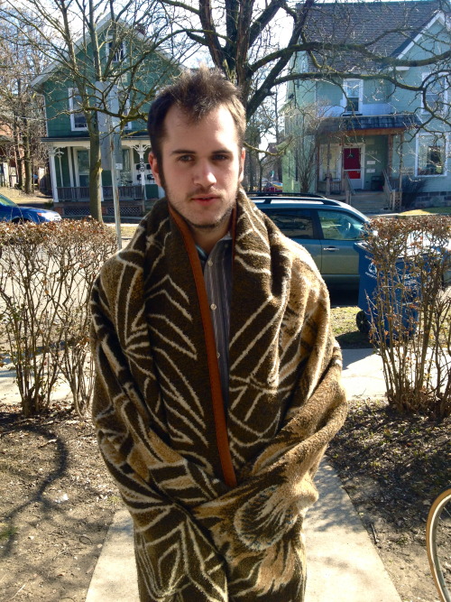
This is one of the images I’m planning on using in my photo essay: my friend Nick in a lion blanket. I like this photo because of the expression on his face, and how out-of-place he looks - almost like a lost bachelor who forgot to take off his robe when he left the house.
Missing the Camera
We’ve looked at a lot of pictures that are posed, or have people staring directly into the camera, that display a lot of emotion. I don’t have much photographic skill, and found it really hard to recreate that - but one thing I’ve enjoyed doing is taking candid photos of people.
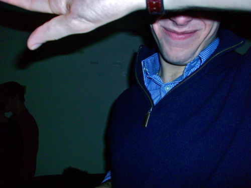
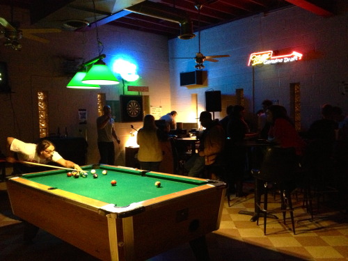
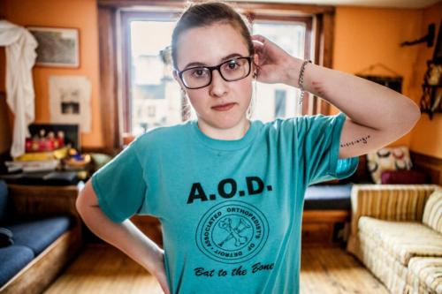
I took all three of these as candid photographs with the intention of never having the person’s eyes facing the camera. Aja, my friend John, and the guy playing pool at the bar were my three subjects, and I tried to vary the composition as much as I could while still having common markers, like the rule of thirds.
My photos for the week are here. I went back and forth between Ann Arbor and my parents’ home this week, so I wasn’t able to use photoshop or even a computer for a lot of my time here, which made it challenging to come up with a good selection of photos (with the exception of the self-portrait my roommate took, all of these pictures are either in or very close to my house). I think if I had had more mobility and time I would have been able to have better results, but for now I’m happy with what I was able to come up with.
My response to the documentary on Diane Arbus is here.
“Lately I’ve been struck with how I really love what you can’t seen in a photograph.”
I really liked this line from Masters of Photography: Diane Arbus. I think it’s so interesting, especially paired with some of the photographs shown in the documentary. I especially like Arbus’s portraits of people; I think that portraits can be the most challenging types of photographs to take, because you’re working with a live subject (obviously), and it can be hard to find a moment in time or a person that warrants a photograph that can tell a story - or inspire you to make up your own kind of story. Arbus’s portraits, to me, are a bit haunting - such as the one of the guy in the mask - and this kind of theme or mood that they carry with them is what draws the viewer’s eye: that mystery of the subject of the photo.
Arbus also quotes her teacher saying, “The more specific you are, the more general it will be.” I wasn’t sure how to take this - but for me it made me think of how trying to force a photo, trying to make the subject emote or demonstrate something that’s not natural to them in the name of creating an artful photograph, will give your photo that same air of forced emotion that is common in so many posed pictures.
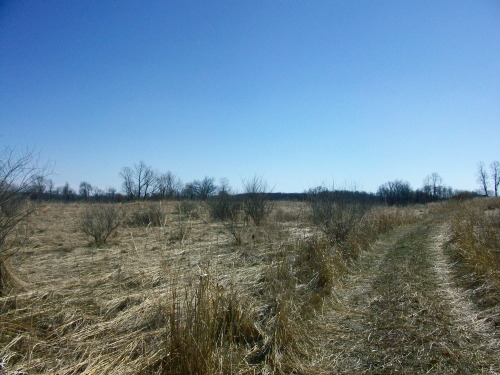
“Take a photo that communicates a universal theme; name the picture with that theme.”
This is a photo of property that my parents own in Manchester, and to me the barren landscape and silence that surrounds it just puts the word “oblivion” into my head - after the horizon, is there even anything there? Where does that path lead? It just seems so empty, and infinite, and I think this every time I’m forced to go out there to look for squatters.
1. Take a photo with strong contrasts—technical (lighting, coloring), physical (size, distance), conceptual (new and old, present and past).
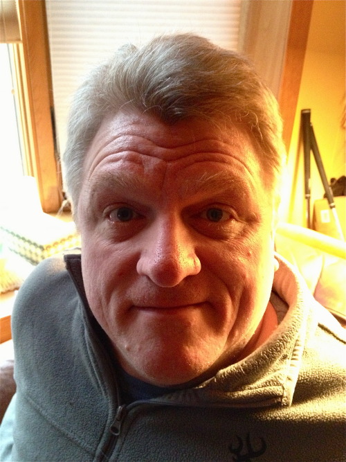
2. Take a portrait. Meet my father.
3. Take a self-portrait (I cheated with this one and had my roommate use her nice camera last week).
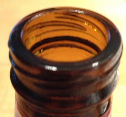
4. An extreme close-up of an easily recognizable object.
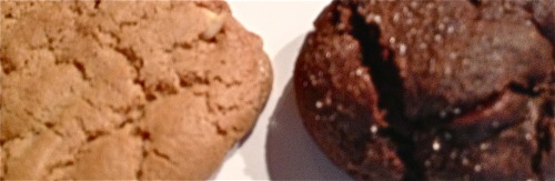
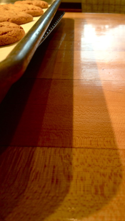
5. A photo of something’s shadow. Cookie tray had a couple shadows - I thought I’d take advantage of it.
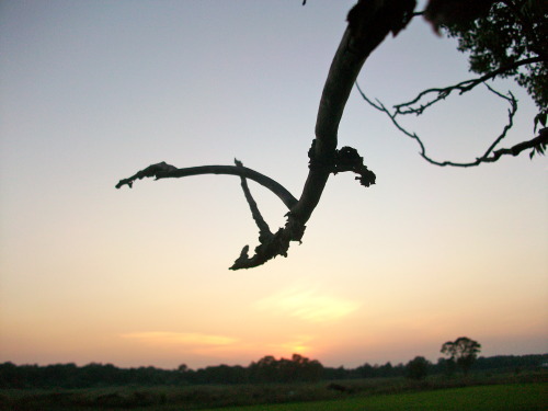
6. Photograph something commonly considered ugly and make it beautiful. A gnarly tree branch by my house, showcased by a nice sunset.
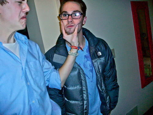
This article interested me with its talk of candid photos, so yesterday I decided to see if I could capture a candid camera moment. It’s not easy! I took a lot of photos before capturing this one, which neither guy thought I was taking, since I used my phone. I just love the mix of emotions - shock and terror on the Michael’s face as my friend Paul squeezes his cheeks and looks like he’s in absolute turmoil. I like the idea of not offering any context to the situation - it begs the questions of what exactly was going on for this to happen.
I edited the picture a little, messing with the shadows, contrast, tint (I made it a little more blue to accentuate both of their outfits) and definition. I like the way it looks a lot - kind of sharper that a normal picture, and a little more textured.
For this week I looked into Cambridge in Colour’s tutorials on Sharpness and Noise in photography, aspects of photo editing that I’ve never really grasped fully.
The tutorial discussed how sharpness can emphasize texture in a photo, so I looked through some photos I’ve taken to see if I can find a really textured one to try changing the sharpness of.

I picked this first picture because of the texture of the clouds. I wanted to see what it would look like if I messed with the sharpness and noise.
I looked into their guide to image sharpening to see what I could do with the clouds. I was most interested to learn about image noise, or film grain. I’ve always seen the image noise button on photo editing software but never understood how it affected the picture other than making it randomly blurry, so it was interesting to learn how it works in conjunction with other effects.
After messing around with the sharpness and noise of my cloud photo, I got a little more texture: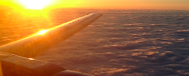
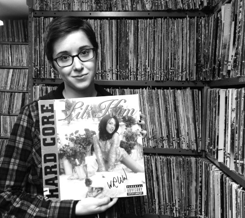
A photo that looks better in black and white. This was hard for me, because in general I don’t like how stuff looks in black and white, but I just think this is a hilarious photo that, when put in black and white, gets this air of faux seriousness, despite featuring Lil’ Kim’s Hardcore album on vinyl. Special thanks to my cousin’s radio station for this choice shot.
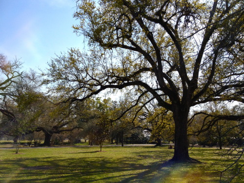
Rule of thirds, taken at the park. Got the tree to the side there. Absolutely beautiful weekend - I didn’t even edit this photo at all!
I’m not good at analyzing literature, and I’m going to be honest: it’s hard for me to understand how this reading applies to what we’ve been doing. I’m more interested in seeing how we’re going to approach this in class and in what context we’ll be looking at it.
Here’s my gif! This was the only video I have saved on my computer other than Lady Gaga’s “Bad Romance,” so I decided to gif it. It’s a scene wherein Buffy (the Vampire Slayer) is telling Spike (that guy up there) to tell him what he was doing standing outside of her house in five words or less. His reponse: “Out - for - a - walk… bitch.”
The quality on this is terrible, but I couldn’t figure out how to improve it without making the file size insane. Tumblr won’t let me post it right now for some reason - it keeps saying “error uploading image” so I’m just linking to it right now from a site I put it on. Once I have faster internet I’ll try to fix this.
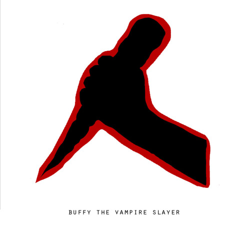
Minimalist poster: Buffy.
So this took eight million years (aka like half an hour). I used this image from Google and then made it completely black with a red outline.
Wooden stakes, #1 vampire-killing method for Buffy Summers.
This week was my first foray into Photoshop and while I’m still trying to figure things out, I’m glad I know enough of the basics to begin to experiment. You can see the products of this experimenting here, in my visual creates for the week.
We also read some interesting pieces on visual design and creation, and while none of the ideas were necessarily earth-shattering, it gave me a good perspective on how to approach my projects in the coming weeks. I also liked looking at the applications of these tools on various websites and trying to re-create my own.
I’ve always been a big fan of contrast in design, and enjoyed Williams’ tutorial on this. It reminded me of my days as a yearbook editor in high school, which, while traumatizing, gave me the chance to do a bit of experimenting with design elements like this. However, I think sometimes his examples looked really crowded. I’m a fan of contrast in a more minimalist fashion, like the star wars posters. Having more than two types of font on one page, to me, is a terrible idea.
I had never really thought about repetition, however, and how influential it can be in design. I found Williams’ examples really interesting, and the importance of being visually consistent in a piece was something that stood out for me. I think that’s something I can struggle with, so it was helpful seeing his examples.
I really enjoyed the minimalist Star Wars travel posters. I’ve seen similar minimalist artwork a lot and think that these are really well done. I think that the Bespin “Cloud City” and Endor posters are especially beautiful. I think the contrast that Williams discusses work well in these posters, where light text is used against dark backgrounds and vice-versa. It creates a pleasing balance, I think, that directs the eye to the name but doesn’t distract from the vibrant colors in the rest of the poster. I’d like to know what mediums the artist used to create some of the textures in the posters, especially the Endor one.
Alright, so here’s my own project for the week: me trying to figure out photoshop again, and ending up with this by (happy) accident.
I took this picture and was trying to figure out how to improve it - I wanted to try to mess with the focus of it, and make the person in the foreground a little sharper. I came at this whole thing with no tutorial and remembering little to nothing about how to use photoshop. I ended up doing this by using “work paths” instead of (instead of…?) layers, in a way. I selected the person in the foreground and was able to sharpen some aspects of the photo, but had trouble adjusting it so that it would be sharp enough without looking fake. In order to contrast this, I blurred the background more by deselecting that “work path” and then applying my changes to the rest of the photo. I also fooled around with the brightness, contrast, saturation, etc., and ended up making the foreground person black & white because, with the added sharpness and blurred background, he almost looked “photoshopped in,” and I thought that it would be interesting to b&w him to see how much it would stand out. To me it now looks like he actually was just randomly placed in the photo, which I kind of like, because isn’t the exact opposite of the point of photoshop?
Design create: Color splash.
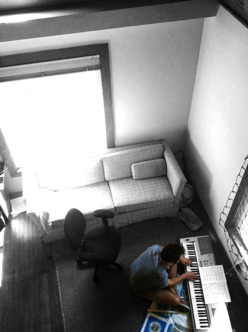
I took this photo of my friend Nick serenading me today and decided to try the color splash trick on it when I was looking through pictures. I was really happy with my ability to figure out how to do this on photoshop! Brian’s instructions were really helpful and it actually went pretty quickly.
In general I like this photo a lot because of the perspective (I took it while sitting on a balcony overlooking the room) and the general composition of the room. Also, it was finally sunny today which also adds to the atmosphere. In black and white/desaturated, the color from the window is really washed out, and it was impossible (for me, at least) to get rid of that, which is the only thing I wish I could change about the photo. In all, though, I think it’s nice - I like that Nick and his colorful shoes and DDR mat are sticking out in the rest of the room.
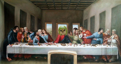
Another design project was to put a fat cat into a famous work of art. Obviously I chose Da Vinci’s “The Last Supper” and the melon head cat, because few things go better together than classic religious art and cats with fruit on their heads. I just used basic tools to crop out the surrounding image around the cat’s head and then place it over… Jesus’s. Is this blasphemy?
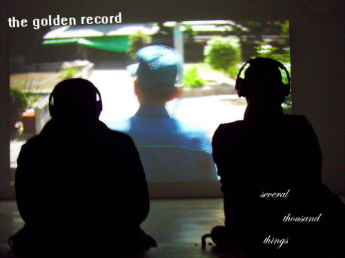
This is my album cover that I made for the nonexistent band The Golden Record, and their debut EP, “Several Thousand Things.” I followed the directions of Albums Without Sound to obtain the names and the photo.
I didn’t do anything to edit the photo in terms of contrast/saturation/etc. because it has already been edited and what I did didn’t really contribute to how the image looked. I have always liked contrasts between serif and sans-serif fonts, so I decided to do that for this cover. I aligned the band’s name with the angle that the projected image is on, and then scattered the album title along the man’s silhouette. I messed with the alignment a little because “several thousand things” to me just seems to go along with the idea of scattered objects. I toyed with the idea of scattering the letters in the words themselves, but it made it too hard to read and I think that the way it’s aligned now works out too.
I really enjoyed perusing the Albums Without Sound blog, which I found to be surprisingly creative and diverse in its creations, especially given that this artist takes their inspiration from random Wikipedia articles. My favorite so far has been the cover for “Mass Flow Rate.” I was first attracted to it because the picture was so beautiful, but I also enjoy the minimalism of the cover, as well as the vertical sans serif typeface. I’ve always been a sucker for any sort of title that follows the line of BOLDED FIRST PART UNBOLDED SECOND PART or some variation thereof, and I think that the artist executed this really well, especially in terms of placing and font color. I think both features complement the picture really well - it showcases the entire picture for the most part, and gives you the information you need in a visually pleasing way without disrupting the landscape behind it. I also like how it lines up with the sun - that’s a really nice feature. I’m not very good at symbolism or anything, but given that the name of the band is “Mass Flow Rate,” I can only connect it to the fact that the background image is water - but again, because this artist also choose the photo at random, it’s up to interpretation.
I’m glad that today’s reading was “The Non-Designer’s Design Book.” I come from zero design background, unless you count at 9th grade “photojournalism” class I took with a teacher that barely graduated from college, so I was happy to be presented with the basic principles of design, which I think will make the projects in the coming weeks, especially the final one, a little easier to take on.
I especially enjoyed the “Proximity” chapter and examples with the business cards. I see some pretty terrible designs on business cards - in fact, at the restaurant I used to work at that had one of those “enter your business card for a free lunch” raffles didn’t choose cards at random, but based on how nice they looked. The author’s focus on how our eyes react to the layout and design reminded me how important audience reaction is to your design, and how I will need to keep this in mind in the future.
The readings for this week were very, very hard to get through. I’m not sure how much I’ll be able to apply them to this part of the class, but it was interesting to see how people (attempt to) write about images.
This was my first foray into photoshop, although my roommate Isabel is an expert and everyone should go look at her excellent photography. I’m not a huge fan of how complex it is and how little the buttons are, but I think I did okay so far. I did both photo challenges here and here.
I miss audio - I really liked interviewing people for the small projects we had, strangely more than video. And it got me back into listening to This American Life on a regular basis, which I’m very thankful for.
I’m more apprehensive going into the image section because I’ve never been very good at photography - I took a class in 9th grade and I was useless. I think it takes a special eye to be able to tell a story through one soundless, motionless image. It will definitely be an adventure attempting to do that for the rest of the semester.
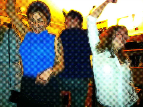
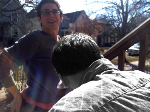
Add a comic book effect to a photo.
Featuring myself and Aja Weston, circa sophomore year.
I used this program to add the effect to the program, because I was out of town and didn’t have access to photoshop this time. I haven’t approached Gimp because of what I’ve heard so far in the class, so I decided to go with a more simple approach this time. I chose this photo in particular because of the contrasting colors, which I think stand out in an otherwise blurry photo.
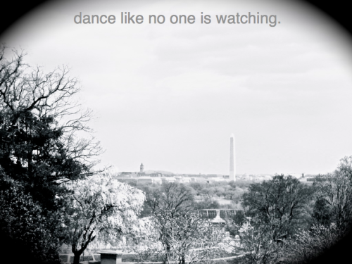
Take a bad photo, apply a vintage effect, and write something in Helvetica.
Taken in Arlington Cemetery overlooking Washington, D.C. circa 2006.
I used iPhoto ‘08 to put a black and white effect on this photo, and also faded the colors a little and added a vignette, because I find vignettes so tacky and therefore appropriate for this photo project. I have always found this quote hilarious, and so stupid, and thus felt it would be funny to contrast it with a more serious photo that I think is completely out of place.
