
-
-
Minimalist travel poster? (Design Create)
At the top you can see my final product. I asked myself where I wanted to be the most right now, and the answer was Madison Avenue, inside Don Draper’s office, telling him to make me an “old fashioned” and screaming at him for not being good enough and telling him to either give me ...
-
Minimalism on the Web
CC Flickr SpacesickThis poster is compelling because Edward Scissorhands is a weird, underrated film that I thought most people forgot about, so I was happy to see that people are still remembering! I also like that it was so literal, though I probably... -
Design Create: Minimalist Travel Poster
For this design create, I based it off one of the most boring places in the world: Romeo, Michigan, my hometown. It was someone of a process trying to figure out what image would best represent Romeo in a minimalist way. At first, I was going to create... -
Design Create: Fantasy Ted Talk
For whatever reason, I knew that I wanted to somehow incorporate grumpy cat in this ted talk, so I found a random image of him on the web. I used dragged the cat image to the provided Ted Talk template, and then used the lasso on the sidebar to trace o... -
Weekly Recap
Design has turned out to be pretty tricky, there a major learning curve with using photoshop. One of my room mates who is in the art school was able to help me a bit though 1. Looking through the albums … Continue reading →
-
Design Create: My Own Album Without Sound
This design project was influenced by Albums Without Sound. I simply followed the rules by finding a random article on Wikipedia, which led me to Kim-Young Ran. I then found a random quote, and stole the last five letters, which ended up being "...reve... -
Honest Movie Title: AVATARDED
This is my next design create. If movie posters told the truth!! Take a movie poster and make it say what the movie is really about, or what it is really like. I went with this little piece, called Avatar (or AVATARDED), which was super expensive. Sadly, with James Cameron, the costs-quality relationship is inversely ...
-
Original Design Create
For this project, I first googled "most famous paintings in the world," and randomly chose this classic:I then chose a random cat picture by googling "funny cat face," and found this little creature:I then dragged it into photoshop and clicked the lass... -
My Album Without Sound
I decided to have a go at the albums without sound idea! I randomly generated a quote : “face the truth” random wiki article: Glow random flickr picture: by zoologist1998 To create this poster, I used the glowing edges effect in photoshop and played around with fonts and their properties!
-
Weekly Summary: Digital Storytelling
Lots of posts this week. We dove right into designing images. After learning some Photoshop basics in class, I used what I had learned to practice with the roller coaster swap and the album without sound, which I chose for my choice design assignment. ... -
Weekly Summary
This week was spent mostly on visual design. I'm familiar with Photoshop, so when we did the in-class editing with it, I was completely comfortable. However, on my computer, I have Gimp, so when I had to do my design creates it took way longer because ... -
Minimalist Image Design
By Hengki Koentjoro, from here This images is so compelling to me because of its simplicity. Of course, for it to be a minimalist image it must be simple, so that's no surprise. When I look at this image, I imagine that the dock represents my life, and I am continually stepping forward, out into the grey, the unknown. I can't tell what's in the distance; only the next few steps are clear to -
Response to Minimalism
I found this example of minimalism online, a movie poster for the film The Social Network. It caught my attention because all it is is the Facebook "friend request" logo, and so it makes it clear that the movie is about Facebook. The image of a friend ... -
Sunday Post
Well, Happy Holiday’s to those that don’t celebrate Easter! This week was a challenge but thanks to the professor it was manageable. The in class workshop was very much needed and appreciated. I learned that I would rather work with Photoshop … Continue reading →
-
I can read movies
In the The Non-Designer’s Design Book, William outlines 4 basic principles for design. These are below. Contrast: avoid elements that are merely similar; make them very different. Repetition: repeat visual elements of the design throughout the piece. Alignment: every element should … Continue reading →
-
Where’s Perry
I created this picture in Gimp. First I found this picture on twitter while searching Northquad. I used the magic wand to delete the picture of swimmers added. Then copied and paste pieces of the water to fill the space. … Continue reading →
-
MICHIGAN!!!
In honor of our trip to the Final Four, here is my own design! I started by getting pictures of each of the starting five players, Coach Beilein and the Michigan Block M. I then used the text tool in photoshop to type out Michigan and find a font that I liked. I chose Impact ...
-
Ted Talk: Britney Spears on "How to Go Bald"
This one was pretty fun. I'm not sure how the idea came to me, but I knew it was perfect. 1. I downloaded the Ted talk template from here (scroll to the bottom of the post), and opened it. 2. I found all the images that I wanted from the Internet, downloaded them, and opened them into Photoshop. 3. I used the magnetic lasso tool to select the parts of the images that I wanted, then I -
Minimalist Poster – Jack Rabbit Slim’s from Pulp Fiction
My process: 1. I found an image from the Internet with the text and logo, so I downloaded it and then imported it into Photoshop. 2. I used the magnetic lasso tool first to draw out the rabbit, then I created a new project and made the poster dime... -
Original Creation
I took my original creation from the DS106 Assignment Bank. I chose to do "The Ultimate Merger", by creating a logo to combine 2 famous companies. This is what I came up with:+= -
Weekly Summary
Albums Without Sound Post Flow Rate “It Goes On Forever” Design Creates Mona CatOSU TedSprint T&TAutumn Splash Minimalism Reading and Blog Assignment Ghost Dad movie book cover
-
I Can Read Movies (Minimalism)
This book cover represents the surface meaning of the movie but not exactly how the movie functioned. I found this book cover interesting because it actually makes the movie seem more animated, or interesting. I don’t believe any of William’s principles to be at play here.
-
Mona Cat (Design Create)
This assignment was both random and hilarious. I first added the painting to photoshop. Then I searched through the Creative Commons for a specific type of cat that would fit in this picture. I hid the painting while I used the lasso tool to outline and erase the cat’s background. I wish I could have … Continue reading →
-
Sprint T&T (Design Create)
If these two companies merged, I feel that maybe my iPhone signal wouldn’t be terrible. I found each logo and added them to photoshop. I used the lasso tool to remove the excess background and Sprint logo and I placed it under the AT&T logo.
-
OSU TED (Design Create)
This picture represents Brutus trying to educate people about how amazing Michigan is because OSU sucks. I downloaded the TED template. I found a picture of Brutus. I used the lasso tool to outline him To erase his background: Select > Inverse then I used the erase tool Finally, I added and resized a picture … Continue reading →
-
Autumn Splash (Design Create)
When I moved to Michigan I was amazed by the way the leaves turned colors. I thought it was the coolest thing ever. It took me a while to figure out that this was because they were dying. In Florida, the leaves don’t change colors the way they do here. In order to create this … Continue reading →
-
original project – album without sound
So I really, really liked Eric Sena's Albums Without Sound project, and I decided I had to do one of my own. The instructions are on his Tumblr (side note - he followed me back!) and are fairly easy:- Go to wikipedia, click "Random Article" - Band name
- Go to quotationspage.com and click "Random Quotes" - last 4 or 5 words are the album title
- Go to Flickr and click "last seven days" - the third picture is the album cover
 I really like the picture that was chosen – I think it was called "A Soldier's Goodbye" or something like that. I especially like the cat because I love cats. The typeface works well with the image because it is rather simple and futuristic, while the actual photo is grainy and vintage. In contrasting these two themes I think I ended up with an album cover that really works.
-
d e s i g n create 4
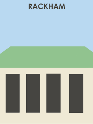 The assignment for the fourth design create was to create a minimalist travel poster of your favorite or least favorite place. The Rackham building is my favorite building on campus, so I thought I would make a poster in it's honor.This was actually a little bit difficult to make mostly because, again, Gimp is so so hard to figure out – there isn't even a tool to make a triangle shape! Some of my corners are uneven and I think the last window on the right is placed a little bit off, but this is only because I could not figure out how to fix a lot of things, even after looking at gimp for so long. Anyways, my process was fairly simple:
- Fill blue background
- Make beige rectangle, add same-size rectangles to make the windows, color them gray
- Make green rectangle
- Make angled rectangles for sides of the roof by rotating them, color in with blue paintbrush to make seamless (this was the worst part)
- Add text
-
I don’t want to wait for Season 4 to come out
But since I’ve got to wait for Season 4 of Downton Abbey, why not make some minimalist-ish posters for the show. The first and second posters were made awhile ago … Continue reading →

