-
For my fantasy Ted Talk, I chose Shosh from Girls giving a talk on ” The Correlation Between Men’s Willingness to Pursue Employment and Number of Things Hated”. At the end of this season, Shosh broke up with her boyfriend … Continue reading →

-
Design Create #5- Color Splash
I luckily found an excellent tutorial on how to do color splash. I chose this photo of blooming cherry blossoms from Flickr. Spring has finally arrived, kind of, and I wanted to highlight the colors of spring in the photo. … Continue reading →
-
Sundae Summary
This week in Design was very challenging. I’m very proud of myself. I think I’ve grown fond of the Lasso function on Photoshop. I used it a lot in my Design Creates. I really enjoyed our in-class workshop. It was … Continue reading →
-
Minimalism – Gotham City
So, I had a hard time understanding what Minimalism is. So with google searches of what it is , I think I did this right. I wanted the definition of the buildings to stay but for the picture to look … Continue reading →
-
D3S!GN C R E A T E #3
[original image from flickr user TED Conference]So this image is pretty small but if you click on it, you can see it a lot better.The assignment for this create was to take an image of a TEDx conference and make it fictional. Since there are so, so man... -
Design Create: Alternate History
I figured this scene from The Matrix would be perfect to use for an alternate history creation. The entire movie relies on this one fork in the road where Neo has to make a decision between the Red or Blue pill. If Neo were to choose the blue... -
Design Create: Movie Poster
When trying to think of a movie that I can sum up in a few words, Swordfish was the first to come to mind. No disrespect to Swordfish, I enjoyed the movie but the only thing I can really remember about it is that you see Halle Berry naked. As one ... -
Design Create: Minimalist Poster
My minimalist poster for the beach is quite simple: sand + ocean + chair. When I go to the beach I go to relax and enjoy the view which I believe is represented through this poster. To start I opened a Gimp file and filled in using the color ... -
Minimalism, Contrast, Repetition and Repetition
I think I have told you before that I am a minimalist.
For this reason, this part of our design unit was especially enjoyable for me. I spent a lot of time looking at minimalist images on flickr, google images, tumblr etc. and I honestly couldn't pick a favorite, so I have a couple example of minimalism that I really like that I will share with y'all.Allard One on Flickrairows on Tumblrartssake on TumblrLet's start with the first image. There isn't a lot going on here, but the contrast of the blue and red definitely defines the image. Though it is pretty simple, the bold colors show a perfect example of how contrast can help a minimalist image. This image is compelling because we don't exactly know what is going on - where are these chairs, who previously sat in them, why are they here? From the dark edges and bright colors, we get almost an eerie feeling from this photo - again exemplified from the contrast. The two red chairs also help this image because they gives us one of the main design elements discussed from Williams: repetition. This repetition helps the image by giving it a bold blast of color and, as discussed by Williams, an element of recognition.The next image doesn't contain much content, but I really enjoy it. Again, this is a prefect representation of Williams' discussion of both contrast and repetition. The same circles, same frame around the words, same font – repetition is a main theme of this image and ties it all together. The contrast is also very obvious. Like Williams discusses, "don't be a wimp about it"; either go big or go home. Don't contrast navy blue with royal blue, but instead contrast red with black, which is perfectly portrayed in this image.This last image is probably one of my favorites. While there are plenty of different colors in this picture, they are all fairly similar and are repeated throughout the image – each square has (more or less) the same color scheme as the next. There is obviously repetition throughout the image, and this consistency helps bring the image together, once again bringing a sense of recognition to its viewers. The contrast is once again obviously by comparing each square to the next, since the colors contrast and compliment each other nicely.All of these images are great representations of Williams' discussion of design through repetition and contrast. Each have repetition, or stick to a certain theme that evokes a feeling within the viewer, as well as a contrast that helps keep the image interesting, unique and beautiful.
-
Design Create #3- Truthful Movie Poster
I So I learned how to do something other than change the colors, I also know how to cut and blend thing–Big week. I redid the movie poster for the recently released movie Spring Breakers. Selena Gomez and Vanessa … Continue reading →
-
Design Create: Color Splash
One of the many great things to come out of last night's epic sweet sixteen victory was this picture of Trey Burke rising high and delivering one of the most memorable moments in Michigan basketball history. I realized giving this pictur... -
Minimalism– There is always money in the banana stand
There are a lot of minimalist fan made art for most of the shows that I love. But the one that I am most excited for its return is Arrested Development. We have waited years and years for this, and … Continue reading →
-
Design Create #4
Minimalist travel posters: Narnia? Downton Abbey? Skeepers? Make a minimalist poster showcasing your favorite/least favorite plcae. Or a place that you have complicated feelings about. Or a place that you can think of now.My feelings towards Rick's are... -
Minimalism
The concept of minimalism is very cool. I think its because of the simplicity of the images that make this form of design so enticing. Some of the posters I looked at had such little going on that they were somewhat tricky to identify. I came across a lot of superhero posters, which was fairly ...
-
Westeros
Welcome to Westeros, one of the Seven Kingdoms in the HBO series Game of Thrones. To do this poster, here is what I did: Found a picture of Westeros online In Photoshop, I outlined the kingdom and Select > Inverse and deleted the landscape I used the gradient tool to make my own gradient from colors ...
-
Design Create – Color Splash
Ok, so did sort-of the inverse of the project, but I think this looks better than the other way around of color-splashing. I especially like the color of the rocks - I didn't even edit the color, they're really that bright!This project wasn't too diffi... -
Design Assignment: Black and White Picture
This one was actually really easy to do. I put the photo into Photoshop, used the lasso tool to draw out the shoes, then copied and pasted them onto the original image. I made the original photo the top layer, then decreased saturation until it was bl... -
An Album Without Sound
The idea for this comes from here, a blog called Albums Without Sound. This is how it works (from the blog): 1) Go to wikipedia and select "Random article". This article gives you the names of the band 2) Go to quotationspage.com and click on "Random Quotes". The first or last four or five words of the very last quote on the page is the title of your album. 3) Go to flickr and click on -
Roller Coaster Face Swap
This is what I did in class the other day for practice in using Photoshop. First I imported the original picture into Photoshop, used the lasso tool to draw around the funny face, and copied and pasted it onto the image for as many faces as there are i... -
Design Create- Album Without Sounds
For my own little design create I decided to make my very own album without sound. Xianjue Subdistrict was what came up for my random wikipedia article, the little lego tank was my flickr pic and the last line of … Continue reading →
-
Design Create #1: Do I still hate GIMP?
I hate GIMP. Every single version of GIMP I have used in the past was frustrating. Tasks I found easy in photoshop seemed to have no equivalent in GIMP. However, I was willing to give the program a second chance. I used the latest version to complete an assignment for my Digital Storytelling class: “Pick A ...
-
Design Create #4
Design Create #4! What are you waiting for? Go! Go! Minimalist travel posters. Narnia? Downton Abbey? Skeepers? Make a minimalist poster showcasing your favorite/least favorite place. Or a place that … Continue reading →
-
Zero Dark Thirty – My Own Movie Poster
Found a picture of a ZERO DARK THIRTY poster here: http://www.impawards.com/2012/zero_dark_thirty_ver8.html Typed out “The Time We Got Osama” with the text tool in font Helvetica Neue. I opened the Text Tool Toolbox and played around with the spacing between the letters in both the vertical and horizontal directions. Then I did Layer > New Fill Layer > ...
-
American Flag – Color Splash
For the color splash daily creat, I immediately knew I wanted to do something with an American Flag. It is such an iconic figure and I knew the colors would stand out really well on a black and white background. Here are the steps I took to create this image: Open Image Duplicate Layer On ...
-
So I wanted to make a collage type picture. I took The smiling…
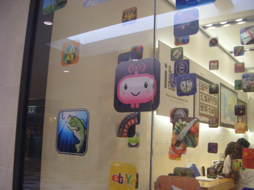
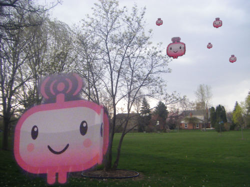
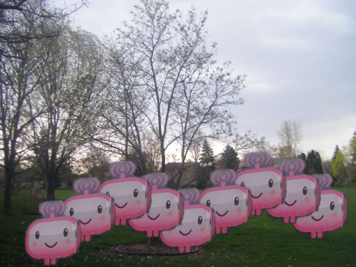
So I wanted to make a collage type picture. I took The smiling guy from this picture I took of an apple store. I used the eraser tool to get rid of as much background as I could. I then copy and pasted him several times into another picture. I wanted to play around with perspective. I did this by taking copies and making them bigger or smaller and arranging them to give the illusion of distance. The background is just a picture I took of my backyard to give the comic invasion look more validity by being in a space that looks obviously real compared to the cartoon. Cartoons are invading. I like how this looks. I need to make sure I pay attention to using the eraser tool carefully.
-
If movie posters told the truth
I chose the film something borrowed. This is because I felt like it was a better title available. I wanted to use the word “engagement” in here but I didn’t want it to be obvious about what the movie was … Continue reading →
-
Another design project was to put a fat cat into a famous work…
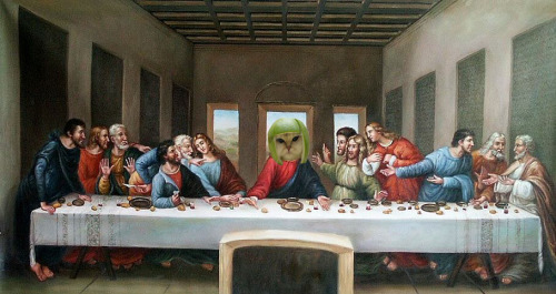
Another design project was to put a fat cat into a famous work of art. Obviously I chose Da Vinci’s “The Last Supper” and the melon head cat, because few things go better together than classic religious art and cats with fruit on their heads. I just used basic tools to crop out the surrounding image around the cat’s head and then place it over… Jesus’s. Is this blasphemy?
-
Design Create #3
If movie posters told the truth: Take a movie poster and make it say what the movie is really about, or what it is really like.To start this design create, I though of my favorite movies and which one of them could be renamed to make more sense. Pretty... -
This is my album cover that I made for the nonexistent band The…
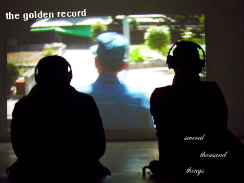
This is my album cover that I made for the nonexistent band The Golden Record, and their debut EP, “Several Thousand Things.” I followed the directions of Albums Without Sound to obtain the names and the photo.
I didn’t do anything to edit the photo in terms of contrast/saturation/etc. because it has already been edited and what I did didn’t really contribute to how the image looked. I have always liked contrasts between serif and sans-serif fonts, so I decided to do that for this cover. I aligned the band’s name with the angle that the projected image is on, and then scattered the album title along the man’s silhouette. I messed with the alignment a little because “several thousand things” to me just seems to go along with the idea of scattered objects. I toyed with the idea of scattering the letters in the words themselves, but it made it too hard to read and I think that the way it’s aligned now works out too.
-
Daily Create- Splash
Who: I, Kelly. What: Decided to create one of the stereotypical pictures of items in colors. I wanted to choose ballet shoes or the kid with red balloon. The shoes won because I found this picture on Creative commons. THANKS … Continue reading →


