1. kmof1992

    The Perks of Being a Wallflower Minimalist Posters

    by
    These pictures were relatively easy to make. I just found the images online, used the magnetic lasso tool to get just the typewriter and just the 45 single, added the text (courier new bold) and then filled in the green background. To get the right color I opened the original movie poster in photo shop and then used the color sample tool.
  2. pborisov

    Fantasy Ted Talk: Momā€™s Spaghetti

    by
    I did not do anything classy for this assignment. Instead, I decided to do a take on an old meme that refuses to die. “Eminem knew he had one shot to make himself relevant again. It clearly had him nervous after his absence from the lime light. He needed to be taken seriously, but his ...
  3. pborisov

    Visual Personal Project: Comic Effects Via Photoshop

    by
    One of the past assignment options we had was to create a comicbook effect. There’s a video tutorial for GIMP (via Brian Short’s blog). However, I didn’t use GIMP for this assignment because it’s lacking some useful features that will let me get things done faster for this effect. Instead, I tried to see what ...
  4. tpcm

    W E E K L Y . S U M M A R Y

    by
    WHAT I DID THIS WEEK:

    • made an image from a poem
    • posted about albums without sound
    • made a design create - color splash
    • talked about minimalism, design, and repetition
    • design create 3
    • design create 4
    • made an original design project
    This week went by much too fast. With finals sneaking around the corner, I've had a lot of preparation to do as well as basic everyday life obligations that always keep me on my toes. This section of the class has been my favorite thus far – I love working with, talking about, creating and discussing design. I've really enjoyed all of the media we've been working with as well as using photoshop (NOT Gimp). I think it's great that we can create completely new designs just from one image, which is exactly what photoshop allows us to do. In opening new doors to the world of design we can add to the never-ending field of creativity that we each individually contribute to.
  5. hfaley

    Weekly Summary

    by

    This week was my first foray into Photoshop and while I’m still trying to figure things out, I’m glad I know enough of the basics to begin to experiment. You can see the products of this experimenting here, in my visual creates for the week.

    We also read some interesting pieces on visual design and creation, and while none of the ideas were necessarily earth-shattering, it gave me a good perspective on how to approach my projects in the coming weeks. I also liked looking at the applications of these tools on various websites and trying to re-create my own.

  6. janus ajax

    Splash of colorĀ  album coverĀ blog postĀ  for fun design TED talk minimilist travel…

    by

    Splash of color 

    album cover blog post 

    for fun design

    TED talk

    minimilist travel poster

    minimalism 

    This week was interesting in making pictures. One thing I forgot was how time consuming picture editing can be. Even if I know exactly how to do something and it is pretty straight forward, it always seems surprising to see how much time it actually took to create. Overall I rather like the graphics I made for this week. 

  7. eitantal

    A Week In Review 3/24-3/31

    by
    cc Andrew GainerThis week brought about a further concentration into the design portion of the class. Honestly this design section has given me the most difficulties out of every section. Dealing with Gimp and Photoshop has been very frustrating and fo...
  8. janus ajax

    Minimalism on the web

    by

    image

    Recently I really liked the minimalist posters from College Humor. I liked them because they felt relevant and accurate as the posters had to do with the general personality of websites. My favorite website is tumblr so I chose it’s poster. The element that makes this particular poster effective is contrast. While the background is blueish-gray the heart which is the main attraction of this poster is bright and contrasts greatly. While being minimilist in nature this particular poster does seem a little more complex and embellished than other minimalist posters but I still think it did a nice job being balancing simplicity with small flourishes. For example the boarder and underlining add detail but don’t make the visual overly complex.There are are a series of posters and each seems to take different elements but they are all effective.

  9. eitantal

    Minimalism Response

    by
    After searching around for a while I finally found my favorite example of minimalism on the web. This movie poster for Reservoir Dogs for some reason stands out to me above the rest. The crayons each represent the code names for the main char...
  10. thirstytony

    Week In Review

    by
    This was my favorite week of digital storytelling ever. I fell in love with photoshop, which I had never used before and I even learned how to work Gimp- which is after all not as bad as I thought in the beginning. I don’t remember doing this many creative projects in a long time. I ...
  11. janus ajax

    For my minimalist travel poster I made it for Londonā€™s…

    by


    For my minimalist travel poster I made it for London’s eye. I felt red and white would be good for my poster as well as keeping it simple. I didn’t want to use too many colors and red and white seem very British to me. I also used Arial font to keep the poster as simple and clean as possible. I used a plain circle to represent London’s Eye (which is a Ferris wheel.) I placed  the eye in the center of the circle to emulate an eye. Overall I liked the project and feel people know what it’s about.

  12. thirstytony

    MINIMALIST CRO?

    by
    We were supposed to find an example of minimalism on the web. After a very, very long search, I realized that the answer was right in front of me. While I was searching, I was listening to music by my favorite artist- Cro. He is famous for wearing a panda mask and never showing his ...
  13. hfaley

    The Non-Designer’s Design Book: Repetition and Contrast

    by

    I’ve always been a big fan of contrast in design, and enjoyed Williams’ tutorial on this. It reminded me of my days as a yearbook editor in high school, which, while traumatizing, gave me the chance to do a bit of experimenting with design elements like this. However, I think sometimes his examples looked really crowded. I’m a fan of contrast in a more minimalist fashion, like the star wars posters. Having more than two types of font on one page, to me, is a terrible idea.

    I had never really thought about repetition, however, and how influential it can be in design. I found Williams’ examples really interesting, and the importance of being visually consistent in a piece was something that stood out for me. I think that’s something I can struggle with, so it was helpful seeing his examples.

  14. janus ajax

    TED talk by princess Zelda. I combined three pictures to make…

    by


    TED talk by princess Zelda. I combined three pictures to make this. I found a picture of Princess Zelda from my Guide book to The Legend of Zelda: Twilight Princess. The graphic are symbols are from the game. The Ted talk stage is from a still of a ted talk. I covered the screen with a graphic which didn’t tilt/line up very well but I tried my best to get it to fit. I don’t really like it but couldn’t find a way to adjust the picture to fit exactly where the screen was. There was another person on the stage which I used the smudge feature to “erase” from the stage and place Princess Zelda over where they were standing. I really liked how that worked because at first I tried to fit my graphic over the person but their hands kept sticking out awkwardly. Smudging the person made it much easier to place a graphic over that didn’t exactly have the same stance. Overall I kind of like how the ted talk turned out because I like TED talks and it would be cool to have one from Princess Zelda. 

  15. hfaley

    Star Wars Minimalist Travel Posters

    by

    I really enjoyed the minimalist Star Wars travel posters. I’ve seen similar minimalist artwork a lot and think that these are really well done. I think that the Bespin “Cloud City” and Endor posters are especially beautiful. I think the contrast that Williams discusses work well in these posters, where light text is used against dark backgrounds and vice-versa. It creates a pleasing balance, I think, that directs the eye to the name but doesn’t distract from the vibrant colors in the rest of the poster. I’d like to know what mediums the artist used to create some of the textures in the posters, especially the Endor one.

  16. hfaley

    Alright, so hereā€™s my own project for the week: me trying…

    by


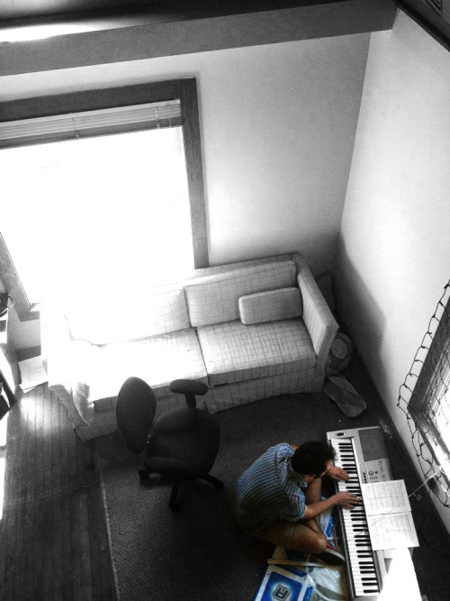
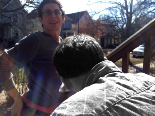
    Alright, so here’s my own project for the week: me trying to figure out photoshop again, and ending up with this by (happy) accident.

    I took this picture and was trying to figure out how to improve it - I wanted to try to mess with the focus of it, and make the person in the foreground a little sharper. I came at this whole thing with no tutorial and remembering little to nothing about how to use photoshop. I ended up doing this by using “work paths” instead of (instead of…?) layers, in a way. I selected the person in the foreground and was able to sharpen some aspects of the photo, but had trouble adjusting it so that it would be sharp enough without looking fake. In order to contrast this, I blurred the background more by deselecting that “work path” and then applying my changes to the rest of the photo. I also fooled around with the brightness, contrast, saturation, etc., and ended up making the foreground person black & white because, with the added sharpness and blurred background, he almost looked “photoshopped in,” and I thought that it would be interesting to b&w him to see how much it would stand out. To me it now looks like he actually was just randomly placed in the photo, which I kind of like, because isn’t the exact opposite of the point of photoshop?

  17. thirstytony

    Splash the Color! (a class photo)

    by
    For this design create I used an old photo of my high school class dressed as transvestites ! yes, in Germany, this is part of a fun week called “Mottowoche”, where you pick different mottos for each day of the week and dress up as whatever you collectively choose! I used my iPhone color splash ...
  18. hfaley

    Design create: Color splash. I took this photo of my friend Nick…

    by


    Design create: Color splash.

    I took this photo of my friend Nick serenading me today and decided to try the color splash trick on it when I was looking through pictures. I was really happy with my ability to figure out how to do this on photoshop! Brian’s instructions were really helpful and it actually went pretty quickly.

    In general I like this photo a lot because of the perspective (I took it while sitting on a balcony overlooking the room) and the general composition of the room. Also, it was finally sunny today which also adds to the atmosphere. In black and white/desaturated, the color from the window is really washed out, and it was impossible (for me, at least) to get rid of that, which is the only thing I wish I could change about the photo. In all, though, I think it’s nice - I like that Nick and his colorful shoes and DDR mat are sticking out in the rest of the room.

  19. arianaln

    Week Review

    by
    This week I did the following: Haiku Photo Design Create, Design Create, Design Create, Design Create Album Cover Response to Robin Williams I am enjoying this design unit, although I am having a harder time than I thought with it. Graphic design is something that I feel I am not really able to teach myself ...
  20. arianaln

    Response to Robin Williams

    by
    I know it’s a little early for Christmas, Edward, but… I have a present for you., a photo by spacesick on Flickr. I really liked the way this poster incorporated a theme in the movie into the aesthetics. The sliced up hands with space in between refers to the character’s scissorhands and the heart is ...
  21. ajaweston

    Weekly Summary Post

    by
    CC Guido SportaalThis week's completed assignments:Read the required readingsBlogged about "Albums Without Sound" Blogged about minimalism on the webOne, two and three design projects, as well as an original project.I am still getting used to photoshop...
  22. bsosnik

    Weekly Summary

    by
    Design has gotten off to a great start.  I was able to brush off some of my old Photoshop skills and have some fun as well. I’m really looking forward to doing all the daily creates and designing some unique things. As far as my creates, here is what I made: In honor of our ...

UMW Spring 2024 (Bond & Groom)

Welcome to Paul Bond and Jim Groom’s Spring 2024 ds106

Student Blogs

(9 posts)

[feedroll tag=”spring24bond”]

Spread some comment love! Find a random post from this section